
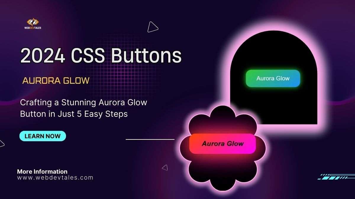
Hey there, creative coders! 🎉 Welcome to another fun tutorial where we’ll be crafting this magical “Aurora Glow Button”—it’s the button that glows like the northern lights but without needing a plane ticket to the Arctic! 🛫 So let’s get started with our First Button of the 2024 CSS Buttons Series.
Look at this beauty! It’s green and blue by default,

But wait… hover over it, and BOOM 💥! It lights up like a neon sign after too much caffeine. ☕💡

2024 CSS Buttons: Stunning Aurora Glow Button
Table of Contents
Step 1: Let’s get the Basics down
So, first things first—here’s our basic button wrapped in a super-chill container. Nothing fancy yet… but hang tight! We’ll get there.
<div class="button-container">
    <button class="aurora-glow-button">Aurora Glow</button>
</div>
Now, let’s jump into the CSS where the real magic happens! ✨
Step 2: Style That Glow!
We start by styling the button. We’ve got a gorgeous gradient here: from green to blue. I call it the “Aurora Borealis effect,” but my friends just call it “fancy.” 🌈
.aurora-glow-button {
    padding: 20px 40px;
    font-size: 1.4rem;
    color: #fff;
    background: linear-gradient(145deg, #32cd32, #1e90ff);
    border: none;
    border-radius: 20px;
    cursor: pointer;
    box-shadow: 0 0 20px #32cd32;
    transition: all 0.5s ease;
}
Next, we’re using box-shadow to add that shiny glow because let’s be real—no glow, no show. And, of course, our buddy transition makes everything look smooth like butter on a hot pancake! 🥞
Step 3: The glow-up happens when you hover!
Now for the fun part: when we hover, things start to heat up. 🔥
Watch how the gradient flips into fiery red and purple. You’d think this button just got back from a rave! 💃🕺
.aurora-glow-button:hover {
    background: linear-gradient(145deg, #ff4500, #ff00ff);
    box-shadow: 0 0 50px #ff4500, 0 0 80px #ff00ff;
    transform: scale(1.1);
    color: #000;
    font-weight: 700;
    font-style: oblique;
}
That’s right, it grows, it glows, it’s fabulous 🎇 Not to mention the hover turns the text bold and oblique—because we love our buttons with personality, right? 💅
Step 4: Button press!
And finally, when you press the button, the glow kinda chills out a bit. It’s like the button is saying, “Hold on! I got this!” 🧘
.aurora-glow-button:active {
    box-shadow: 0 0 40px rgba(255, 69, 0, 0.8);
}
That’s a wrap, folks! Hit that button, watch it glow, hover, and impress everyone at your next CSS party 🎉 (or, you know, in your next project).
So, what are you waiting for? Go ahead, grab the code, and start glowing with Aurora Glow Buttons—where hovering is believing. 🌌
Video Tutorial:
2024 CSS Buttons: Aurora Glow Button
Complete Source Code :
HTML Code:
<div class="button-container">
    <button class="aurora-glow-button">Aurora Glow</button>
</div>
CSS Code:
body {
    display: flex;
    justify-content: center;
    align-items: center;
    height: 100vh;
    background: #000;
    font-family: 'Arial', sans-serif;
}

.aurora-glow-button {
    padding: 20px 40px;
    font-size: 1.4rem;
    color: #fff;
    background: linear-gradient(145deg, #32cd32, #1e90ff);
    border: none;
    border-radius: 20px;
    cursor: pointer;
    box-shadow: 0 0 20px #32cd32;
    transition: all 0.5s ease;
}

.aurora-glow-button:hover {
    background: linear-gradient(145deg, #ff4500, #ff00ff);
    box-shadow: 0 0 50px #ff4500, 0 0 80px #ff00ff;
    transform: scale(1.1);
    color: #000;
    font-weight: 700;
    font-style: oblique;
}

.aurora-glow-button:active {
    box-shadow: 0 0 40px rgba(255, 69, 0, 0.8);
}
Announcement:
Welcome to our 2024 CSS Button Series! 🎨 In this exciting series, we’ll be diving into the world of beautiful, modern CSS button designs. Each tutorial will explore unique button styles—like glowing auroras, 3D effects, animated transitions, and much more—all created with pure HTML and CSS.
Whether you’re looking for hover effects, gradients, or interactive ui elements, we’ve got you covered with buttons that are not only visually stunning but also easy to implement. Stay tuned as we release more creative and cutting-edge designs to elevate your web projects! 🚀


In it something is. Clearly, I thank for the information.