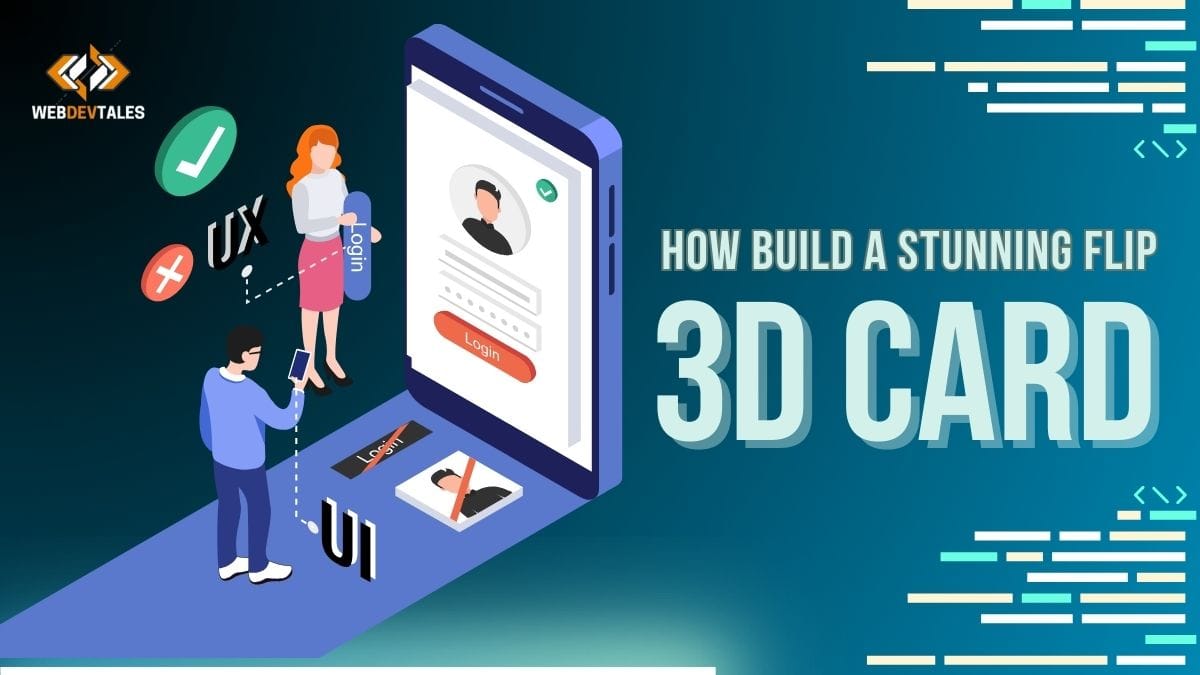
Make UI components interactive and visually appealing to make your website look much better with your improvements. No doubt, a 3D card is the most interesting UI element to have on your website. Follow along with us in this guide, where you create a beautiful 3D card UI element in just three easy steps. Let’s go!
Table of Contents
3 Steps to Create a 3D Card
Following are the three steps to create a stunning 3D Flip Card.
This will be the card we will be making.

1. Set Up the Basic UI Element Structure
The first step to building out the structure of your 3D card UI component is to create containers for both the front and back faces of your card in the HTML structure.
Basic HTML Structure: Let’s start by creating a container element with a card class. Inside, this will be our complete UI element. Inside this card div, add another div with the class inner card. The faces for our 3D card lie right here in this inner-card div.
<div class="card">
    <div class="inner-card">
        <div class="card-face front">
            <!-- Front content -->
        </div>
        <div class="card-face back">
            <!-- Back content -->
        </div>
    </div>
</div>
Front and Back Faces: Inside the parent element, Create two div elements that have classes of card face and back to represent the front and back faces of our 3D card UI component. A 3D model generally has an image on the front face and text or other information on the face.
2. Apply 3D and Flip Effects to the UI Element Using CSS
The second step is to breathe life into your 3D card, giving it depth and motion using CSS.
Basic Styles: Define the dimensions of your card using the clamp() function, making your design responsive. Add some perspective to the card container so the 3D effect can now be used, giving proper depth to our UI component.
.card {
    width: clamp(150px, 20vw, 190px);
    height: clamp(200px, 27vw, 254px);
    perspective: 1000px;
}
Inner Card Animation: The inner-card class is very important to get the flip animation of your UI element. Add transform style: preserve-3D to support 3D transformations and transitions: transform 0.8s ease-in-out to make a nice flipping effect. The card rotates 180° on hover, showing the back face.
.inner-card {
    position: relative;
    width: 100%;
    height: 100%;
    transform-style: preserve-3d;
    transition: transform 0.8s ease-in-out;
}

.card:hover .inner-card {
    transform: rotateY(180deg);
}
Styling the Faces of the UI Element: The styling for both. Card-face elements must be distinct to leave them in place exactly where they are positioned on the flip. Use backface-visibility: hidden to set only the front face to be visible until the card flips. Apply position: absolute to stack them perfectly, and add border-radius for a polished look.
.card-face {
    position: absolute;
    width: 100%;
    height: 100%;
    border-radius: 10px;
    backface-visibility: hidden;
    display: flex;
    justify-content: center;
    align-items: center;
    overflow: hidden;
}
Customize the front and back faces:
- We typically place an image on the front face. Use CSS to help ensure the image scales well across devices and keep your UI element sharp and responsive.
- Text can be added to the back face or any other content for that matter. This face will be in a 180-degree Y rotation to ensure its visibility when the card is flipping.
.front {
    background-color: #07182E;
}

.front img {
    width: 95%;
    height: 95%;
    border-radius: 3%;
}

.back {
    background-color: #0E3358;
    transform: rotateY(180deg);
    color: white;
    font-size: clamp(10px, 1.5vw, 14px);
    padding: 10px;
    text-align: center;
}
Before Setting .back Properties:

After Setting .back Properties:

Final Look Full Responsive:
3. Enhance and Optimize the UI Element for User Experience
Finish 3D card UI element optimization to enrich and enable maximal user experience, ensuring that the card is responsive and accessible, as well as beautiful in appearance.
Responsive Design: The UI part of the component will be made responsive with the help of Clamp from CSS. Ensure that the design is tested everywhere to make sure that everything is okay. Correct the font, padding, or any other thing as required that goes off.
Accessibility Considerations: Make your interface accessible, and make sure 3D card images have proper ‘alt’ attributes so that they read for screen readers. Proper contrast in the text of the back face is needed so that the content will be clear to the users, keeping in mind that someone will not perceive the flip effect.
Visual Enhancements:
- It is also possible to highlight your UI element by adding shadows or simple gradients to make the object look more three-dimensional.
- Come up with good images that reflect your content, and write good text when creating your UI element for it to be attractive and effective.
- Check out different timing models or easing functions, I am sure that you will find the best timing with its best result to show it to your audience.
Testing and Tweaking: Lastly, validate your 3D card UI element on different browsers to know if it is compatible with them. Try to move something a little bit to the left or right, or rotate it by a few degrees, or change font to sweat the look and feel of your UI element. It can also prove valuable for A/B testing in order to compare users’ reactions to different variations.
Conclusion:
Constructing an excellent-looking 3D card UI element is not a very difficult task and it goes a long way to making your website more engaging.
So if you follow these three simple rules – setting up the structure, applying the 3D effects with CSS and the final step is optimizing the element for the user — you will have a perfect UI element in your hands.
It can be used in applications that demonstrate products, advertise their features, or enhance the design of a webpage with an animation of a 3D card which increases the users’ interest and satisfaction greatly.
Complete Source Code:
Just Copy the given code and paste in your vs code or other software you are using:
USE YOUR OWN IMAGE AND REPLACE IT WITHIN THE GIVEN CODE.
<!DOCTYPE html>
<html lang="en">
<head>
    <meta charset="UTF-8">
    <meta name="viewport" content="width=device-width, initial-scale=1.0">
    <title>3D Flip Card</title>
    <style>
        body {
            margin: 0;
            display: flex;
            justify-content: center;
            align-items: center;
            min-height: 100vh;
            background-color: #f0f0f0;
        }

        .card {
            width: clamp(150px, 20vw, 190px);
            height: clamp(200px, 27vw, 254px);
            perspective: 1000px;
        }

        .inner-card {
            position: relative;
            width: 100%;
            height: 100%;
            transform-style: preserve-3d;
            transition: transform 0.8s ease-in-out;
        }

        .card:hover .inner-card {
            transform: rotateY(180deg);
        }

        .card-face {
            position: absolute;
            width: 100%;
            height: 100%;
            border-radius: 10px;
            backface-visibility: hidden;
            display: flex;
            justify-content: center;
            align-items: center;
            overflow: hidden;
        }

        .front {
            background-color: #07182E;
        }

        .front img {
            width: 95%;
            height: 95%;
            border-radius: 3%;
        }

        .back {
            background-color: #0E3358;
            transform: rotateY(180deg);
            color: white;
            font-size: clamp(10px, 1.5vw, 14px);
            padding: 10px;
            text-align: center;
        }
    </style>
</head>
<body>
    <div class="card">
        <div class="inner-card">
            <div class="card-face front">
                <img src="Your own image.jpg" alt="">
            </div>
            <div class="card-face back">
                <p>WebDevTales.com</p>
                <p>Front-End Development Tips & Tricks</p>
            </div>
        </div>
    </div>
</body>
</html>
A Bonus For You Guys:
A new animation was added with the Flip Animation. Enjoy.
Video Tutorial:
Complete Source Code:
<!DOCTYPE html>
<html lang="en">
<head>
    <meta charset="UTF-8">
    <meta name="viewport" content="width=device-width, initial-scale=1.0">
    <title>3D Flip Card with Moving Background</title>
    <style>
        body {
            margin: 0;
            display: flex;
            justify-content: center;
            align-items: center;
            min-height: 100vh;
            background-color: #f0f0f0;
        }

        .card {
            width: clamp(150px, 20vw, 190px);
            height: clamp(200px, 27vw, 254px);
            perspective: 1000px;
            position: relative;
            overflow: hidden;
            border-radius: 10px;
            display: flex;
            justify-content: center;
            align-items: center;
        }

        .card::before {
            content: '';
            position: absolute;
            width: 100%;
            height: 100%;
            background-image: linear-gradient(45deg, #ff6f61, #d5a6a7, #f4cccc, #c2c2f0);
            top: 0;
            left: 0;
            z-index: 0;
            animation: rotBGimg 5s linear infinite;
            transform-origin: center;
        }

        @keyframes rotBGimg {
            0% {
                transform: rotate(0deg);
            }
            100% {
                transform: rotate(360deg);
            }
        }

        .card::after {
            content: '';
            position: absolute;
            background: rgba(8, 8, 142, 0.5); /* Semi-transparent overlay */
            inset: 5%;
            border-radius: 10px;
            z-index: 1;
        }

        .inner-card {
            position: relative;
            width: 100%;
            height: 100%;
            transform-style: preserve-3d;
            transition: transform 0.8s ease-in-out;
            z-index: 2;
        }

        .card:hover .inner-card {
            transform: rotateY(180deg);
        }

        .card-face {
            position: absolute;
            width: 100%;
            height: 100%;
            border-radius: 10px;
            backface-visibility: hidden;
            display: flex;
            justify-content: center;
            align-items: center;
            overflow: hidden;
        }

        .front {
            background-color: #07182E;
        }

        .front img {
            width: 95%;
            height: 95%;
            border-radius: 3%;
        }

        .back {
            background-color: #0E3358;
            transform: rotateY(180deg);
            color: white;
            font-size: clamp(10px, 1.5vw, 14px);
            padding: 10px;
            text-align: center;
        }
    </style>
</head>
<body>
    <div class="card">
        <div class="inner-card">
            <div class="card-face front">
                <img src="add your image here.jpg" alt="">
            </div>
            <div class="card-face back">
                <p>WebDevTales.com</p>
                <p>Front-End Development Tips & Tricks</p>
            </div>
        </div>
    </div>
</body>
</html>
Note: Do you want to get more source codes or learn these UI Element creation processes? Visit Our UI Element Page.
Visit our Home Page to learn more about Web Development.
If you want to gain more knowledge on UI elements. Visit uizard.io.
FAQs:
Q. What is clamp() in CSS?
clamp() is a CSS function that sets up a responsive value, which shall be somewhere between specific specified minimum and maximum values. It takes three arguments: minimum value, preferred value, and maximum value. It means properties will then scale fluidly between the range set, and the design will adapt better to multiple screen sizes. For example, clamp (14px, 2vw, 24px) would set the font size somewhere between 14px and 24px, depending on the width of the viewport.
Q. What is a UI card?
A UI card is essentially a design element intended for use in web and app interfaces that projects the content into a very short form and is very visually structured. This will usually comprise a mix of text and images and interactive elements used in projecting products, features, or small pieces of information in quite an easily digestible way.
Q. What does UI stand for?
User interface, mostly called UI, is all that a user can see or interact with within a logic creation while navigating a website, an app, or software: buttons, menus, and icons.
Q. What are UI elements?
UI elements are simply the single components in a user interface, including buttons, sliders, icons, text fields, and every other single artifact. They are the building blocks for interactive experiences and engaging user interfaces on websites and applications.
Q. What is a card design?
A card design pattern is a UI pattern that represents content in terms of structure, normally a rectangular container with the same layout. Often, it will include an image, title, and short description for a visual arrangement of information. This is often used when dealing with visual items like product listings, user profiles, or even notifications.
Q. What is a card on the web?
What is a card in web design? A card, in web design, is a container of styled rectangles that contain content. A card comprises mostly images, text, and buttons for elements. Therefore, this bid is to present materials or any other forms of action in beautiful, well-structured manners. Most often, this will be applied to things like product previews, user profiles, news articles, and the like.