In today’s modern web design, the humble button is no longer just a clickable rectangle. It’s evolved into an interactive, animated element that can wow visitors and improve user experience. With 2024 just around the corner, the Aurora Extreme Button is set to be the next big thing in stylish button design. And guess what? You can easily create one using CSS!
This is a guide for you to create this futuristic, glowing button. Sleek gradients and hover animations on responsive design: you can’t get any cooler than that for websites looking to make an impression.
So, ready to build your own? Let’s dive into 2024 CSS Buttons: Aurora Extreme Button! 🚀
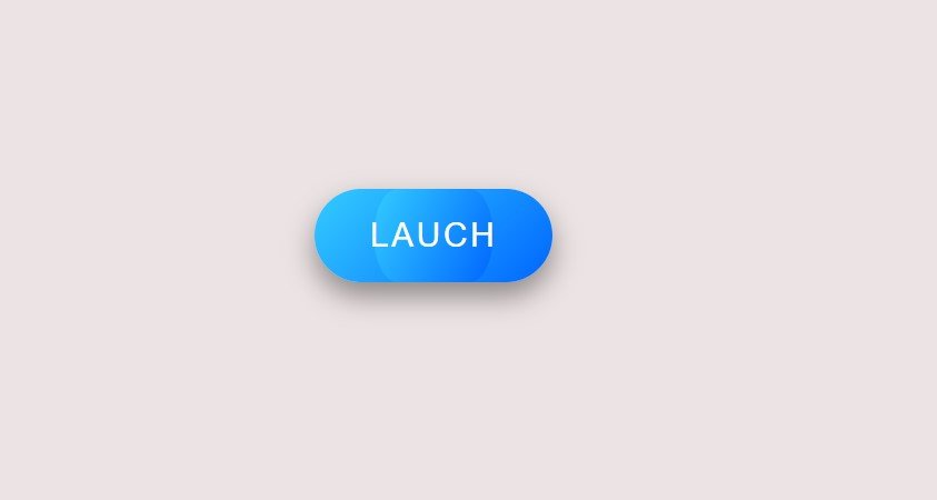
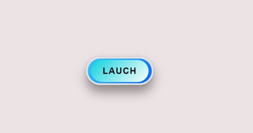
But Before that why don’t we take a look at buttons Final Design. So that your interest could be increased.
Normal Look:
Hover Effect:
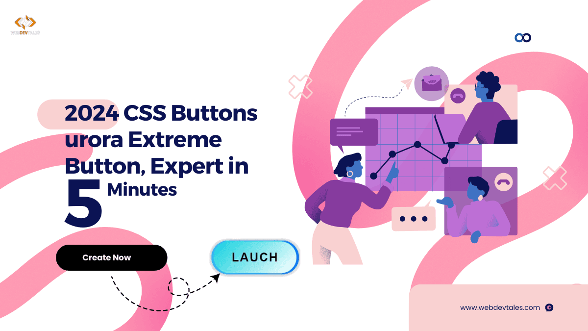
2024 CSS Button: Aurora Extreme Button, Expert in 5 Minutes
Table of Contents
Setting Up Your Environment
Before we begin, make sure you’ve set up a basic HTML and CSS environment. Don’t worry—this is super simple! Here’s what the basic structure will look like:
<div>
  <button class="btn">
    <span>Launch</span>
  </button>
</div>
Now, the magic happens in the CSS. We’ll be creating a sleek button with hover effects, gradient backgrounds, and cool animations.
Breaking Down the Code
Understanding the .btn Class
The .btn class is where we define the button’s core style. Here’s a snippet of the CSS for .btn:
.btn {
  padding: 20px 40px;
  font-size: 1.5rem;
  color: #fff;
  background: linear-gradient(135deg, #33ccff, #0066ff);
  border-radius: 50px;
  transition: all 0.4s ease;
}
Key Highlights:
- Gradient Background: The linear gradient makes the button look futuristic, blending two shades of blue.
- Rounded Corners: A
border-radiusof 50px gives the button that smooth, pill-shaped look. - Transition: This ensures smooth animation when the button is hovered over.
Hover Effects and Transformations
Hover effects add life to any button, and this Aurora Extreme Button is no exception. Here’s the magic code behind the hover effect:
.btn:hover {
  box-shadow: 0 20px 30px rgba(0, 0, 0, 0.5);
  transform: translateY(-5px);
}
Notice how we increase the shadow on hover, making the button look like it’s floating? This is paired with a slight upward movement (translateY), which gives it depth.
The Role of ::before and ::after Pseudo-Elements
These pseudo-elements are responsible for the button’s flashy futuristic glow. Here’s what the ::before pseudo-element does:
.btn:before {
  content: '';
  width: 100%;
  height: 100%;
  background: linear-gradient(135deg, #33ccff, #0066ff);
  transform: scaleX(0.5);
  transition: transform 0.4s ease;
}
When you hover over the button, it scales from 0.5 to full size, creating a cool expanding effect. The ::after element adds even more depth by overlaying a light gradient.
Deep Dive: Hover Animation Effects
Animations make buttons truly interactive. With the Aurora Extreme Button, we’ve added glow and pulse effects to give it that sci-fi touch:
@keyframes glow {
  0% {
    box-shadow: 0 0 10px rgba(0, 0, 0, 0.5);
  }
  100% {
    box-shadow: 0 0 20px rgba(0, 0, 0, 0.5);
  }
}
This subtle glow animation repeats, making the button appear alive, like something out of a futuristic user interface!
Enhancing Interactivity
To enhance interactivity, we’ve added a deeper shadow effect and a bold color shift when the button is pressed. This gives feedback to the user, making the button feel tactile:
.btn:active {
  box-shadow: 0 10px 20px rgba(0, 0, 0, 0.5);
}
Futuristic Glow Effects
By using @keyframes glow and pulse, we create dynamic movements. The glow intensifies while the pulse subtly expands the button:
@keyframes pulse {
  0% {
    transform: scale(0.9);
  }
  100% {
    transform: scale(1);
  }
}
Creating a Responsive Button
Now that we’ve made an awesome button, let’s make sure it works on all devices. We can use viewport units (vw and vh) to ensure that the button looks great on mobile, tablet, and desktop.
.btn {
  padding: 2vw 4vw;
}
Exploring Further Customization
Want to make the Aurora Extreme Button uniquely yours? You can easily adjust colors, font size, or even the hover effects. Try experimenting with different gradients or adding more animations to make it stand out even more!
2024 CSS Button Series: Complete Source Code
<!DOCTYPE html>
<html lang="en">
<head>
    <meta charset="UTF-8">
    <meta name="viewport" content="width=device-width, initial-scale=1.0">
    <meta name="description" content="Learn how to create the 2024 Aurora Extreme Button with CSS - A stylish, futuristic, animated button perfect for modern web design.">
    <meta name="keywords" content="CSS button animation, futuristic button CSS, animated button hover effect, gradient button design, CSS3 button styling, button hover transitions, interactive web button, responsive button design">
    <meta name="author" content="Your Name">
    <title>2024 CSS Button: Aurora Extreme Button</title>
    <style>
        body {
            display: flex;
            justify-content: center;
            align-items: center;
            height: 100vh;
            margin: 0;
            background: #ece4e4;
        }

        .btn {
            position: relative;
            padding: 20px 40px;
            font-size: 1.5rem;
            color: #fff;
            background: linear-gradient(135deg, #33ccff, #0066ff);
            border: none;
            border-radius: 50px;
            cursor: pointer;
            text-transform: uppercase;
            letter-spacing: 2px;
            box-shadow: 0 10px 20px rgba(0, 0, 0, 0.3);
            transition: all 0.4s ease;
        }

        .btn:before {
            content: '';
            position: absolute;
            top: 0;
            left: 0;
            width: 100%;
            height: 100%;
            background: linear-gradient(135deg, #33ccff, #0066ff);
            border-radius: 50px;
            transform: scaleX(0.5);
            transition: transform 0.4s ease;
        }

        .btn:hover:before {
            transform: scaleX(1);
        }

        .btn:after {
            content: '';
            position: absolute;
            top: 0;
            left: 0;
            width: 100%;
            height: 100%;
            background: linear-gradient(135deg, #10d1db, #fff);
            border-radius: 50px;
            opacity: 0;
            transition: opacity 0.4s ease;
        }

        .btn:hover:after {
            opacity: 1;
        }

        .btn span {
            position: relative;
            z-index: 1;
            transform: translateY(0);
            transition: transform 0.4s ease;
        }

        .btn:hover span {
            transform: translateY(-5px);
        }

        .btn:hover {
            box-shadow: 0 20px 30px rgba(0, 0, 0, 0.5);
            transform: translateY(-5px);
            color: black;
            font-weight: 600;
            border: 5px solid rgb(255, 255, 255);
        }

        .btn:active {
            box-shadow: 0 10px 20px rgba(0, 0, 0, 0.5);
            transform: translateY(0);
        }

        /* Additional futuristic effects */
        .btn:hover:before {
            animation: glow 1s infinite;
        }

        @keyframes glow {
            0% {
                box-shadow: 0 0 10px rgba(0, 0, 0, 0.5);
            }
            100% {
                box-shadow: 0 0 20px rgba(0, 0, 0, 0.5);
            }
        }

        .btn:hover:after {
            animation: pulse 1s infinite;
        }

        @keyframes pulse {
            0% {
                transform: scale(0.9);
            }
            100% {
                transform: scale(1);
            }
        }
    </style>
</head>
<body>

    <div>
        <button class="btn">
            <span>Launch</span>
        </button>
    </div>

</body>
</html>
Video Tutorial:
I have used a different approach to get the same result in this tutorial. The main thing is that you can create similar buttons with different approaches.
Also Read:
- 2024 CSS Buttons: Crafting a Stunning Aurora Glow Button in Just 5 Easy Steps
- Create an Epic CSS Sticky Sidebar: 9 Proven Steps
- Mesmerizing CSS Cool Loading Animations: 3 Designs to Love
- 3 Creative CSS Loader Designs That Will Amaze Your Users
- How to Build a Stunning 3D Card UI Element in 3 Simple Steps
- 5 Simple Steps to Create a Stunning UI Element Card
Conclusion
The Aurora Extreme Button is a sleek, modern, and interactive CSS button that’s perfect for 2024’s design trends. Its futuristic look, combined with smooth hover and glow animations, makes it ideal for any modern web project. Try it out on your website and watch as users are drawn to its engaging design!
FAQs
- How Can I Change the Button Colors?
Modify thelinear-gradientvalues in the CSS to experiment with different color schemes. - Is This Button Compatible with Older Browsers?
Most modern browsers support the animations, but older versions of Internet Explorer might need a fallback design. - Can I Use This Button in WordPress?
Absolutely! You can embed the HTML and CSS directly in your WordPress theme or using a custom HTML block. - How Do I Make the Button Bigger or Smaller?
Adjust the padding and font-size properties within the.btnclass to scale the button. - What Are the Best Use Cases for This Button?
This button is perfect for call-to-action buttons on landing pages, apps, or anywhere you want to grab user attention!