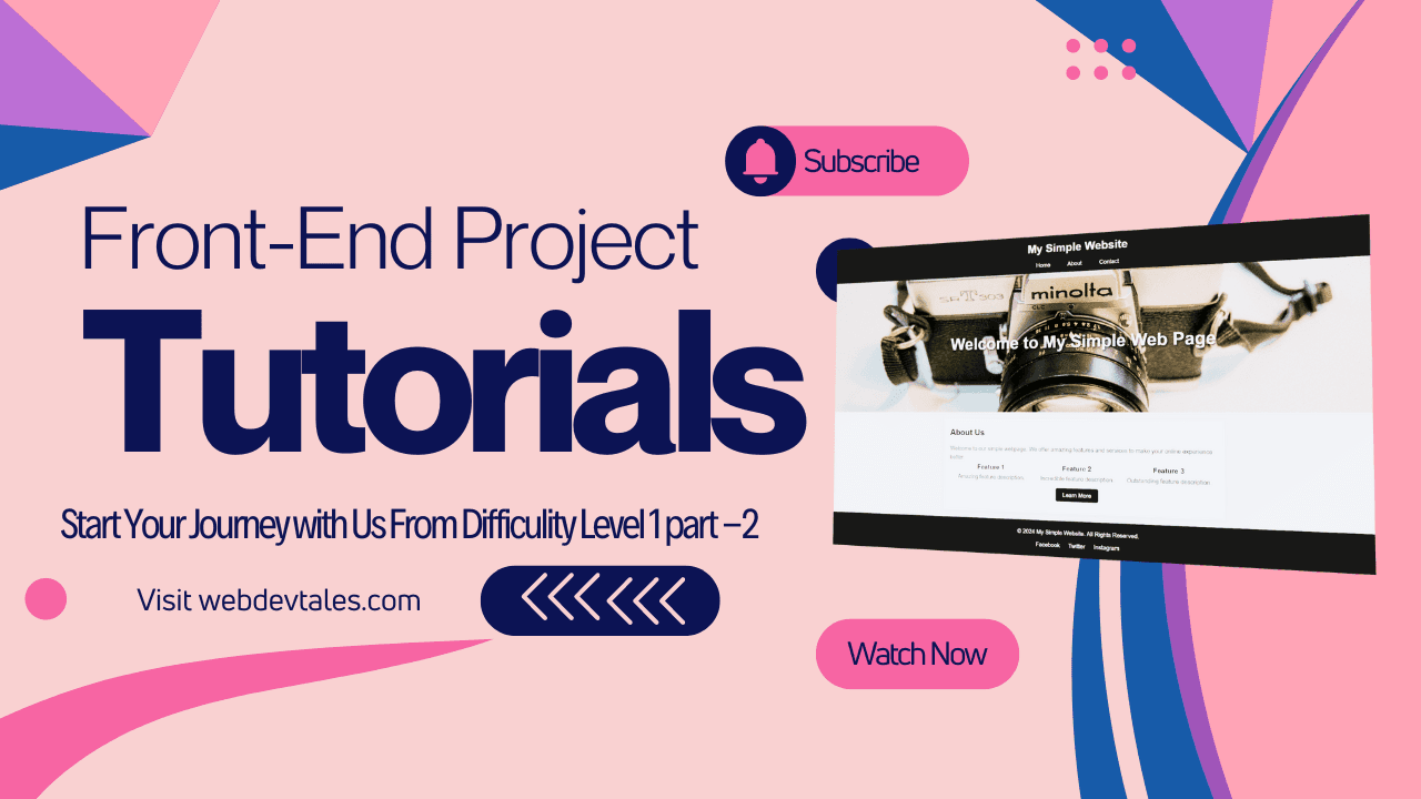
Welcome back to our Front-End Projects Tutorial series! In Part 1, we drilled deep into HTML and how to structure a simple webpage. With that groundwork laid, let’s continue to move forward with the essential tool for all web developers – CSS. 🎨
You’ll see which CSS styles were applied to transform that basic structure into an appealing web page in this tutorial.
Let’s zoom in a bit more on how CSS transforms a blank HTML document into a visually interesting site by applying styles to elements such as the header, navigation bar, hero section, and many other features. Are you ready to add some life to your webpage? Let’s get started!
Why CSS is Important for Web Design
So, why is CSS such a big deal? 🤔 In simple terms, HTML is the skeleton of your webpage, but CSS is the skin, clothing, and makeup that makes it look presentable. CSS (Cascading Style Sheets) lets us control the layout, colors, typography, and even the interaction effects of our web page.
Everything would look bare-bones and boring if it were not for CSS. By using CSS, we can provide a beautiful user experience and ensure consistency across different devices.
Table of Contents of Front-End Projects Tutorial (Part 2)
Basic CSS Setup
Before we start styling individual elements, let’s set up some basic CSS rules we can apply throughout the entire webpage.
Universal Reset
The first thing you’ll notice in the code is the universal selector *, which applies a reset:
* {
  margin: 0;
  padding: 0;
  box-sizing: border-box;
}
This small block of code will set all elements in the HTML to no margins or padding. That way, there will not be any inconsistencies between browsers about what is to be determined by the specification and what each browser can do.
You could think of it like clearing the slate so you would have total control over how things may look.
Setting up the Body
Next, we style the body to set the foundation for the entire page:
body {
  font-family: Arial, sans-serif;
  line-height: 1.6;
  background-color: #f4f4f4;
  color: #333;
}
Here we define the font-family so that by default all the text will be in a clean, readable style. We assign a line-height to ensure that the text is well spaced out for readability and give a subtle gray (#f4f4f4) to the background to make the page more visually appealing than a stark white canvas.
Styling the Header
Now let’s focus on the header. A header typically contains the title or logo of your website, and sometimes a navigation bar.
header {
  background: #333;
  color: #fff;
  padding: 10px 0;
  text-align: center;
}
- Background Colour: We’ve filled the header with an enriched dark
background-color(#333) in contrast to the whitetext color (#fff). - Text Alignment: The
text alignmentis done in thecenterso that the title is placed perfectly, thus giving it a clean and professional look.
Text Styling for Header
header h1 {
  margin-bottom: 10px;
}
By adding a margin-bottom to the header’s <h1>, we ensure there’s some space between the title and other elements, making everything feel less cramped.
Designing the Navigation Bar
The navigation bar is your visitors’ guide, so let’s make sure it’s both functional and good-looking! 💻
nav ul {
  list-style: none;
  display: flex;
  justify-content: center;
}
- Flexbox Layout: Flexbox is a fantastic way to lay out elements horizontally. Here, we’re using
display: flexto align our list items side-by-side, whilejustify-content: centerensures they are centered.
Hover Effects for Links
To make the navigation interactive, we add a hover effect:
nav ul li a:hover {
  background-color: #555;
  border-radius: 5px;
}
- This provides feedback to the user when they hover over the links by changing the background color, and the
border-radiusgives the links rounded edges, making them look modern.
Creating a Stunning Hero Section
Your hero section is the first thing visitors see, so it needs to stand out! ✨
.hero {
  background: url(cam1.jpg) no-repeat center center/cover;
  height: 400px;
  color: #fff;
  display: flex;
  justify-content: center;
  align-items: center;
  text-align: center;
}
- Background Image: We use background: url(cam1.jpg) so that we can set an image as our background, and center/cover ensures the full width of the section so that the section is covered without distortion of an image.
- Flexbox for Centre: Flexbox makes it easy to center elements inside the hero section, ensuring your welcome text is always vertically and horizontally centered.
Text Styling in the Hero Section
To make the hero section text pop, we apply this CSS:
.hero h2 {
  font-size: 3em;
  text-shadow: 2px 2px 5px rgba(0, 0, 0, 0.7);
}
The large font size grabs attention and the text-shadow adds depth, making the text easier to read against a potentially busy background image.
Main Content Styling
Once we’re past the hero section, the main content needs to be well-structured.
.main-content {
  max-width: 800px;
  margin: 20px auto;
  padding: 20px;
  background: #fff;
  box-shadow: 0 2px 8px rgba(0, 0, 0, 0.1);
}
- Max Width and Centering: We limit the width to 800px for better readability on larger screens, and center it using
margin: 20px auto. - Box Shadow: The subtle shadow around the content container makes it stand out against the background, giving the design a polished, professional look.
Styling Features Section
The features section uses flexbox again to ensure all three feature boxes are aligned neatly:
.features {
  display: flex;
  justify-content: space-around;
  margin-bottom: 20px;
}
This layout ensures the feature descriptions are evenly distributed.
Adding Call-to-Action Buttons
You want your visitors to take action, right? 👇 Let’s make that button pop:
.cta a {
  padding: 10px 20px;
  background-color: #333;
  color: #fff;
  text-decoration: none;
  border-radius: 5px;
}
This gives the button a bold, clickable look, and border-radius: 5px softens the edges to make it more inviting.
Hover Effects for Buttons
.cta a:hover {
  background-color: #555;
}
This simple hover effect provides subtle feedback when users interact with the button.
Footer Styling
Finally, let’s finish with a cohesive footer design:
footer {
  background: #333;
  color: #fff;
  text-align: center;
  padding: 20px 0;
}
This mirrors the header design, providing consistency across the page. We also include social media links with styling to ensure they are easy to interact with.
footer .socials a {
  margin: 0 10px;
  color: #fff;
  text-decoration: none;
}
This styling ensures the social media links are spaced evenly and maintain the site’s color theme.
Optimizing for Mobile
It’s critical to ensure your site is responsive. Use media queries to adjust for smaller screens:
@media (max-width: 768px) {
  .features {
    flex-direction: column;
  }
}
This ensures the features section stacks vertically on mobile devices for better readability.
Read the first part of “Front-End Projects Tutorial: Create a Simple Yet Eye-Catching Web Page!(Part 1)”
Conclusion
Well, if you take some dull HTML document and transform it into something beautiful and user-friendly, then CSS is your best buddy. In this part of the Front-End Projects Tutorial, we have learned how this basic CSS improved a simple webpage to be interactive, responsive, and visually appealing.
From styling headers and navigation bars to creating stunning hero sections and well-organized content, CSS does it all. Now, it’s your turn to play with the styles and make your webpage unique! 🎉
Video Tutorial:
Source Code of “Front-End Projects Tutorial: Create a Simple Yet Eye-Catching Web Page! (Part 2)“
<!DOCTYPE html>
<html lang="en">
<head>
<meta charset="UTF-8">
<meta name="viewport" content="width=device-width, initial-scale=1.0">
<title>Simple Web Page</title>
<style>
/* Basic Reset */
* {
margin: 0;
padding: 0;
box-sizing: border-box;
}
/* Body Styling */
body {
font-family: Arial, sans-serif;
line-height: 1.6;
background-color: #f4f4f4;
color: #333;
}
/* Header Styling */
header {
background: #333;
color: #fff;
padding: 10px 0;
text-align: center;
}
header h1 {
margin-bottom: 10px;
}
/* Navigation Menu */
nav ul {
list-style: none;
display: flex;
justify-content: center;
}
nav ul li {
margin: 0 15px;
}
nav ul li a {
color: #fff;
text-decoration: none;
padding: 5px 10px;
}
nav ul li a:hover {
background-color: #555;
border-radius: 5px;
}
/* Hero Section */
.hero {
background: url(cam1.jpg) no-repeat center center/cover;
height: 400px;
color: #fff;
display: flex;
justify-content: center;
align-items: center;
text-align: center;
}
.hero h2 {
font-size: 3em;
text-shadow: 2px 2px 5px rgba(0, 0, 0, 0.7);
}
/* Main Content */
.main-content {
max-width: 800px;
margin: 20px auto;
padding: 20px;
background: #fff;
box-shadow: 0 2px 8px rgba(0, 0, 0, 0.1);
}
.main-content h2 {
margin-bottom: 15px;
}
.features {
display: flex;
justify-content: space-around;
margin-bottom: 20px;
}
.feature {
width: 30%;
text-align: center;
}
.cta {
text-align: center;
margin: 20px 0;
}
.cta a {
padding: 10px 20px;
background-color: #333;
color: #fff;
text-decoration: none;
border-radius: 5px;
}
.cta a:hover {
background-color: #555;
}
/* Footer Styling */
footer {
background: #333;
color: #fff;
text-align: center;
padding: 20px 0;
margin-top: 20px;
}
footer p {
margin-bottom: 10px;
}
footer .socials {
margin-top: 10px;
}
footer .socials a {
margin: 0 10px;
color: #fff;
text-decoration: none;
}
</style>
</head>
<body>
<!-- Header Section -->
<header>
<h1>My Simple Website</h1>
<nav>
<ul>
<li><a href="#">Home</a></li>
<li><a href="#">About</a></li>
<li><a href="#">Contact</a></li>
</ul>
</nav>
</header>
<!-- Hero Section -->
<section class="hero">
<h2>Welcome to My Simple Web Page</h2>
</section>
<!-- Main Content -->
<section class="main-content">
<h2>About Us</h2>
<p>Welcome to our simple webpage. We offer amazing features and services to make your online experience better.</p>
<!-- Features Section -->
<div class="features">
<div class="feature">
<h3>Feature 1</h3>
<p>Amazing feature description.</p>
</div>
<div class="feature">
<h3>Feature 2</h3>
<p>Incredible feature description.</p>
</div>
<div class="feature">
<h3>Feature 3</h3>
<p>Outstanding feature description.</p>
</div>
</div>
<!-- Call to Action -->
<div class="cta">
<a href="#">Learn More</a>
</div>
</section>
<!-- Footer Section -->
<footer>
<p>© 2024 My Simple Website. All Rights Reserved.</p>
<div class="socials">
<a href="#">Facebook</a>
<a href="#">Twitter</a>
<a href="#">Instagram</a>
</div>
</footer>
</body>
</html>
Output:

Concepts We Have Learned:
- Universal Reset: Removing default margins and padding from all elements.
- Body Styling: Setting font, background color, and text color for the entire page.
- Header Styling: Customizing background, text color, and header alignment.
- Navigation Bar: Using Flexbox to align menu items horizontally.
- Hover Effects: Changing link appearance when hovered over.
- Hero Section: Adding a background image and centering text with Flexbox.
- Text Shadow: Adding shadow to text for a stylish effect.
- Main Content Styling: Setting max-width, centering content, and adding box shadows.
- Features Section: Using Flexbox to align feature boxes side by side.
- Call-to-Action Button: Styling buttons with padding, background color, and rounded corners.
- Button Hover Effect: Changing button color when hovered over.
- Footer Styling: Matching footer design with header using similar colors and alignment.
- Social Media Links: Styling social links in the footer with consistent spacing and color.
- Responsive Design: Using media queries to adjust the layout on smaller screens.
- Flexbox Layout: Simplifying alignment and distribution of elements across the page.
I hope this has helped you in creating your first web page. Even though we haven’t explored CSS deeply, which we will do in our upcoming Front-End Projects Tutorials.
FAQs
What is CSS and why is it important?
CSS is the language used to style and layout HTML documents. It enhances the visual presentation of web pages, making them more user-friendly.
What is a universal reset in CSS?
A universal reset removes default browser padding and margin to ensure consistent styling across all elements.
How does Flexbox help in layout design?
Flexbox simplifies layout by providing a flexible way to arrange elements in rows or columns and align them easily.
What are hover effects in CSS?
Hover effects trigger a visual change (like color or size) when the user places the cursor over a particular element, improving interactivity.
Why is responsive design important?
Responsive design ensures your website looks good on all devices, from large desktops to small smartphones.


