

When it comes to web design, the choice of unit for measurements will make or break your project’s responsiveness and scalability. With so many options available—including pixels, percentages, ems, and viewport units—it’s no wonder why REM stands out as a difference-maker. Why? Well, it’s because REM combines the precision of absolute units with the flexibility of relative units, making it the perfect choice for modern web development.
Let’s dive into what REM is, why REM is so useful, and how it outshines other units with practical examples.
What is REM?
REM stands for “Root EM.” It’s a relative unit in CSS referring to the font size of the root element (mostly <html>). Most browsers set the root font size by default to 16 pixels unless you specify otherwise. So, if you use 1rem, it means 16px by default, and 2rem equals 32px.
The advantages of REM are that it does not rely on its parent element, just like “em”. Instead, it always resets to the root font size to maintain a consistent scaling in your design.
Why REM is Better than Pixels (px)?
Pixels are straightforward—1px equals one pixel on the screen. While this might sound like the easiest option, it comes with some significant drawbacks:
- Lack of Scalability:
Pixels are absolute, so they don’t adjust when the user changes their browser’s default font size or zooms in/out.- Example: If a user with visual impairments increases their browser’s font size to improve readability, a layout defined in pixels remains fixed, making the text or spacing hard to read.
- Responsiveness Issues:
- Modern devices come in various resolutions and sizes. Pixels can struggle to adapt seamlessly across these variations.
REM Solution: With REM, you define measurements relative to the root font size. If a user changes the default font size in their browser settings, the entire design scales accordingly. This makes your layout more accessible and adaptable.
REM vs. EM: Consistency Wins
While both REM and EM are relative units, they behave differently.
EMis relative to the font size of its parent element.REMis relative to the font size of the root element.
Example Problem with EM: Let’s say you nest multiple elements with font-size defined in EM:
body {
  font-size: 16px;
}

.container {
  font-size: 1.5em; /* 24px (16px * 1.5) */
}

.child {
  font-size: 2em; /* 48px (24px * 2) */
}

In this case, the .child element’s font size becomes 48px instead of the expected 32px because EM multiplies font sizes based on its parent. This cascading behavior can lead to unexpected results.
REM Solution: With REM, you avoid this cascading problem entirely:
body {
  font-size: 16px;
}

.container {
  font-size: 1.5rem; /* 24px */
}

.child {
  font-size: 2rem; /* 32px */
}
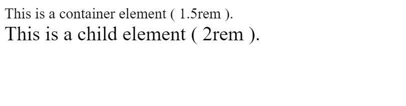
Now, the .child font size is always 32px, regardless of nesting.
How REM Excels in Responsive Design
REM is incredibly handy for creating fluid, responsive layouts because you can scale everything with a single adjustment to the root font size.
Example: Building a Responsive Layout
Imagine you’re designing a website where you want the font size and spacing to adjust automatically for different screen sizes.
Using REM, you can achieve this by setting a font-size on the <html> tag based on the viewport width:
/* Responsive Root Font Size */
html {
  font-size: 100%; /* Default to 16px */
}

@media (max-width: 768px) {
  html {
    font-size: 90%; /* Scale down to 14.4px */
}

@media (max-width: 480px) {
  html {
    font-size: 80%; /* Scale down to 12.8px */
}
}
Now, all measurements in REM adjust automatically when the root font size changes. For example:
h1 {
  font-size: 2rem; /* Scales dynamically */
}

p {
  margin-bottom: 1.5rem; /* Also scales dynamically */
}
This approach ensures your design stays proportional across devices, from large desktops to small mobile screens.
REM in Action: Practical Use Cases
1. Typography
Typography is one of the most common areas where REM shines. For example:
html {
  font-size: 16px;
}

h1 {
  font-size: 2rem; /* 32px */
}

p {
  font-size: 1rem; /* 16px */
}
If you decide to increase the base font size for readability (e.g., 18px), all text sizes scale proportionally without changing individual values.
2. Spacing and Padding
REM isn’t limited to font sizes; you can also use it for spacing, padding, and margins:
button {
  padding: 0.5rem 1rem; /* Scales with root font size */
  margin: 1rem;
}
This consistency ensures that spacing adapts along with your typography, keeping the design balanced.
3. Accessibility
By using REM, you empower users to customize their viewing experience. If a user prefers a larger font size for better readability, your design will respect their preference.
For example:
- A user sets their browser font size to 20px instead of the default 16px.
- Your design, defined with REM, automatically scales up all font sizes, spacing, and layout proportions.
Challenges of REM (and How to Overcome Them)
While REM is incredibly versatile, there are a couple of challenges:
- Initial Setup: Setting up the root font size and calculating REM values might seem tricky initially, but a simple rule like “1rem = 16px” can simplify the process.
- Browser Defaults: Users can change their browser’s default font size, which might affect your design. However, this is rare, and the accessibility benefits outweigh this potential issue.
Read More About Web Development.....
Check this post on medium.
Conclusion
When building modern websites, choosing REM over pixels or EM can significantly enhance scalability, responsiveness, and user accessibility. Its ability to maintain consistency while adapting to user preferences and device sizes makes it the ultimate unit for web design.
By incorporating REM into your projects, you future-proof your designs, ensuring they look great on any screen size and for all users. Whether it’s typography, spacing, or full layouts, REM provides the flexibility and reliability that modern web design demands.
FAQs:
- EM depends on the font size of its parent element, which can lead to compounding issues in nested elements.
- REM is always relative to the root font size, avoiding cascading inconsistencies.
<div>

/* Using EM */
.parent {
  font-size: 2em; /* 32px if base is 16px */
}

.child {
  font-size: 2em; /* 64px because it multiplies parent's size */
}

/* Using REM */
.parent {
  font-size: 2rem; /* 32px */
}

.child {
  font-size: 2rem; /* Always 32px, no compounding */
}


</div>- Scales with the root font size, making it accessible for users who adjust their settings.
- Is more flexible for responsive designs, especially when combined with media queries.
If a user increases their browser’s default font size from 16px to 20px, a layout using REM will scale automatically, while a pixel-based layout will remain fixed.
<div>

button {
  padding: 1rem; /* Proportional to root font size */
}


</div>- Accessibility: Adapts to user preferences for font sizes.
- Consistency: Avoids cascading issues common with EM units.
- Scalability: Works perfectly in responsive designs.
- Simplified Maintenance: Changing one root font size updates the entire design proportionally.
- Readability: Keeps the layout proportional, ensuring a balanced visual experience across devices.
- Responsive Design: REM units allow designers to create flexible layouts that adjust to different screen sizes.
- Scalability: REM units make it easy to create scalable designs that adjust to different screen sizes and font sizes.
- Accessibility: REM units provide a consistent and flexible way to manage font sizes, making it easier for users with visual impairments to read and understand content.
- Readability: REM units make it easier to create visually balanced designs that are easy to read and understand.
- Simplified Maintenance: REM units make it easier to maintain and update designs, as changing the root font size updates the entire design proportionally.
- Proportional Layouts: REM units allow designers to create proportional layouts that adjust to different font sizes.
- Consistency: REM units ensure that the layout remains consistent across different devices and screen sizes.
- Mobile Responsiveness: REM units make it easier to create responsive designs that adapt to different screen sizes and orientations.
- Customization: REM units make it easier for designers to create customizable designs that can be adjusted to different font sizes.