
Video Element HTML & IMG Introduction:
Media elements, like videos and images are big determinants of a captivating website. Knowing how to effectively use Video Element HTML and IMG in your web design can greatly enhance the user experience, making your website not only informative but also interactive and beautiful.
In this article, we will take you through everything that you need to know regarding video element HTML and IMG—from basic usage to advanced methods. Whether you’re a total newbie trying to up your game or a professional seeking to boost your worth in the field, these eight crucial tactics will have you mastering these elements in no time.
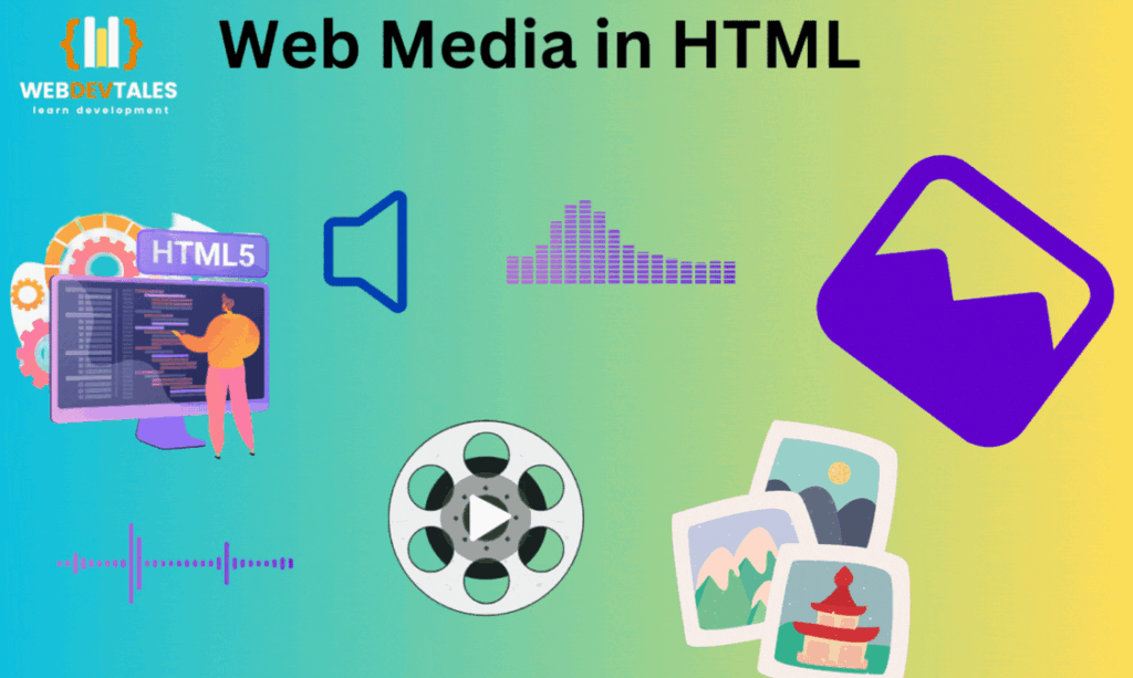
Table of Contents
1. Understanding HTML Video Element:
Basic Syntax and Structure:
Video Element HTML is quite simple, yet a strong element for embedding video content directly into your web pages. The basic syntax looks as follows:
<video src="video.mp4" controls>
    Your browser does not support the video tag.
</video>
Now, let’s break it down into the main components:
<video>tag: This is the container that holds your video.srcattribute: This specifies the path to the video file you want to play.controlsattribute: This adds playback controls (like play, pause, and volume) to your video.
Example: Let’s say you have a video file named promo.mp4. You can inline it on your webpage like this:
<video src="promo.mp4" controls>
    Your browser does not support the video tag.
</video>
The video player will be inlined directly inside your webpage and has all the controls users might need to play your content.
Key Attributes: “controls”, “autoplay”, “loop”, and “muted”
The Video Element HTML comes with a few attributes that help you modify the video behavior as needed, including:
- Controls: This displays video controls, for example, play, pause, and volume.
- Autoplay: Play the video as soon as it loads. Use it with caution, as playing videos on autoplay can be really intrusive.
- Loop: The video replays right from the beginning once it has reached the end.
- Muted: Play the video with its sound off. This could come in handy if you want the videos to autoplay without disturbing the user.
Example: You want to have a video play, and it must loop, and it also has to run without sound.
<video src="promo.mp4" autoplay loop muted></video>
This setup will make the video play as soon as the page has loaded, loop it continuously, and also play it without sound.
Adding Video Sources with <source> :
The src attribute alone is easy, but what if you want to have the video work on any browser? That is where the element comes in. It provides a way for you to specify different formats of the same video so that it will play on any device.
<video controls>
    <source src="video.mp4" type="video/mp4">
    <source src="video.webm" type="video/webm">
    Your browser does not support the video tag.
</video>
Here’s how it works:
- It checks the first
<source>and then tries to play it.
- If the format doesn’t work then it moves on to the next
<source>.
That way, you can provide fallback formats like WebM in addition to MP4 and have a far greater chance that your video will play no matter what browser your user is on.
Using Fallback Content:
Some browsers may not support this particular element at all. In these cases, the best way forward is to include fallback content. This can be done by offering a download link for the video or even a message that explains the situation.
<video controls>
    <source src="video.mp4" type="video/mp4">
    <source src="video.webm" type="video/webm">
    Your browser does not support the video tag. <a href="video.mp4">Download the video</a> instead.
</video>
The point is, even if a video fails to play in this case, the user will have an alternative way to access it.
Example: Embedding a Simple Video:
Now, let’s put it all together with a very basic example. Say you have a video that you have to embed on your homepage. You want that video to be playing automatically, loop, and have users in a position to control the playing of that video.
<video autoplay loop controls muted>
    <source src="intro.mp4" type="video/mp4">
    <source src="intro.webm" type="video/webm">
    Your browser does not support the video tag. <a href="intro.mp4">Download the video</a> instead.
</video>
This will show the video player auto-playing, looping continuously, and giving the user the possibility to control it. If the browser doesn’t support the video, then there’s a download link.
2. Advanced Techniques for Video HTML Element
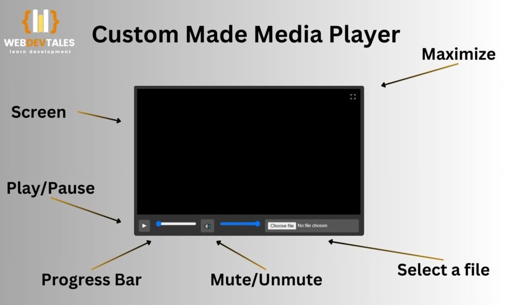
First I will show you a custom video player, this custom player has the following functionality:
- Play/Pause Button: A button to play or pause the video.
- Sound Control Button: This button controls your video’s voice.
- Open File Button: This will allow you to select the file from your system to play.
- Minimize and Maximize Button: A button that lets you minimize and maximize the screen.
- Progress Bar: A progress bar showing the progress of the video and the same for the sound button.
Customizing Video Controls with CSS
Even though the video controls that come up by default work great, they still might not suit or fit with the design of your website. Those can, however, be customized with the help of CSS and JavaScript.
For example, to remove the default controls and add custom buttons for play/pause:
<video id="myVideo" muted>
    <source src="video.mp4" type="video/mp4">
    Your browser does not support the video tag.
</video>
<button onclick="playPause()">Play/Pause</button>

<script>
function playPause() {
    var video = document.getElementById("myVideo");
    if (video.paused) {
        video.play();
    } else {
        video.pause();
    }
}
</script>
In this example:
- The video is embedded without the controls attribute.
- The button is added to play or pause the video with JavaScript.
You can go a bit further by styling the button with CSS so it fits your website’s theme.
Handling Multiple Video Formats for Cross-Browser Compatibility
Different browsers support different video formats. In a bid to ensure your video plays on browsers as well, you should include multiple video sources, as follows: Some of the examples are as follows:
<video controls>
    <source src="video.mp4" type="video/mp4">
    <source src="video.webm" type="video/webm">
    <source src="video.ogv" type="video/ogg">
    Your browser does not support the video tag.
</video>
By serving your video in more than one format, you ensure that your video will play properly no matter what browser is being used.
Adding Subtitles and Captions with <track>:
It is always necessary to make your video accommodate everyone. <track> provides a way of including subtitles, chapters, and other text tracks in your video.
<video controls>
    <source src="video.mp4" type="video/mp4">
    <track src="subtitles_en.vtt" kind="subtitles" srclang="en" label="English">
    Your browser does not support the video tag.
</video>
Here’s what’s happening:
<track>: attaches a text track to your video.- src: specifies the file from which the subtitles or captions file is derived.
- kind: The type of text track (subtitles, captions, etc.).
- srclang: The language of the track text data.
- label: Provides a user-visible label to display the text track subtitles and captions that can be turned on or off on demand.
Subtitles and captions improve accessibility for users who are deaf or hard of hearing and also enhance the viewing experience for users who may not speak the language of the video.
Responsive Video Embedding Techniques
In our multi-device world, it now matters more than ever to ensure our video content looks awesome on any size screen. Here’s a simple—although not very clean—technique to make your videos responsive using CSS:
.video-container {
    position: relative;
    padding-bottom: 56.25%; /* 16:9 aspect ratio */
    height: 0;
    overflow: hidden;
}

.video-container video {
    position: absolute;
    top: 0;
    left: 0;
    width: 100%;
    height: 100%;
}
<div class="video-container">
    <video controls>
        <source src="video.mp4" type="video/mp4">
    </video>
</div>
This code:
- Wraps the video in a div that is padded on the bottom. @ the height of a percentage-based element (e.g., 16:9)
- The video will scale proportionately to the width of the container.
Diagram Highlighting a Customer Media Player:
Example: Creating a Custom Video Player
Let’s Experiment with the things we have learned and build a custom video player.
<div class="video-container">
    <video id="customVideo" muted>
        <source src="custom.mp4" type="video/mp4">
    </video>
    <div class="controls">
        <button onclick="playPause()">Play/Pause</button>
        <button onclick="muteUnmute()">Mute/Unmute</button>
    </div>
</div>

<script>
function playPause() {
    var video = document.getElementById("customVideo");
    if (video.paused) {
        video.play();
    } else {
        video.pause();
    }
}

function muteUnmute() {
    var video = document.getElementById("customVideo");
    video.muted = !video.muted;
}
</script>

<style>
.video-container {
    position: relative;
    width: 100%;
    max-width: 600px;
    margin: auto;
}

.controls {
    display: flex;
    justify-content: center;
    margin-top: 10px;
}

button {
    background-color: #007bff;
    color: white;
    border: none;
    padding: 10px;
    cursor: pointer;
    margin: 0 5px;
}

button:hover {
    background-color: #0056b3;
}
</style>
This one includes:
- Video embedded within a responsive container. (To play the video in it, add a video at the “custom.mp4” place)
- Custom play/pause and mute/unmute buttons.
- Styles that comfortably fit into a professional design.
With this setup, you have complete control over the appearance and functionality of your video player, making it easier to integrate with the rest of your website design.
3. Understanding the HTML IMG Element
Basic Syntax and Structure
The IMG element is used for embedding images into your web pages. Unlike other elements, it is self-closing, meaning it doesn’t require a closing tag. Here is the basic syntax:
<img src="image.jpg" alt="Description of image">
Here’s a breakdown of the main components:
- <img> tag: This is the tag that embeds the image into your page.
- src attribute: The path to the image file.
- alt attribute: It is the alternate text, which is also read by screen readers and displayed if an image fails to load.
Example: Say you have an image file called logo.png that you would like to display on your website.
<img src="logo.png" alt="Company Logo">
This code embeds the image in your page, but users with sight problems will still be able to know what the image is about.
Key Attributes: src, alt, title, width, height:
The IMG element has some attributes that allow the image to be tailored as it is displayed. These are:
- src: source file for the image. This can be either an absolute or relative URL.
- alt: descriptive text for the image, very relevant for accessibility purposes and also for search engines in indexing the image.
- title: Text that will show as a tooltip when the mouse comes over the image.
- Width and height: Set the image width and height in pixels. It’s a good idea to set these attributes to prevent page layouts from flickering when the page is loading.
Example: Of course, you would use both in tandem, like this:
<img src="banner.jpg" alt="Promotional Banner" title="Click to learn more" width="600" height="300">
This piece of code not only embeds the image but also makes sure it renders with the right dimensions, making for a more enjoyable user experience.
Responsive Images with srcset and sizes :
As more users are reaching websites from a variety of devices with different screen sizes, the need to make sure that your images are responsive has grown very significant. The “srcset” attribute and “sizes” offer a mechanism that provides several versions of an image, which should ensure that the best one gets loaded based on the resolution of the device resolution.
<img src="image-small.jpg"
     srcset="image-large.jpg 1024w, image-medium.jpg 640w, image-small.jpg 320w"
     sizes="(max-width: 600px) 480px, 800px"
     alt="Responsive image example">
Here’s how it works:
- srcset: A space-separated list of file names for different resolutions and widths. The browser will pick the correct resolution, depending on the device.
- Sizes: Describes how big the image is for different viewports to use.
That way, users on high-resolution displays—like retina displays—see sharp images, yet mobile devices won’t transfer an unnecessarily huge image or waste bandwidth on them.
Example: Embedding a Simple Image
Suppose you want to put an image in a blog post. You want it displayed responsively, and you want accessibility because it includes an alternative description.
<img src="post-thumbnail-small.jpg"
     srcset="post-thumbnail-large.jpg 1024w, post-thumbnail-medium.jpg 640w, post-thumbnail-small.jpg 320w"
     sizes="(max-width: 600px) 480px, 800px"
     alt="An illustration representing web development"
     title="Web Development Illustration"
     width="800" height="400">
This will make your picture responsive—looking lovely on all devices while remaining accessible to everyone.
Example: An Image Viewer:
I have created a basic image viewer with some basic functionality to explain you the concepts.

This image viewer has the following basic functions:
- Open File
- Multiple Image Selector
- Next/Previous Image
- Image Edit: Contains two basic functions of Rotate and Crop.
- Image Properties
This Video will demonstrate these all functionalities:
4. Advanced Techniques for HTML IMG
Lazy Loading for Better Performance
Probably the most efficient way to provide better speed for a page is by implementing lazy loading on images. Lazy loading means that images are loaded only as they enter the viewport—that is when the user scrolls down the page.
Lazy loading can be enabled with the “loading” attribute:
<img src="high-res-image.jpg" alt="High-resolution image" loading="lazy">
This straightforward attribute makes a high-speed difference in changing pages with a lot of images by preventing all images from downloading upfront.
Using SVG Images for Scalability
SVG stands for Scalable Vector Graphics. SVG images are a great, natively supported alternative to traditional raster images like JPEG or PNG. SVGs are vector-based, so they can scale to any size without losing quality. They are especially useful in logos, icons, and illustrations.
<img src="icon.svg" alt="Scalable vector icon" width="100" height="100">
This, in turn, enables more active designs with SVGs through the use of CSS and JavaScript. As an example, you could change the color of an SVG icon when you hover over it:
img:hover {
    fill: #ff0000;
}
This will position SVGs as very strong in today’s web design, particularly where responsive and interactive elements are concerned.
Optimizing Images for Web Performance
If your website contains large image files, it can slow down and eventually impact the user experience. Here are some tips on how you could optimize images:
- Compressing the images: Compressing pictures through plugins or with the use of tools like Tiny.
PNG and JPEG-Optimizer to reduce the file size with minimal effects on the quality.
- Choosing the Right Format: JPEG for photographs, PNG for images with transparent backgrounds, and SVG for logos or icons.
- WebP format: Use WebP, since it is far better in terms of compression; thus, it would make a page load faster.
- Responsive Images: As explained above, the set and size attributes load different sizes appropriate for different devices.
5. SEO and Accessibility Best Practices for Images
Optimizing Alt Text for SEO
The alt attribute doesn’t just help in terms of accessibility alone; it also plays a very important role in SEO. The search engines can read it and, hence, can interpret what is in the image. Such tips include the following:
- Be descriptive: that is, describe what’s in the image.
- Include Keywords: Try including your focus keywords if they are relevant, but never stuff them.
- Be Concise: Emphasize clarity in as few as 125 characters.
Example:
<img src="web-design-tips.jpg" alt="Responsive web design tips and techniques">
Using Captions and Surrounding Text
Captions for images increase user engagement. Search engines also use surrounding text to determine the relevance of images.
Example:
<figure>
    <img src="code-example.png" alt="Example of HTML code">
    <figcaption>An example of a well-structured HTML document.</figcaption>
</figure>
Ensuring Accessibility with ARIA Labels
For functional images—those that perform like buttons or links—ARIA labels can be used in conjunction with alt text to further define the image for screen readers.
Example:
<img src="submit-icon.png" alt="Submit" aria-label="Submit form">
This lets any users who are using assistive technologies know exactly what the image does.
6. Performance Optimization Strategies
Techniques for Image Compression
Using applications like ImageOptim or Kraken.io, images can be compressed without visible loss. Reduced file size will reduce the loading time of your page, which is important for both the user experience and for the sake of search engine optimization.
Using Content Delivery Networks (CDNs)
CDNs duplicate your images in various places around the world. This means that users download images from the closest server, greatly reducing latency and thus increasing load times.
How to Implement Lazy Loading
As explained above, lazy loading delays loading images until they are needed. It can dramatically reduce the initial load time and increase performance, especially on image-heavy pages.
7. Professional Tips for Video and Image Elements
Integrating Images and Videos with CSS
You can combine images and videos with CSS to create many more visually appealing and interactive elements, such as overlaying text on a video or adding hover effects to images.
Example:
<div class="video-container">
    <video src="background.mp4" autoplay muted loop></video>
    <div class="overlay-text">Welcome to Our Site</div>
</div>

<style>
.video-container {
    position: relative;
    width: 100%;
    height: auto;
}
.overlay-text {
    position: absolute;
    top: 50%;
    left: 50%;
    transform: translate(-50%, -50%);
    color: white;
    font-size: 2em;
}
</style>
This creates a stunning visual effect that can grab the user’s attention right away.
Optimizing Images for Retina Displays
Because retina displays have larger pixel densities, standard images could be pixelated. You may use high-resolution images or, even better, SVGs. Also, you can serve different images based on the device’s pixel density by using media queries.
Example:
@media (-webkit-min-device-pixel-ratio: 2), (min-resolution: 192dpi) {
    img {
        content: url('high-res-image.jpg');
    }
}
That will make your images sharp and clear on every device.
Conclusion
Finally, in this guide, the basic considerations of the Video Element HTML and IMG tags and how to use them, as well as the more complex applications, have been explained. Here’s a recap of what we covered: Here’s a recap of what we covered:
Summary of 7 Key Strategies:
Basic Understanding:
- Video Element HTML: We were able to understand how to use the HTML5 element <video> tag, how to set up controls, and how to make the videos responsive on different devices.
- IMG Element: The next tutorial showed how to place images and the most important parameters of the <img> tag, namely src, alt, width, and height.
Advanced Techniques:
- Responsive Images: We talked about srcset and sizes to make images downscaled and of great quality for all the devices and densities.
- SVG Images: To adapt to those issues, we explained the advantages of SVGs in such cases as scalability and dynamic elements.
Performance Optimization:
- Compression and Formats: We examined how to reduce image size as well as which formats, such as WebP, may help improve loading speeds.
- Lazy Loading: I deleted jQuery and made use of lazy loading for images so that images were only loaded as the user scrolled through them.
SEO and Accessibility Best Practices:
- Alt Text and Captions: As usual, I highlighted that detectors, as well as descriptive alt text and captions, are crucial for both accessibility and search engine optimization.
- ARIA Labels: They can help make the images more accessible; here, we revealed how it could be done for functional images.
Professional Tips:
- CSS Integration: We learned how to use CSS for the styling of images and videos with hover effects and overlays.
- Retina Displays: In this portion, there were advancements to adapt on how to make images appear clear on high PPI screens.
By using these techniques, the design and appearance of the website, as well as the ease of using the site, will be improved. The HTML and IMG tags in Video Element are very effective, which, if employed, result in an excellent user experience as well as the right optimization of the website.
For gradual changes, one should keep changing the methods and keep abreast of the latest techniques. Learning these aspects will not only enhance your web design but also guarantee that the multimedia content you are putting on the site is as efficient as it can be and compliant with Web accessibility policies.
If you have any questions or need further guidance, don’t hesitate to reach out or explore additional resources on these topics. Happy designing!
Resources:
- Quiz
- Custome Media Player
- Posts on HTML, CSS, and JavaScript
- Visit mdn for the details.
FAQs:
Q. How to play video in HTML without <video> tag?
Yes! You can play videos in other different ways by using the <iframe> tag, <object> tag, or the <embed> tag. You can also use JavaScript to create a video player.
Example:
<!DOCTYPE html>
<html lang="en">
<head>
<meta charset="UTF-8">
<meta name="viewport" content="width=device-width, initial-scale=1.0">
<title>Play Video Without Video Tag</title>
</head>
<body>
<!-- 1. Using the <iframe> Tag -->
<!-- This method embeds a video hosted on YouTube or another platform using an iframe. -->
<h2>Using the <iframe> Tag</h2>
<iframe width="560" height="315"
src="https://www.youtube.com/embed/VIDEO_ID"
frameborder="0"
allow="autoplay; encrypted-media"
allowfullscreen>
</iframe>
<!-- 2. Using the <object> Tag -->
<!-- This method embeds a video using the <object> tag. It's useful for embedding SWF files or similar. -->
<h2>Using the <object> Tag</h2>
<object data="movie.mp4"
type="video/mp4"
width="560"
height="315">
<!-- The <param> tag can be used to set parameters, like autoplay. -->
<param name="autoplay" value="true">
</object>
<!-- 3. Using the <embed> Tag -->
<!-- This method embeds a video using the <embed> tag. -->
<h2>Using the <embed> Tag</h2>
<embed src="movie.mp4"
width="560"
height="315"
autoplay="true" />
<!-- 4. Using JavaScript -->
<!-- This method dynamically creates a video element using JavaScript. -->
<h2>Using JavaScript</h2>
<script>
// Create a video element
var video = document.createElement('video');
// Set the source file for the video
video.src = 'movie.mp4';
// Set the width and height of the video
video.width = 560;
video.height = 315;
// Enable autoplay
video.autoplay = true;
// Append the video element to the body of the document
document.body.appendChild(video);
</script>
</body>
</html>
Q. How do I stream a video in HTML?
Use the <video> tag with the src pointing to a video URL. Example:
<video controls>
    <source src="https://example.com/video.mp4" type="video/mp4">
</video>
Q. What is a .m3u8 file?
A .m3u8 file is a playlist used by HLS to stream video segments, typically hosted on a streaming server.
Q. Will autoplay work on all devices?
Autoplay might be blocked on some devices, especially mobile unless the video is muted. Use the muted attribute to ensure autoplay:
<video autoplay muted>
    <source src="video.mp4" type="video/mp4">
</video>
Q. What is a picture element?
The <picture> element in HTML is used to provide multiple versions of an image for different display scenarios. It allows you to specify different images or image formats for different screen sizes, resolutions, or devices. This makes it a powerful tool for responsive design.
<picture>
    <source srcset="image-small.jpg" media="(max-width: 600px)">
    <source srcset="image-large.jpg" media="(min-width: 601px)">
    <img src="image-default.jpg" alt="Description of the image">
</picture>
<source>tags inside<picture>define different image sources and conditions under which they should be used (e.g., screen width).
<img>tag within<picture>acts as a fallback for browsers that don’t support the<picture>element or when none of the conditions are met.
Ideal for responsive images, serving different images based on device capabilities.