Introduction:
In this fast-paced, ever-changing world of web design, first impressions are everything. It’s the most boring wait when a user opens up your site, and even a fraction of a second determines the impression of your brand. That’s where CSS cool loading animations come into play.
These little gems of design not only fill the gap while your content loads but also set the tone for the entire user experience. In this post, we’ll take a closer look at one of these catchy designs—the Sliding Bar Loader—and deconstruct how it works, why it works, and how you can use it on your website.
CSS Cool Loading Animations
Table of Contents
What Makes a CSS Loading Animation Beautiful?
The beauty in CSS animations often comes down to three key factors: simplicity, smoothness, and visual appeal.
- Simplicity: The purpose of loading animation is to be beautiful, simple, and understandable. Overcomplicated designs will eventually distract users’ attention instead of attracting it.
- Smooth Transitions: The success of any animation lies in how smooth the transitions are. Anything jerky, abrupt, or jittery would look off-putting; hence, it’s important to ensure that the animations take place naturally.
- Visual Appeal and Interactivity: Lastly, the animation should be appealing and get the users engaged with the site by providing them with a sensation of interest and fulfillment while the page has been loaded.
Design 1: Dynamic Loading Bars Loader
We’re talking CSS loading animation here, and it’s not just any ordinary loading animation — it’s cool, it’s dynamic, and it’s got a rhythm that’s sure to grab attention. Think of it like a tiny dance party for your page while the real content is still on its way. Ready? Let’s dive in!

Okay, prepare yourself while I am going to bring you some hot stuff right now! and guess what, it is the CSS magic! 🔥 Congrats man, you have a dynamic loading animation on your hands and it is literally like watching bars at a dance. Grab the picture that they are jumping up and down to the rhythm, changing colors and are dancing. 🎉 So, let’s look at the breakdown, stage by stage.
The Main Party Scene: <div class="loader"> 🎶
This is the dance floor where all the action happens! We’ve got a div with the class loader, which acts as the container for our bouncing bars. It’s perfectly centered, like a spotlight on the stars. 🌟
.loader {
  display: flex;
  justify-content: center;
  align-items: center;
  height: 100vh;
}
display: flex: This is the secret sauce! It lines the bars up perfectly in a row, just like dancers on stage. 💃🕺justify-content: center: All the bars are centered horizontally—right where they need to be for the show.align-items: center: And they’re vertically centered too, making sure everything’s balanced and in sync. 🎯
The Bouncing Stars: .bar ⭐
Each .bar is a fun little rectangle that dances up and down in height and color as the song plays out. This happens with the animation!
.bar {
  width: 20px;
  height: 60px;
  background-color: #007cff;
  margin: 0 5px;
  animation: load 1.5s infinite ease-in-out;
}
width: 20px;: And here you have slim and sleek bars that indicate the readiness for movement!
height: 60px;: Aw, look at them, they grow up from nothing, but simply watch when the animation begins. 💥
background-color: #007cff;: It comes in blue but that’s not all that you’re going to get!
margin: 0 5px;: But there is a small gap between the two bars so that none of the bars interfere with each other when the show is on.
animation: load 1.5s infinite ease-in-out;: This is where the bars get their groove on. The “load” animation runs on a loop, with a smooth, relaxed rhythm. 🕺
The Choreography: @keyframes load 🎭
Here’s where the real magic happens—this is the CSS part that controls the bars’ dance routine. The bars grow, shrink, and change colors in a smooth cycle.
@keyframes load {
  0% { height: 60px; background-color: #007cff; }
  50% { height: 20px; background-color: #ff5733; }
  100% { height: 60px; background-color: #007cff; }
}
0%: The bar starts tall at 60px with its cool blue color. 🎨50%: Halfway through the animation, it shrinks down to 20px and turns a fiery orange-red (#ff5733), like it’s feeling the heat! 🔥100%: The bar grows back to its original height, cooling off with blue again—just in time to repeat the dance! 🔄
Delaying the Moves: .bar:nth-child(n) ⏳
To make sure the bars don’t all bounce at the same time, we use nth-child to create a delay for each one. It’s like giving them a cue to enter the stage at different moments!
.bar:nth-child(1) { animation-delay: 0s; }
.bar:nth-child(2) { animation-delay: 0.3s; }
.bar:nth-child(3) { animation-delay: 0.6s; }
.bar:nth-child(4) { animation-delay: 0.9s; }
.bar:nth-child(5) { animation-delay: 1.2s; }
- Each bar waits its turn to start dancing. The first one jumps in right away, the second waits 0.3 seconds, the third waits 0.6 seconds, and so on. This staggered delay gives the animation a more natural, flowing feel—like each bar is taking a turn in the spotlight. 🌟
Summary of the CSS Cool Loading Animation 🎉
To summarise, this loading animation is more like watching a little performance. Every bar has its own dynamic properties, alternating in height and color as per the cycle, attractive and lively visually. It is all happening with the help of @keyframes for height and color transition while nth-child that makes each bar start the dance at the right moment.
This is how you take a basic loading animation and give it personality—like your page is saying, “Hold on, we’re just getting warmed up!” 😎
Complete Source Code:
<!DOCTYPE html>
<html lang="en">
<head>
  <meta charset="UTF-8">
  <meta name="viewport" content="width=device-width, initial-scale=1.0">
  <title>Dynamic Loading Bars Loader</title>
  <style>
    .loader {
      display: flex;
      justify-content: center;
      align-items: center;
      height: 100vh;
    }
    .bar {
      width: 20px;
      height: 60px;
      background-color: #007cff;
      margin: 0 5px;
      animation: load 1.5s infinite ease-in-out;
    }
    .bar:nth-child(1) { animation-delay: 0s; }
    .bar:nth-child(2) { animation-delay: 0.3s; }
    .bar:nth-child(3) { animation-delay: 0.6s; }
    .bar:nth-child(4) { animation-delay: 0.9s; }
    .bar:nth-child(5) { animation-delay: 1.2s; }
    @keyframes load {
      0% { height: 60px; background-color: #007cff; }
      50% { height: 20px; background-color: #ff5733; }
      100% { height: 60px; background-color: #007cff; }
    }
  </style>
</head>
<body>
  <div class="loader">
    <div class="bar"></div>
    <div class="bar"></div>
    <div class="bar"></div>
    <div class="bar"></div>
    <div class="bar"></div>
  </div>
</body>
</html>
Even though the code is a little too small, still the loader is too beautiful.
Happy Coding!
Design 2: The Spinning Ring Loader
Designing loading animations is now considered to be one of the key tasks in the process of website development. In this guide, understand how you can design a spinning ring loader from scratch with the help of HTML and CSS only. This kind of loader is beautiful, simple to implement, and comfortable for a user when he expects some content to be loaded.
1. Understanding the Spinning Ring Loader
Now first, let me make you understand what exactly is a spinning ring loader, or the commonly used term load spinner. It is an animation, often circular, that just ‘turns’ about its axis, thereby providing an illusion of everlasting movement. This type of loader is often used to communicate that something is being loaded, for example, data or work is being processed in the background.
2. Setting Up the HTML Structure
This part focuses on how to set up a basic HTML structure, and the following tutorial will teach you how to:
First, create the main container of the page and additions to it that are inherent in HTML. This will be a basic setup whereby I will lay down some of the required variables for the loader.
<!DOCTYPE html>
<html lang="en">
<head>
    <meta charset="UTF-8">
    <meta name="viewport" content="width=device-width, initial-scale=1.0">
    <title>Spinning Ring Loader</title>
</head>
<body>
    <div class="container">
        <section class="loader v2">Loading... <span></span></section>
    </div>
</body>
</html>
Explanation:
- Container: The
<div>with the class container is the parent element, hence our target for the dropdown container is within thisdiv. This is important since it anchors the loader at the center of the page. - Loader: The
<section>with the classloader v2is the loader that loads a class. To create the rotating part, we employ a span inside.
3. Adding Basic CSS Styles
Moving on, let me show you what changes should be made to create a proper environment for our loader in terms of CSS.
body {
    margin: 0;
    padding: 0;
    height: 100vh;
    background: #161616;
    display: flex;
    align-items: center;
    justify-content: center;
}


.loader {
    width: 150px;
    height: 150px;
    background: transparent;
    border-radius: 50%;
    text-align: center;
    line-height: 150px;
    font-family: sans-serif;
    font-size: 20px;
    color: #ffffff;
    letter-spacing: 2px;
    text-transform: uppercase;
    box-shadow: 0 0 20px rgba(255, 255, 255, 0.15);
    overflow: hidden;
    position: relative;
    margin: 0 auto;
    background: var(--loader-body-color);
}
Explanation:
- Body: To make the body fill the viewport and create a contrast, we decided to paint the background black and align the content of the page in the center.
- Loader: The
.loaderclass defines the circular loader; it has size, shape, and text inside it.
4. Creating the Spinning Effect
Next, let’s combine spin animation using CSS keyframes.
.loader span {
    position: absolute;
    top: calc(50% - 2px);
    left: 50%;
    width: 50%;
    height: 4px;
    background: transparent;
    transform-origin: left;
}

.loader span::before {
    content: '';
    position: absolute;
    width: 16px;
    height: 16px;
    border-radius: 50%;
    background: #ffffff;
    top: -6px;
    right: -8px;
    box-shadow: 0 0 20px 5px rgba(255, 255, 255, 0.5);
}
Explanation
- Span Positioning: The span inside the loader is made position absolute so that it can be rotated around its base.
- Before Pseudo-Element: The before pseudo-element places a tiny dot at the end of the rotating line, which gives the spinning effect.
5. Animating the Loader
To make the loader spin, the keyframes for the rotation are used.
@keyframes spin {
    0% {
        transform: rotate(0deg);
    }
    100% {
        transform: rotate(360deg);
    }
}

.loader.v2 span {
    background: radial-gradient(circle, var(--color-v2-inner), var(--color-v2-outer));
    animation: spin 2s linear infinite;
}
Explanation:
- Spin Keyframes: This causes the spin keyframes to rotate the loader from 0 to 360 degrees, making it spin endlessly.
- Loader Animation: The animation property here is used to put spin animation to the loader’s span element.
6. Customizing the Loader’s Appearance
There are two options for color switchable and multiple-size selectors, as well as the speed of the loader animation. Let’s adjust the colors with CSS variables now.
:root {
    --color-v2-border: #4d79ff;
    --color-v2-inner:  #8069f1;
    --color-v2-outer: #4d79ff;
    --loader-body-color: #0b0b0b;
}
Explanation:
- CSS variables: These variables make it possible for you to customize the loader’s color by just editing the value of the root selector.
7. Making the Loader Responsive
Make sure that the loader appears good on every device by optimizing the design for responsive display.
.container {
    grid-template-columns: repeat(auto-fit, minmax(100px, 1fr));
}
Explanation:
- Responsive layout: The grid-template-columns property is modified to modify the loader’s size and ensure it is responsive to the screen.
8. Testing and Troubleshooting
After putting the loader in place, test it on different browsers to gauge its suitability. In case of problems, look for typos in the code and make sure that the CSS animations are compatible with the targeted browsers.
9. Conclusion
Designing a spinning ring loader using CSS comes with a very simple process that is beneficial to the user experience. Thus, this article demonstrates a step-by-step guide to making a visually appealing and responsive loader for web projects. It is completely customizable, and you can choose between different styles and add animations, which makes it personal!
Complete Source Code:
<!DOCTYPE html>
<html lang="en">
<head>
    <meta charset="UTF-8">
    <meta name="viewport" content="width=device-width, initial-scale=1.0">
    <title>Spinning Ring Loader</title>
    <style>
        body {
            margin: 0;
            padding: 0;
            height: 100vh;
            background: #161616;
            display: flex;
            align-items: center;
            justify-content: center;
        }

        .container {
            grid-template-columns: repeat(auto-fit, minmax(150px, 1fr));
        }

        .loader {
            width: 150px;
            height: 150px;
            background: transparent;
            border-radius: 50%;
            text-align: center;
            line-height: 150px;
            font-family: sans-serif;
            font-size: 20px;
            color: #ffffff;
            letter-spacing: 2px;
            text-transform: uppercase;
            box-shadow: 0 0 20px rgba(255, 255, 255, 0.15);
            overflow: hidden;
            position: relative;
            margin: 0 auto;
            background: var(--loader-body-color);
        }

        .loader span {
            position: absolute;
            top: calc(50% - 2px);
            left: 50%;
            width: 50%;
            height: 4px;
            background: transparent;
            transform-origin: left;
        }

        .loader span::before {
            content: '';
            position: absolute;
            width: 16px;
            height: 16px;
            border-radius: 50%;
            background: #ffffff;
            top: -6px;
            right: -8px;
            box-shadow: 0 0 20px 5px rgba(255, 255, 255, 0.5);
        }


        @keyframes spin {
            0% {
                transform: rotate(0deg);
            }
            100% {
                transform: rotate(360deg);
            }
        }

        .loader.v2 span {
            background: radial-gradient(circle, var(--color-v2-inner), var(--color-v2-outer));
            animation: spin 2s linear infinite;
        }


        :root {

            --color-v2-border: #4d79ff;
            --color-v2-inner:  #8069f1;
            --color-v2-outer: #4d79ff;
            --loader-body-color: #0b0b0b;

        }
    </style>
</head>
<body>
    <div class="container">
        <section class="loader v2">Loading... <span></span></section>
    </div>
</body>
</html>
FAQs
1. Is it possible to adjust the spinning ring loader even more?
Of course, the dimension, the coloring, and the frequency of the change of the animation can be changed using the CSS rules.
2. Can one enhance the loader and add more effects; if yes, then to what extent?
Absolutely! To this, we can add other effects such as pulsing effects, color change, or even multi-ring loaders if an improvement is made on CSS animations.
3. What modifications have to be made for the loader to be compatible with all browsers?
Style key CSS properties with vendor prefixes, and test the loader on as many Internet browsers as possible to ensure cross-browser compatibility.
4. Could I be using this loader together with JavaScript frameworks?
Indeed, the integration of the loader into the JS frameworks, including React or Angular, is not a problem.
5. If the loader fails to show up on the page, then what?
Color-proof your HTML and CSS code for errors, and ensure your browser supports CSS animations.
<————————————–>
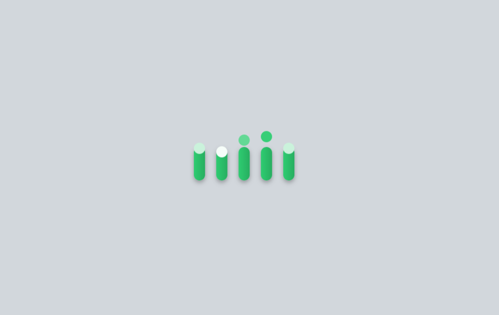
Design 3: The Sliding Bars Loader
The Sliding Bar Loader is one example of loading animation ideas that are minimalistic but engaging. It includes several vertical bars sliding up and down, showing a smooth sliding effect.
The good thing about this loader is that it is not just simple to implement but highly customizable too, where colors, speed, and size can be modified according to the theme of your website.
Set up the HTML Structure:
First, we will set the HTML structure of this loading animation.
<section class="loader">
        <div class="slider" style="--i:0"></div>
        <div class="slider" style="--i:1"></div>
        <div class="slider" style="--i:2"></div>
        <div class="slider" style="--i:3"></div>
        <div class="slider" style="--i:4"></div>
    </section>
General Styles for the Sliding Bars Loader
We’ll start with some basic setup styles that will set the base for our loader. Here it is:
body {
    display: flex;
    align-items: center;
    justify-content: center;
    height: 100vh;
    margin: 0;
    background-color: #d2d7dc;
    font-family: Arial, sans-serif;
}
Here, we use Flexbox to center the loader both vertically and horizontally. The background is a soft gray acting as a neutral background, making the sliding bars stand out.
Creating the Loader Container
The loader itself is inside a container that is targeted by the .loader class:
.loader {
    display: flex;
    align-items: center;
    gap: 20px;
}
This is a basic setup again using Flexbox to align the sliding bars horizontally, with a gap property for even spacing.
Designing the Sliding Bars
Let’s talk in detail now about the sliding bars:
.slider {
    height: 60px;
    width: 20px;
    border-radius: 30px;
    background: linear-gradient(90deg, #2ecc71, #27ae60);
    position: relative;
    transform-origin: center bottom;
    box-shadow: 0 4px 8px rgba(0, 0, 0, 0.3);
}
Each bar is a rounded rectangle with a gradient background. This transform-origin ensures that any transformations pivot around the center bottom. This box-shadow adds depth so that the bars feel like they are floating above the background.
Animating the Sliders
The real magic happens with the animation.
.slider::before {
    content: "";
    position: absolute;
    top: 0;
    left: 0;
    height: 20px;
    width: 20px;
    border-radius: 50%;
    background: #fff;
    animation: slide 2s ease-in-out infinite;
    animation-delay: calc(-0.5s * var(--i));
}
This pseudo-element, before creating a small circle that slides up and down inside the bar. The animation property applies the movement with the animation delay, creating a staggered effect so they all don’t move in unison.
The keyframes for the sliding motion are defined as:
@keyframes slide {
    0%, 100% {
        transform: translateY(0);
        background: #fff;
    }
    50% {
        transform: translateY(-30px);
        background: #2ecc71;
    }
}
It gives the effect of moving the circle up and down while changing color along the way to a color matching the color of the gradient of the bar. This, in turn, results in smooth motion in a rhythmic fashion and is both soothing and attention-grabbing.
Responsiveness and Cross-Browser Compatibility
Make sure that, with any CSS animation, one of the most important things is that it will work across all devices and browsers.
The making of the Sliding Bar Loader prioritizes flexibility, however, with the amount of percentage-based dimensions and media queries applied, adapting the loader for the variety of screen sizes won’t be a problem.
Besides that, the CSS applied here works well with the majority of modern browsers, offering the same output across all of them.
Adding Personalization to the Loader
Want to make the Sliding Bar Loader your own? You can easily customize it by changing its color, and animation speed, or resizing the bars according to your needs. For example, you may switch to a different colored gradient that makes it closer to your site’s branding.
Similarly, you can increase the animation speed for more energy or decrease it to make it calm. By this, you can create your own CSS cool loading animations and enjoy the experience.
Why This Loader is Special?
The Sliding Bar Loader is special because it manages to bring simplicity with a tinge of elegance. From complex loaders that may drive the user to frustration, this design is clean and straightforward, fitting perfectly in almost any website.
Be it a sleek portfolio site or even a minimalist blog, this loader will seamlessly merge into your design yet still capture the user’s attention.
Complete Source Code:
<!DOCTYPE html>
<html lang="en">
<head>
    <meta charset="UTF-8">
    <meta name="viewport" content="width=device-width, initial-scale=1.0">
    <title>Sliding Bars Loader</title>
    <style>
        /* General Styles */
        body {
            display: flex;
            align-items: center;
            justify-content: center;
            height: 100vh;
            margin: 0;
            background-color: #d2d7dc;
            font-family: Arial, sans-serif;
        }

        .loader {
            display: flex;
            align-items: center;
            gap: 20px;
        }

        .slider {
            height: 60px;
            width: 20px;
            border-radius: 30px;
            background: linear-gradient(90deg, #2ecc71, #27ae60);
            position: relative;
            transform-origin: center bottom;
            box-shadow: 0 4px 8px rgba(0, 0, 0, 0.3);
        }

        .slider::before {
            content: "";
            position: absolute;
            top: 0;
            left: 0;
            height: 20px;
            width: 20px;
            border-radius: 50%;
            background: #fff;
            animation: slide 2s ease-in-out infinite;
            animation-delay: calc(-0.5s * var(--i));
        }

        @keyframes slide {
            0%, 100% {
                transform: translateY(0);
                background: #fff;
            }
            50% {
                transform: translateY(-30px);
                background: #2ecc71;
            }
        }
    </style>
</head>
<body>
    <section class="loader">
        <div class="slider" style="--i:0"></div>
        <div class="slider" style="--i:1"></div>
        <div class="slider" style="--i:2"></div>
        <div class="slider" style="--i:3"></div>
        <div class="slider" style="--i:4"></div>
    </section>
</body>
</html>
Final Look:
Best Practices for Implementing CSS Loaders
While implementing the loaders in CSS, say the Sliding Bar Loader, it is important to consider where they are going to be applied. Here are a few best practices:
- Use animations for loading sparingly: Too many animations slow down your site and overwhelm the user. Limit yourself to one or two key animations that improve the user experience.
- Light Animations: Complex animations take time to load, which will defeat good SEO. You will need to optimize your CSS for there not to be any lag.
- Cross-device testing: Animation looks great on the desktop and mobile platforms. Responsiveness ensures predictability in the experience.
SEO and Performance Considerations
While awesome to look at, CSS animation considers the impact on your SEO and performance: the ill-optimized animation can increase the page loading time, which, accordingly, has a very bad influence on the site’s ranking on search engines.
Avoid this by keeping your CSS clean and minimal, avoiding huge image files and complex scripts. In this context, there is also the lazy loading technique that allows running only the animations currently on the screen.
Integrating the Loader into a Website
With this code, you can easily add the Sliding Bar Loader to your website. You only need to drop the given HTML and CSS code into your project. In case you work with some CMS like WordPress, it would be easy to include this loader right into your theme or as a part of a plugin.
Just remember to test the loader in different browsers and on different devices for smooth working and then you can enjoy this CSS cool Loading Animation.
User Feedback and Interaction
One of the best ways of honing your loading animations is by using user feedback. Pay attention to how users are interacting with your site and make changes according to their behavior.
For instance, if users appear frustrated by a page that loads very slowly, consider speeding up the animation, or you can even make it less complex in design.
If users seem to enjoy the animation, you may consider trying to make more interactive elements or integrating the loader into other areas of your site.
Conclusion
Loading animations, like a Sliding Bar Loader, are not just beautification on a webpage but, actually quite significant, user experience enhancers. While your content is loading, load animations create a seamless, aesthetically smooth transition to keep your users from getting bored.
Whether you’re an experienced or fresh web designer, it’s not worth being afraid of trying out various designs and finding out which one suits you best.
Check out another post on CSS Cool loading animations.
If you want to learn more about these types of animations. Visit our UI Elements page.
Visit our homepage to learn about web development.
Visit uiverse to learn more about CSS animations.
NOTE: A new loader will be updated quickly in this series of ” Mesmerizing CSS Cool Loading Animations: 3 Designs to Love “.
FAQs
1. How can CSS animations be best optimized?
Optimize complex properties in the CSS animation using hardware-accelerated properties like transform and opacity, and clean up your CSS code.
2. Can this loader be customized for different themes?
Yes, the Sliding Bar Loader is highly customizable. You can change its colors, sizes, and speed to fit various themes and styles.
3. How do loading animations improve the user experience?
Loading animations enhances user experience by providing immediate feedback when loading, perceived shorter waiting times, and entertainment for the users.
4. Is it possible to create similar loaders without CSS?
CSS is a very popular way of creating loaders, but depending on your needs, you can achieve similar results using JavaScript or SVG animations, too.
5. Name tools you can use to design CSS loaders.
CodePen, CSS-Tricks, and other browser developer tools will greatly expedite the designing and testing of CSS loaders.
<———————————–>