
Welcome to the ultimate treasure trove of CSS Tricks! Whether you’re a seasoned front-end developer or just starting out, these 10 mind-blowing hacks will elevate your skills and leave you amazed at what CSS can do.
From enhancing user experience to solving complex layout issues with ease, these tips are designed to push your creativity and efficiency to the next level. Say goodbye to tedious workarounds and get ready to unlock the full power of CSS magic!
Table of Contents
1. CSS Variables Magic 🎨
💡 Tip: Define reusable values with –custom-properties, then use them throughout your CSS!
:root {
  --main-color: #ff6347;
}
body {
  background-color: var(--main-color);
}
Let me explain using Proper Code:
<!DOCTYPE html>
<html lang="en">
<head>
<meta charset="UTF-8">
<title>CSS Variables Magic 🎨</title>
<style>
:root {
--main-color: #ff6347;
--accent-color: #00bfff;
--text-color: #ffffff;
}
body {
background-color: var(--main-color);
color: var(--text-color);
font-family: Arial, sans-serif;
display: flex;
justify-content: center;
align-items: center;
height: 100vh;
margin: 0;
}
.box {
background-color: var(--accent-color);
padding: 50px;
border-radius: 10px;
text-align: center;
font-size: 1.5em;
}
</style>
</head>
<body>
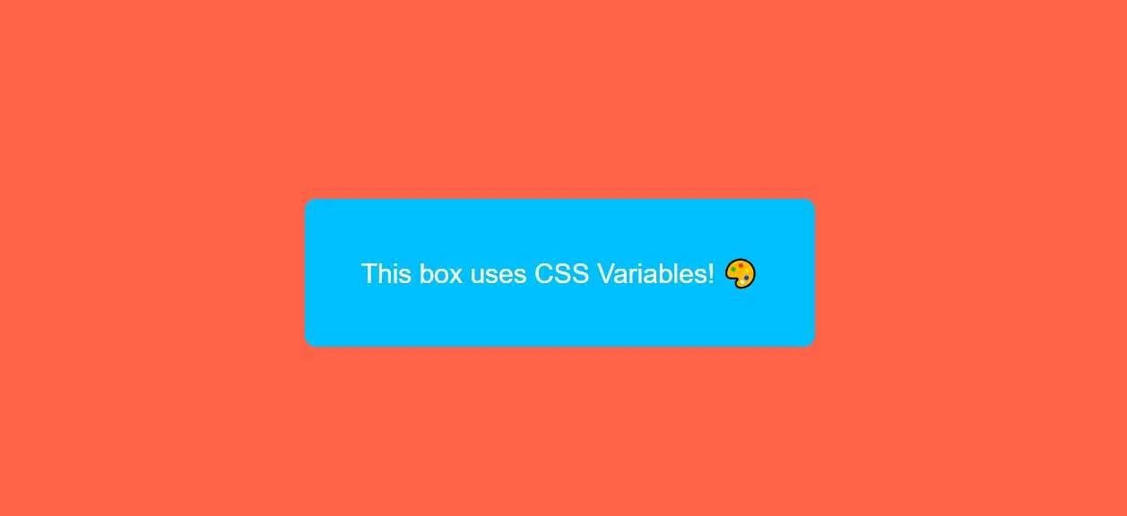
<div class="box">
This box uses CSS Variables! 🎨
</div>
</body>
</html>
Output:
2. The Hidden Hover Effect 🕵️♀️
🎉 Hover effects without adding hover in CSS? Try :not() with child selectors for stealthy hover interactions!
button:not(:hover) {
  background-color: #ddd;
}
Let me explain using Proper Code:
<!DOCTYPE html>
<html lang="en">
<head>
<meta charset="UTF-8">
<meta name="viewport" content="width=device-width, initial-scale=1.0">
<title>Hidden Hover Effect with :not()</title>
<style>
body {
display: flex;
justify-content: center;
align-items: center;
height: 100vh;
background-color: #f5f5f5;
}
.container {
display: flex;
gap: 10px;
}
.box {
width: 100px;
height: 100px;
background-color: #3498db;
transition: background-color 0.3s ease, transform 0.3s ease;
}
/* The hidden hover effect */
.box:hover {
transform: scale(1.1);
}
.box:not(:hover) {
background-color: #e74c3c; /* Changes all other boxes except the hovered one */
}
</style>
</head>
<body>
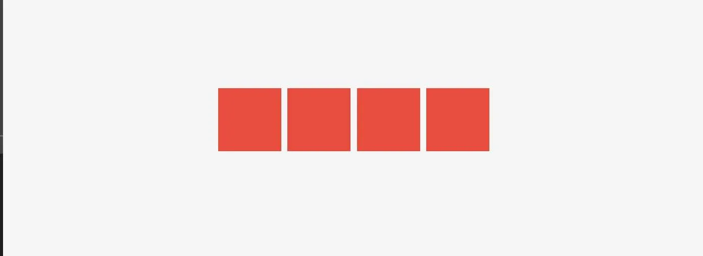
<div class="container">
<div class="box"></div>
<div class="box"></div>
<div class="box"></div>
<div class="box"></div>
</div>
</body>
</html>
Output:
Before Hovering:
After Hovering:
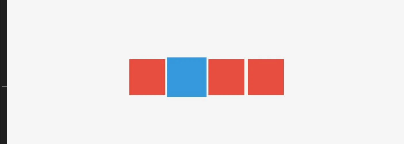
Did you get it? How without using CSS Hover, we created boxes that have a Hover effect.
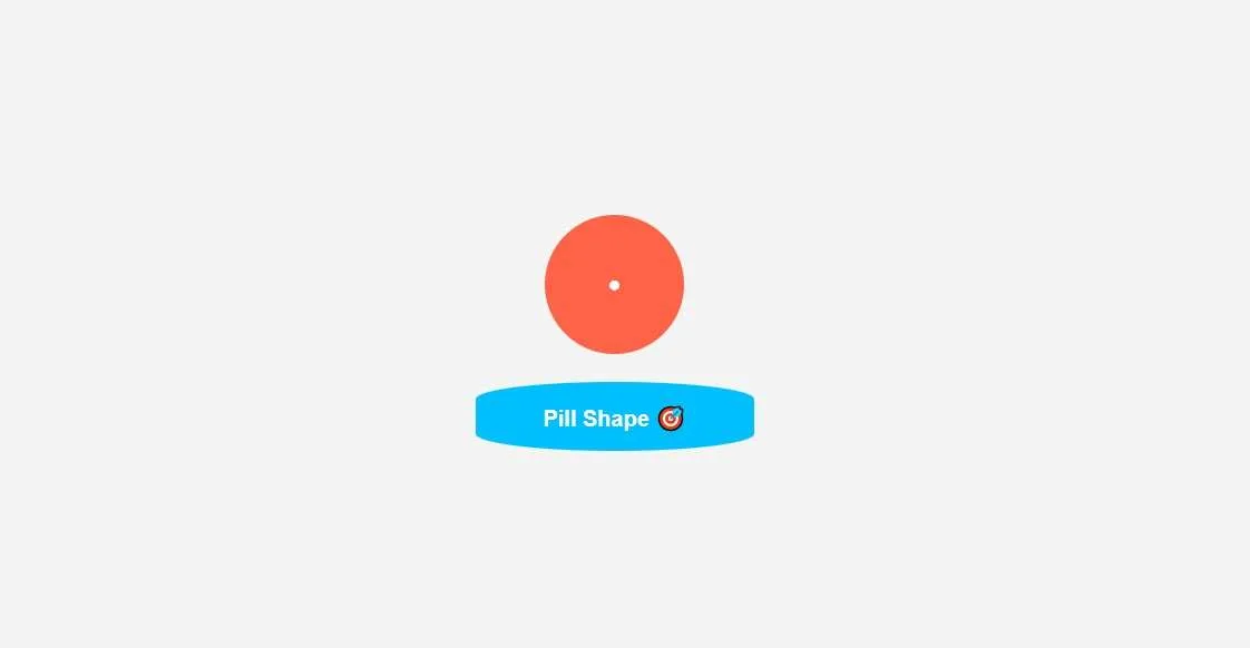
3. Border-Radius Hacks 🎯
🔥 Want perfect circles or pill-shaped buttons? Play with percentages in border-radius to create ultra-smooth shapes!
.circle {
  border-radius: 50%;
}
.pill {
  border-radius: 50% / 25%;
}
Let me explain using Proper Code:
<!DOCTYPE html>
<html lang="en">
<head>
  <meta charset="UTF-8">
  <title>Border-Radius Hacks 🎯</title>
  <style>
    body {
      font-family: Arial, sans-serif;
      background-color: #f4f4f4;
      display: flex;
      flex-direction: column;
      align-items: center;
      justify-content: center;
      height: 100vh;
      margin: 0;
      gap: 20px;
    }
    .circle {
      width: 100px;
      height: 100px;
      background-color: #ff6347;
      border-radius: 50%;
      display: flex;
      justify-content: center;
      align-items: center;
      color: #fff;
      font-weight: bold;
    }
    .pill {
      width: 200px;
      height: 50px;
      background-color: #00bfff;
      border-radius: 50% / 25%;
      display: flex;
      justify-content: center;
      align-items: center;
      color: #fff;
      font-weight: bold;
    }
  </style>
</head>
<body>
  <div class="circle">●</div>
  <div class="pill">Pill Shape 🎯</div>
</body>
</html>
Output:
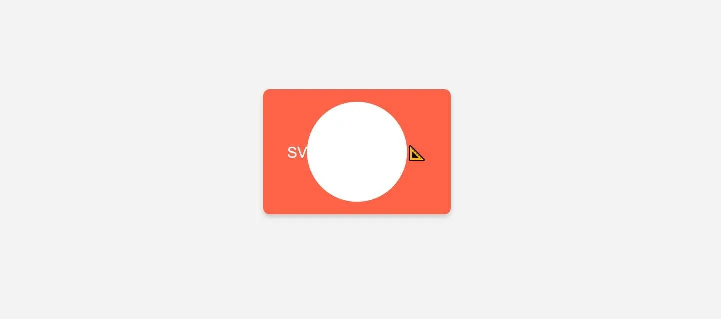
4. SVGs as Backgrounds 📐
🚀 Ditch static images! Use inline SVGs to create scalable, sharp backgrounds without slowing your site down!
background: url('data:image/svg+xml,...');
Let me explain using Proper Code:
<!DOCTYPE html>
<html lang="en">
<head>
  <meta charset="UTF-8">
  <title>SVGs as Backgrounds 📐</title>
  <style>
    body {
      font-family: Arial, sans-serif;
      background-color: #f4f4f4;
      display: flex;
      justify-content: center;
      align-items: center;
      height: 100vh;
      margin: 0;
    }
    .svg-background {
      width: 300px;
      height: 200px;
      background-image: url("data:image/svg+xml,%3Csvg xmlns='http://www.w3.org/2000/svg' width='300' height='200' viewBox='0 0 300 200'%3E%3Crect width='300' height='200' fill='%23ff6347'/%3E%3Ccircle cx='150' cy='100' r='80' fill='%23ffffff'/%3E%3C/svg%3E");
      background-size: cover;
      background-repeat: no-repeat;
      display: flex;
      justify-content: center;
      align-items: center;
      color: #fff;
      font-size: 1.5em;
      border-radius: 10px;
      box-shadow: 0 4px 8px rgba(0,0,0,0.2);
    }
  </style>
</head>
<body>
  <div class="svg-background">
    SVG Background 📐
  </div>
</body>
</html>
Output:
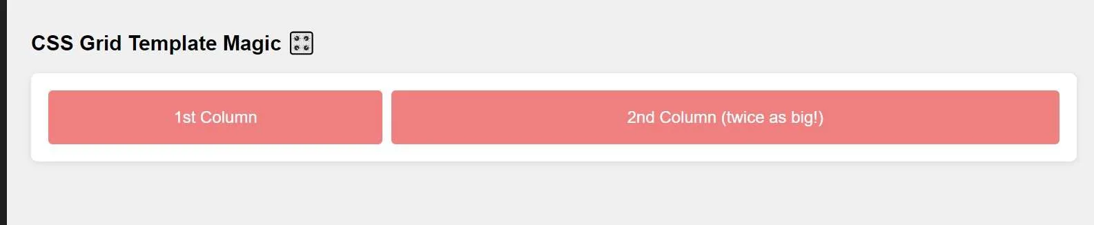
5. CSS Grid Template Magic 🎛️
🌐 Create complex grid layouts with just a few lines of code. Perfect for multi-column layouts!
.container {
  display: grid;
  grid-template-columns: 1fr 2fr;
}
Let me explain using Proper Code:
<!DOCTYPE html>
<html lang="en">
<head>
  <meta charset="UTF-8">
  <title>CSS Grid Template Magic 🎛️</title>
  <style>
    body {
      font-family: Arial, sans-serif;
      padding: 20px;
      background-color: #f0f0f0;
    }
    .grid-container {
      display: grid;
      grid-template-columns: 1fr 2fr;
      gap: 10px;
      background-color: #fff;
      padding: 20px;
      border-radius: 8px;
      box-shadow: 0 2px 8px rgba(0,0,0,0.1);
    }
    .grid-item {
      background-color: #f08080;
      padding: 20px;
      text-align: center;
      font-size: 1.2em;
      border-radius: 5px;
      color: #fff;
    }
  </style>
</head>
<body>
  <h2>CSS Grid Template Magic 🎛️</h2>
  <div class="grid-container">
    <div class="grid-item">1st Column</div>
    <div class="grid-item">2nd Column (twice as big!)</div>
  </div>
</body>
</html>
Output:
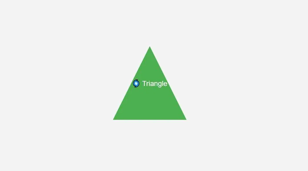
6. Clip-Path for Funky Shapes 🌀
✂️ Bored of rectangles? Use clip-path to cut your elements into triangles, circles, stars, or custom shapes!
.funky-shape {
  clip-path: polygon(50% 0%, 0% 100%, 100% 100%);
}
Let me explain using Proper Code:
<!DOCTYPE html>
<html lang="en">
<head>
  <meta charset="UTF-8">
  <title>Clip-Path for Funky Shapes 🌀</title>
  <style>
    body {
      display: flex;
      justify-content: center;
      align-items: center;
      height: 100vh;
      background-color: #f4f4f4;
      margin: 0;
      font-family: Arial, sans-serif;
    }
    .funky-shape {
      width: 200px;
      height: 200px;
      background-color: #4caf50;
      clip-path: polygon(50% 0%, 0% 100%, 100% 100%);
      display: flex;
      justify-content: center;
      align-items: center;
      color: #fff;
      font-size: 1.2em;
    }
  </style>
</head>
<body>
  <div class="funky-shape">
    🌀 Triangle
  </div>
</body>
</html>
Output:
7. CSS Scroll Snap 🚀
🎢 Smooth scrolling is cool, but scroll snapping takes it to the next level! Perfect for image sliders.
.scroll-container {
  scroll-snap-type: x mandatory;
}
.scroll-item {
  scroll-snap-align: start;
}
Let me explain using Proper Code:
<!DOCTYPE html>
<html lang="en">
<head>
  <meta charset="UTF-8">
  <meta name="viewport" content="width=device-width, initial-scale=1.0">
  <title>Horizontal Scroll Snap Example</title>
  <style>
    body {
      margin: 0;
      padding: 0;
      font-family: Arial, sans-serif;
    }

    /* Scroll Container */
    .scroll-container {
      display: flex;
      overflow-x: scroll;   /* Enables horizontal scrolling */
      scroll-snap-type: x mandatory;  /* Snap points on horizontal axis */
      scroll-behavior: smooth;  /* Smooth scrolling behavior */
      gap: 10px;  /* Space between items */
      padding: 20px;
      height: 300px;  /* Set the height of the container */
    }

    .scroll-item {
  flex: 0 0 60%;
  scroll-snap-align: start;
  background-color: #3498db;
  border-radius: 8px;
  margin: 10px auto;
  height: 100%;
  display: flex;
  justify-content: center;
  align-items: center;
  color: white;
  font-size: 2rem;
  box-shadow: 0 4px 8px rgba(0, 0, 0, 0.2);  /* Add shadow */
  transition: transform 0.3s ease;  /* Add smooth transition on hover */
}

.scroll-item:hover {
  transform: scale(1.02);  /* Scale up on hover */
  background-color: ORANGE;
}

  </style>
</head>
<body>

  <h2 style="padding: 20px;">Horizontal Scroll Snap Example</h2>

  <!-- Scrollable Container -->
  <div class="scroll-container">
    <div class="scroll-item">Slide 1</div>
    <div class="scroll-item">Slide 2</div>
    <div class="scroll-item">Slide 3</div>
    <div class="scroll-item">Slide 4</div>
    <div class="scroll-item">Slide 5</div>
  </div>

</body>
</html>
Output:
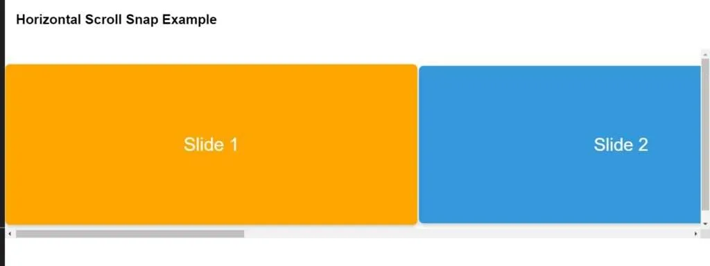
Note: Use the Keyboard Arrow keys or Touch to scroll.
8. CSS Filters for WOW Effects 🎇
🖼️ Apply instant visual effects with CSS filters like blur, brightness, and contrast for cool image transformations!
img {
  filter: blur(5px) brightness(1.2);
}
Let me explain using Proper Code:
<!DOCTYPE html>
<html lang="en">
<head>
  <meta charset="UTF-8">
  <title>CSS Filters for WOW Effects 🎇</title>
  <style>
    body {
      display: flex;
      justify-content: center;
      align-items: center;
      height: 100vh;
      background-color: #f4f4f4;
      margin: 0;
      font-family: Arial, sans-serif;
    }
    .filter-image {
      width: 300px;
      height: 200px;
      transition: filter 0.3s;
      border-radius: 10px;
      box-shadow: 0 4px 8px rgba(0,0,0,0.2);
    }
    .filter-image:hover {
      filter: blur(5px) brightness(1.2);
    }
  </style>
</head>
<body>
  <img src="https://via.placeholder.com/300x200" alt="Placeholder Image" class="filter-image">
</body>
</html>
Output:
Before Blur & Brightness Filter Applied:
After Blur & Brightness Filter Applied:

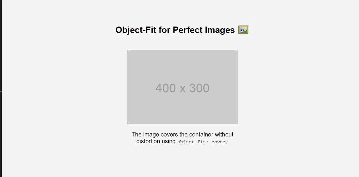
9. Object-Fit for Perfect Images 🖼️
🖼️ Ever had an image that doesn’t fit its container? With object-fit, you can maintain aspect ratio and prevent squished images!
img {
  object-fit: cover;
}
Let me explain using Proper Code:
Output:
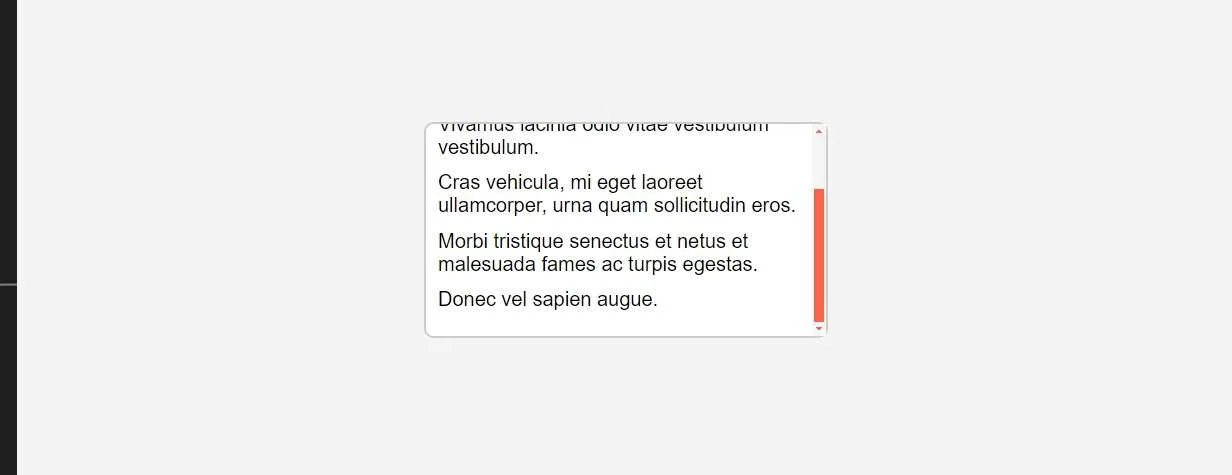
10. CSS Custom Scrollbars ✨
🛠️ Bored of ugly scrollbars? Customize them with ::-webkit-scrollbar to match your site’s vibe!
::-webkit-scrollbar {
  width: 10px;
  background-color: #f5f5f5;
}
::-webkit-scrollbar-thumb {
  background-color: #ff6347;
}
Let me explain using Proper Code:
Output:
⚡ Bonus Tip: Don’t forget, the most mind-blowing trick is to experiment and have fun with your front-end creations! 🧙♂️✨
Also Read:
- The Game-Changer: How Avoiding 10 Common HTML Mistakes Improves Accessibility
- Why JavaScript is the Backbone of the Web (And Why You Should Care)


Your writing is so engaging and easy to read It makes it a pleasure to visit your blog and learn from your insights and experiences
Keep up the amazing work! Can’t wait to see what you have in store for us next.