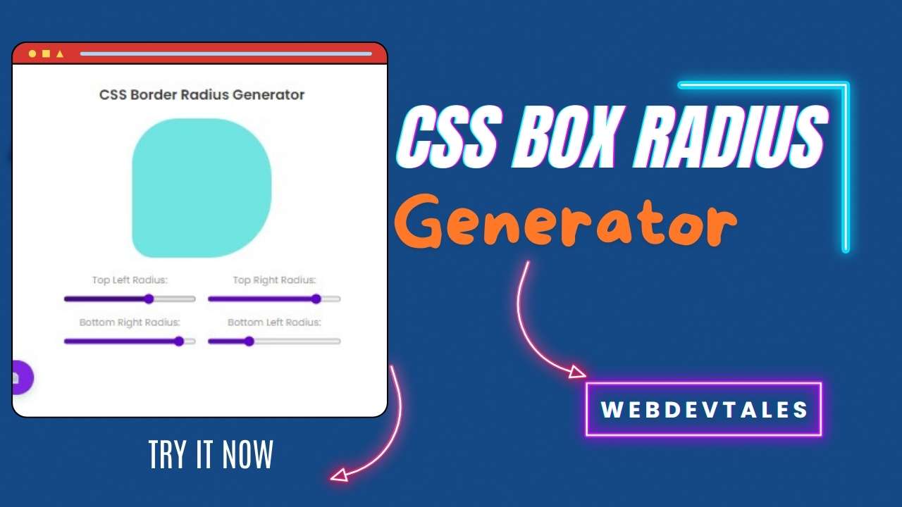
Ultimate Border Radius Generator 2025 (Pro)
Create perfect borders with full customization – radius, style, width, color, and gradients.
Live Preview
Border Controls
Premium Presets
Generated Code
.element {
    border-radius: 0px 0px 0px 0px;
    border: 0px solid #6366f1;
    background: #6366f1;
}.element {
border-radius: 0px 0px 0px 0px;
border: 0px solid #6366f1;
background: #6366f1;
}<div class="rounded-[0px_0px_0px_0px] border-[0px] border-[#6366f1] bg-[#6366f1]"></div>element.style.borderRadius = "0px 0px 0px 0px";
element.style.border = "0px solid #6366f1";
element.style.background = "#6366f1";Ultimate Border Radius Generator 2025 – User Manual
🎨 Create Beautiful Borders with Ease
Welcome to the Ultimate Border Radius Generator 2025 (Pro Edition)! This powerful tool helps designers and developers create perfectly styled borders with full customization—radius, style, width, color, and background effects.
Whether you’re working on a website, app, or graphic design, this generator provides real-time previews and ready-to-use code in CSS, SCSS, Tailwind, and JavaScript.
🛠️ How to Use the Generator
1. Adjust Border Radius
Control each corner individually or use presets:
Top Left
Top Right
Bottom Right
Bottom Left
📌 Pro Tip: Use the shape presets (Rectangle, Circle, Oval, Custom) for quick adjustments!
2. Customize Border Style
Choose from 8 border styles:
✔ Solid – A clean, continuous line
✔ Dashed – A series of short dashes
✔ Dotted – Small dots along the border
✔ Double – Two parallel lines
✔ Groove – A 3D grooved effect
✔ Ridge – A 3D ridged effect
✔ Inset – Makes the element appear pressed in
✔ Outset – Makes the element appear raised
📌 Pro Tip: Combine dashed/dotted borders with a thicker width for a stylish look!
3. Set Border Width & Color
Width: Adjust from
0pxto20pxColor: Pick any color with the color picker
📌 Pro Tip: Use subtle borders (1-2px) for clean designs or thicker borders (3px+) for bold effects.
4. Choose Background (Solid or Gradient)
Solid Color – A single fill color
Gradient – Smooth color transitions (pick two colors + angle)
📌 Pro Tip: Gradients work great for buttons, cards, and modern UI elements!
5. Apply Premium Presets (One-Click Styling)
Save time with 12 handcrafted presets, including:
Soft (subtle rounded edges)
Pill (fully rounded ends, great for buttons)
Modern (sharp top, rounded bottom)
Vintage (classic double border)
Geometric (asymmetrical styling)
📌 Pro Tip: Click any preset to apply it instantly, then tweak as needed!
6. Copy the Code
Get production-ready code in:
CSS – Standard styling
SCSS – For Sass/SCSS projects
Tailwind – Utility-first CSS framework
JavaScript – For dynamic styling
📌 Pro Tip: Use the “Copy All” button to grab every format at once!
🚀 Pro Tips for Best Results
✅ For Buttons: Use Pill shape + gradient background for a modern look.
✅ For Cards: Try Soft radius + thin border for a clean UI.
✅ For Unique Designs: Use Custom shape with asymmetrical corners.
❓ Frequently Asked Questions (FAQ)
Q: Can I use this for Tailwind CSS?
A: Yes! The Tailwind tab generates utility classes like:
<div class="rounded-[10px_20px_30px_40px] border-2 border-dashed border-blue-500"></div>
Q: How do I reset everything?
A: Click the “Reset All” button to restore default settings.
Q: Does this work on mobile?
A: Yes! The tool is fully responsive on all devices.
🎉 Start Designing Now!
Whether you’re a developer, designer, or hobbyist, this tool helps you create stunning borders in seconds.
👉 Try it now and level up your designs!


