For your website, designing a CSS sticky sidebar can be one of the most effective ways of increasing convenience for users. Regardless of whether you have a navigation menu, key links you’d like people to see every time they scroll up and down your blog or any promotional information, fixed sidebars come in handy as they guarantee that the necessary elements are always visible to the users.
In this tutorial, you will discover 9 step-by-step techniques to build a beautiful CSS sticky sidebar that not only stays sticky but also looks fabulous.
Table of Contents
Introduction
Do you sometimes turn a page down and do not see any more in the lower part of the page navigation menu or maybe a promoting banner? It’s frustrating, right? That’s where a sticky ‘sidebar’ comes in handy, but of course, before employing this technique, you have to ensure that you have enough substance to cite.
A CSS sticky sidebar is one of the powerful tools that constantly puts the necessary information or a possibility to navigate easily, regarding a scroll down.
As promised in the article title, I’ll show you 9 steps that ensure crafting an effective CSS sticky sidebar that is not only functional but pleasing to the eye.
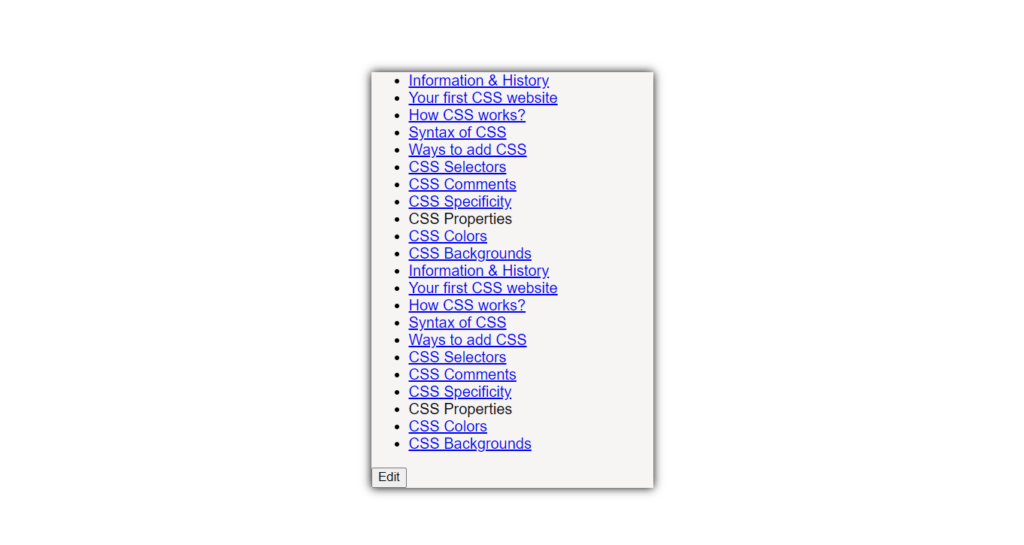
Step 1: Setting Up the HTML Structure
Before going any further, it’s important to get your HTML in the right shape and create a sticky sidebar. The page structure will be very simple, as it needs to contain a sidebar and the main content section.
<!DOCTYPE html>
<html lang="en">
<head>
    <meta charset="UTF-8">
    <meta name="viewport" content="width=device-width, initial-scale=1.0">
    <title>Sticky Custom CSS Navigation</title>
</head>
<body>
    <nav>
        <ul id="nav-list">
            <li><a href="#section1">Section 1</a></li>
            <li><a href="#section2">Section 2</a></li>
            <li><a href="#section3">Section 3</a></li>
        </ul>
    </nav>
    <div id="main-content">
        <!-- Main content goes here -->
    </div>
</body>
</html>
This structure consists of the <nav> element that is dedicated to the sidebar and <div> that is the main content of the page. As explained in the following steps, we will extend this structure.
Step 2: Understanding the position: sticky; Property
The position: attached property is that which makes the sidebar “stick” when you are scrolling. It can be described as semi-flexible, in between relative as well as fixed positioning. Here’s how it works:
- Relative until a certain point: It will be given position: relative; until some given scroll position.
- Fixed after that: As soon as the element is scrolled, it takes on a fixed position on the webpage.
To make your sidebar sticky, you simply apply the position: sticky, and it is property to it.
Step 3: Styling the Sidebar with CSS
Since we have the sidebar structure, it is time to add some style to the design. We will apply background color to make it more attractive, add padding for a better view, and have rounded corners.
nav {
    background-color: #f7f4f4;
    padding: 10px;
    border-radius: 10px;
    box-shadow: 0 0 10px rgba(0, 0, 0, 0.1);
    max-width: 300px;
    margin: 0 auto;
}
By the use of these styles, your sidebar will. be conspicuous and well-styled to look modern.
Step 4: Making the Sidebar Sticky
By default, the sidebar is not sticky, and thus we have to make some changes by fixing its position to stick. We do this by setting the top property, which defines the distance of the sidebar from the top of the viewport.
nav {
    position: sticky;
    top: 20px;
}
This ensures that your sidebar remains visible as the user scrolls through the page.
Step 5: Customizing the Scrollbar
It still has to be noted that a good scrollbar can be a real plus when it comes to the user experience. Now, let’s style the scrollbar of our sticky sidebar for a better look.
::-webkit-scrollbar {
    width: 15px;
}

::-webkit-scrollbar-track {
    background: #2c2c2c;
    border-radius: 10px;
}

::-webkit-scrollbar-thumb {
    background-color: #6000cd;
    border-radius: 10px;
    border: 3px solid #f1f1f1;
    transition: background-color 0.3s ease-in-out;
}

::-webkit-scrollbar-thumb:hover {
    background-color: #3c3c3c;
}
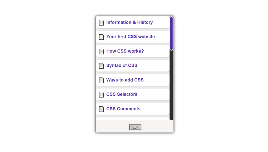
This code snippet stylizes the scrollbar with the preferred look of our sidebar, coordinated with smooth transitions of colors as well as rounded corners.
Step 6: Enhancing Sidebar Navigation Links
Sidebar Navigation Links are the links or the call to action placed on the sidebar of any web page to provide easy-to-access points for the users and are part of sidebar content that needs to be enriched.
Okay, the left sidebar is comprised of the ‘navigation links’, which are definitely crucial; let’s highlight them. We can add hover effects and, for example, a 3D effect to make them more consequent and dynamic.
nav ul li {
    margin-bottom: 10px;
    display: block;
    box-shadow: 2px 2px 8px rgba(0, 0, 0, 0.2);
    border-radius: 8px;
    background-color: #ffffff;
    transition: transform 0.3s ease, box-shadow 0.3s ease;
    padding: 10px;
}

nav ul li:hover {
    transform: translateY(-5px);
    box-shadow: 4px 4px 12px rgba(0, 0, 0, 0.3);
}

nav a {
    text-decoration: none;
    color: #512da8;
    font-weight: bold;
    font-size: 1.1em;
    display: flex;
    align-items: center;
    gap: 8px;
    transition: color 0.3s ease;
}

nav a:hover {
    color: #921b1f;
}
These styles ensure that your sticky sidebar links are not only aesthetic but also give the user feedback that they are clickable links.
Step 7: Adding Responsive Design
Now the time has arrived to make the design responsive without changing the overall layout much, which I implemented using the Bootstrap responsive framework.
While a sticky sidebar can be very helpful, it has to be mobile-friendly to adapt well to your site. To make it responsive, you can control the appearance of the sidebar in different screen sizes by changing the width and the padding.
@media (max-width: 768px) { /* Tablet version */
    nav {
        max-width: 100%;
        padding: 0;
    }
    nav ul {
        max-height: 400px;
    }
    nav a {
        font-size: clamp(0.8rem, 2vw, 1.2rem);
    }
    nav a::before {
        font-size: clamp(0.8rem, 2vw, 1.2rem);
    }
    .delete-icon {
        font-size: clamp(0.8rem, 2vw, 1.2rem);
    }
}

@media (max-width: 480px) { /* Mobile version */

    nav ul {
        max-height: 300px;
    }
    nav a {
        font-size: clamp(0.6rem, 2vw, 1rem);
    }
    nav a::before {
        font-size: clamp(0.6rem, 2vw, 1rem);
    }
    .delete-icon {
        font-size: clamp(0.6rem, 2vw, 1rem);
    }
    body {
        margin: 80px;
    }
    #edit-button {
        margin-left: 80px;
    }
}
This media query also ensures that the sidebar has a different layout in the mobile view and will display a usable format on the mobile.
Step 8: Adding Interactivity with JavaScript
To make your CSS sticky sidebar even more interesting, you can introduce an edit mode that would allow the user to modify the navigation options displayed. This is done with a bit of help from JavaScript, as will be demonstrated in the next few steps.
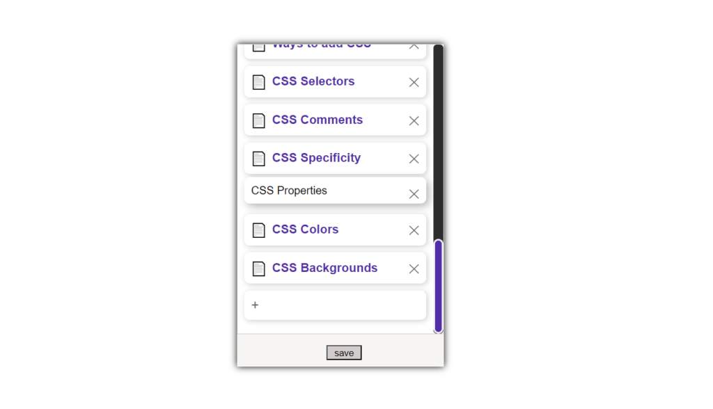
1. Toggling Edit Mode
- Purpose: Enables the users to toggle between viewing the sidebar navigation and editing it.
- Code:
const navList = document.getElementById('nav-list');
const editButton = document.getElementById('edit-button');

editButton.addEventListener('click', () => {
    navList.classList.toggle('edit-mode');
    if (navList.classList.contains('edit-mode')) {
        editButton.textContent = 'Save';
        addDeleteIcons();
        addAddIcon();
    } else {
        editButton.textContent = 'Edit';
        removeDeleteIcons();
        removeAddIcon();
    }
});
Explanation:
-
navListselects the<ul>tag, which represents the list of the items in the navigation bar. editButtonreflects the button that switches between‘Edit’and‘Save’mode.- When the button is clicked,
edit modeis toggled on the<ul>element: When the button is clicked, edit mode is toggled on the<ul>element:- If the variable
‘edit-mode’equals true, the button’s text is changed to"Save”and two functions—addDeleteIcons()andaddAddIcon()—are invoked. - If edit mode is not active, the button text is changed to
"Edit”and the functionsremoveDeleteIcons()as well asremoveAddIcon()are invoked.
- If the variable
2. Adding Delete Icons to Each List Item
- Purpose: It enables users to remove some of the items that are displayed in the navigation bars during the edit mode.
- Code:
function addDeleteIcons() {
    const listItems = navList.children;
    for (const item of listItems) {
        const deleteIcon = document.createElement('span');
        deleteIcon.classList.add('delete-icon');
        deleteIcon.textContent = 'X';
        deleteIcon.addEventListener('click', () => {
            item.remove();
        });
        item.appendChild(deleteIcon);
    }
}
Explanation:
listItemspoints to all the actually <li>‘s within the list of the navigation.- The
addDeleteIcons()function loops through each list item: The addDeleteIcons() function loops through each list item:- A
<span>tag is used, and this element is given the appearance of adelete iconwith the classdelete-icon. - This icon is added at the end of each
<li>. - On clicking on the delete icon, the corresponding list item containing the list is deleted from the DOM tree.
- A
3. Proposing an optional ”Add Item” button
- Purpose: Lets you create new navigation during the edit mode.
- Code:
function addAddIcon() {
    const addIcon = document.createElement('li');
    addIcon.classList.add('add-icon');
    addIcon.textContent = '+ Add Item';
    addIcon.addEventListener('click', () => {
        const newItem = prompt('Enter new item text:');
        if (newItem) {
            const newListItem = document.createElement('li');
            newListItem.textContent = newItem;
            navList.insertBefore(newListItem, addIcon);
        }
    });
    navList.appendChild(addIcon);
}
Explanation:
addAddIcon()generates a new list item or<li>element with the text of“+ Add Item”and a class ofadd-icon.- When this
“Add Item”the button is clicked, and there is a text field in which the user is required to enter the text that is to be displayed on the button. - If the user just types in characters, then a new
<li>element with this character content is copied and inserted at the beginning of the list as well as in the place before the‘Add Item’button. - It is then placed on the navigation menu of the sidebar on the new item.
4. Removing deleted icons
- Purpose: It cleaned up the interface by making the delete icons disappear when the edit mode is turned off.
- Code:
function removeDeleteIcons() {
    const deleteIcons = navList.querySelectorAll('.delete-icon');
    for (const icon of deleteIcons) {
        icon.remove();
    }
}
Explanation:
removeDeleteIcons()chooses all elements havingdelete-iconas a class in the context of the navigation list.- That gets each delete icon and deletes it from the DOM display so that delete icons cannot be seen when checked outside the edit mode.
5. Removing the “Add Item” Button
- Purpose: Disappears the “Add Item” button on exiting the edit mode.
- Code:
function removeAddIcon() {
    const addIcon = navList.querySelector('.add-icon');
    if (addIcon) {
        addIcon.remove();
    }
}
Explanation:
- The function, removeAddIcon(), exists to try to find the element with the class add-icon (the “Add Item” button).
- If it exists, the function removes it from the DOM so that when it is not in edit mode, the interface is not cluttered.
Key Points Summary
- Edit Mode Toggling: This allows users to view a chosen sidebar while at the same time having the opportunity to edit it. As for the other interface items, they are only available in edit mode; these include the delete icons as well as the “Add Item” button.
- Adding/Delete Icons: The delete icon is placed in every navigation item, and it can be placed dynamically once the users enter the edit mode.
- Adding New Items: This button, “Add Item“ enables the addition of new navigation items by entering the item text.
- Interface Cleanup: As the edit mode becomes off, all the icons and buttons that appear dynamically with the edition are then deleted, to avoid complications of the interface.
This approach makes your CSS sticky sidebar more interactive and user-friendly, allowing for on-the-fly customization without cluttering the interface.
Step 9: Testing and Debugging
This is the final stage of the development process of software applications, where the created software applications are checked for functionality and stability.
Last but not least, all the steps are performed, and the final step is to inspect the sticky sidebar on different browsers and devices to fix all the nuances. Common issues you may encounter include: Common issues you may encounter include:
- Sidebar not Sticking: This can be so because there may be little space to contain more in the parent container. Make sure that your sidebar has a sufficient height of its parent element.
- Overflow Issues: Make sure that they don’t extend beyond the screen width on the side of a smaller device and produce horizontal scrolling.
This way, you can discover these problems during the testing phase and correct them before they are live.
Complete Source Code:
<!DOCTYPE html>
<html lang="en">
<head>
<meta charset ="UTF-8">
<meta name="viewport" content="width=device-width, initial-scale=1.0">
<title>Sticky Custom CSS Navigation</title>
<style>
/* Custom scrollbar */
::-webkit-scrollbar {
width: 15px;
}
::-webkit-scrollbar-track {
background: #2c2c2c;
border-radius: 10px;
}
::-webkit-scrollbar-thumb {
background-color: #6000cd;
border-radius: 10px;
border: 3px solid #f1f1f1;
transition: background-color 0.3s ease-in-out;
}
::-webkit-scrollbar-thumb:hover {
background-color: #3c3c3c;
}
body {
font-family: Arial, sans-serif;
margin: 160px; /* can change to adjust the position.*/
}
nav {
position: sticky;
top: 20px; /* Adjust this value to set how far from the top you want it to stick */
max-width: 300px;
margin: 0 auto;
background-color: #f7f4f4;
box-shadow: 0 0 10px;
border-radius: 10px;
}
nav ul {
list-style-type: none;
padding: 0;
overflow-y: auto;
max-height: 400px;
border: 1px solid #ddd;
border-radius: 10px;
padding: 10px;
}
/* General list item styling */
nav ul li {
margin-bottom: 10px; /* Increase margin to separate the boxes */
display: block; /* Ensure each item is a block-level element */
box-shadow: 2px 2px 8px rgba(0, 0, 0, 0.2); /* Add a shadow for 3D effect */
border-radius: 8px; /* Round the corners */
background-color: #ffffff; /* Background color for the box */
transition: transform 0.3s ease, box-shadow 0.3s ease;
padding: 10px; /* Add padding inside the box */
}
/* Add a hover effect to enhance the 3D look */
nav ul li:hover {
transform: translateY(-5px); /* Slightly lift the box on hover */
box-shadow: 4px 4px 12px rgba(0, 0, 0, 0.3); /* Enhance the shadow on hover */
}
/* Anchor styling inside the box */
nav a {
text-decoration: none;
color: #512da8;
font-weight: bold;
font-size: 1.1em;
display: flex;
align-items: center;
gap: 8px;
transition: color 0.3s ease;
}
nav a:hover {
color: #921b1f;
}
nav a::before {
content: "\1F4C4"; /* Page icon */
font-size: 1.2em;
color: #512da8;
transition: transform 0.3s ease;
}
nav a:hover::before {
transform: rotate(10deg);
}
/* Edit mode styles */
.edit-mode {
background-color: #ffffff;
padding: 10px;
border-bottom: 1px solid #ccc;
}
.edit-mode li {
position: relative;
}
.delete-icon {
position: absolute;
top: 10px;
right: 10px;
font-size: 1.2em;
color: #666;
cursor: pointer;
transition: color 0.3s ease;
}
.delete-icon:hover {
color: #921b1f;
}
.add-icon {
font-size: 1.2em;
color: #666;
cursor: pointer;
transition: color 0.3s ease;
}
.add-icon:hover {
color: #921b1f;
}
#edit-button {
align-items: center;
justify-content: center;
margin-left: 130px;
margin-bottom: 10px;
padding: 2px 10px 0px 10px;
background-color: #d3cccc;
border-radius: 5px;
transition: background-color 0.3s ease;
}
#edit-button:hover {
background-color: #512da8;
color: white;
border-radius: 15px;
}
@media (max-width: 768px) { /* Tablet version */
nav {
max-width: 100%;
padding: 0;
}
nav ul {
max-height: 400px;
}
nav a {
font-size: clamp(0.8rem, 2vw, 1.2rem);
}
nav a::before {
font-size: clamp(0.8rem, 2vw, 1.2rem);
}
.delete-icon {
font-size: clamp(0.8rem, 2vw, 1.2rem);
}
}
@media (max-width: 480px) { /* Mobile version */
nav ul {
max-height: 300px;
}
nav a {
font-size: clamp(0.6rem, 2vw, 1rem);
}
nav a::before {
font-size: clamp(0.6rem, 2vw, 1rem);
}
.delete-icon {
font-size: clamp(0.6rem, 2vw, 1rem);
}
body {
margin: 80px;
}
#edit-button {
margin-left: 80px;
}
}
</style>
</head>
<body>
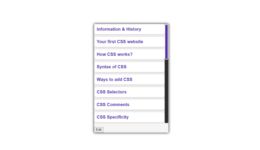
<nav>
<ul id="nav-list">
<li><a href="#information-history">Information & History</a></li>
<li><a href="#first-css-website">Your first CSS website</a></li>
<li><a href="#how-css-works">How CSS works?</a></li>
<li><a href="#syntax-css">Syntax of CSS</a></li>
<li><a href="#ways-add-css">Ways to add CSS</a></li>
<li><a href="#css-selectors">CSS Selectors</a></li>
<li><a href="#css-comments">CSS Comments</a></li>
<li><a href="#css-specificity">CSS Specificity</a></li>
<li><span class="section-title">CSS Properties</span></li>
<li><a href="#css-colors">CSS Colors</a></li>
<li><a href="#css-backgrounds">CSS Backgrounds</a></li>
<!-- Add more topics as needed -->
</ul>
<button id="edit-button">Edit</button>
</nav>
<script>
const navList = document.getElementById('nav-list');
const editButton = document.getElementById('edit-button');
editButton.addEventListener('click', () => {
navList.classList.toggle('edit-mode');
if (navList.classList.contains('edit-mode')) {
editButton.textContent = 'Save';
addDeleteIcons();
addAddIcon();
} else {
editButton.textContent = 'Edit';
removeDeleteIcons();
removeAddIcon();
}
});
function addDeleteIcons() {
const listItems = navList.children;
for (const item of listItems) {
const deleteIcon = document.createElement('span');
deleteIcon.classList.add('delete-icon');
deleteIcon.textContent = '\u2715';
item.appendChild(deleteIcon);
deleteIcon.addEventListener('click', () => {
item.remove();
});
}
}
function removeDeleteIcons() {
const deleteIcons = document.querySelectorAll('.delete-icon');
for (const icon of deleteIcons) {
icon.remove();
}
}
function addAddIcon() {
const addIcon = document.createElement('li');
addIcon.classList.add('add-icon');
addIcon.textContent = '+';
navList.appendChild(addIcon);
addIcon.addEventListener('click', () => {
const newItemName = prompt('Enter the name of the new item:');
if (newItemName) {
const newItem = document.createElement('li');
const newLink = document.createElement('a');
newLink.href = '#';
newLink.textContent = newItemName;
newItem.appendChild(newLink);
navList.insertBefore(newItem, addIcon);
addDeleteIcons();
}
});
}
function removeAddIcon() {
const addIcon = document.querySelector('.add-icon');
addIcon.remove();
}
</script>
</body>
</html>Conclusion
Building an epic CSS sticky sidebar does not only concern functionality but also increases the style for the user. If you are smart enough to implement these 9 steps to success, you can design a gorgeous and productive sidebar that viewers won’t be able to resist.
Don’t stop here! Sideload with more variety, consider more interactive elements and personalize the sidebar section. The possibilities are endless!
Get more source codes for CSS Animations and UI Elements.
Visit our Homepage to learn more about HTML, CSS, and JavaScript.
For any queries Contact Us.
Check more of the UI elements on uiverse.
FAQs
What does CSS sticky sidebar mean?
A CSS sticky sidebar is the type of sidebar that is always fixed at a certain position every time one is scrolling down the webpage. It improves user flow by making the elements necessary for navigation always accessible.
The question is: how to make the CSS Sidebar Sticky?
You can make a sidebar sticky by applying the position: sticky, giving it the property in CSS, and setting the top property to show how far from the top part of the viewport it should stick.
Is it possible to use sticky sidebars on mobile devices?
Oh yes, CSS sticky sidebars can be operated on mobile devices. Also, make sure you have adapted the sidebar well on mobile by changing the width and padding of the sidebar.
What are some of the problems that can result in sticky sidebars?
Some problems are that the sidebar does not stick because the parent container is inadequately high or the sidebar overtakes the screen space on a small viewport. In this case, testing and debugging help address such problems.
How can I enhance the appearance of my sticky sidebar?
You can enhance the appearance by customizing the scrollbar, adding hover effects, and incorporating JavaScript interactivity for editing and adding navigation items.