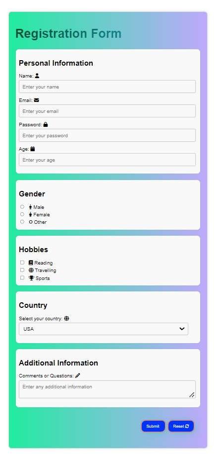
Creating a registration form that’s both stylish and responsive is essential for a modern web experience. Here, we break down the code for a registration form with popup confirmation using HTML, CSS, and JavaScript. Let’s dive in, fieldset by fieldset, to see how each part contributes to a user-friendly, visually appealing form.
In this guide, we will learn step-by-step “How to Create a Stylish and Responsive Registration Form with Popup Confirmation Using HTML, CSS, and JavaScript”
Table of Contents
HTML Breakdown: Creating the Form Structure
The first step is HTML Structure. It is the core of our Form. It consists of multiple sections, each grouped into fieldsets to ensure a clean, organized layout.
Personal Information Fieldset
This section collects basic details like:
- User’s name
- Password
- Age
Icons from Font Awesome are added to each label for a modern touch.
<fieldset>
  <h2>Personal Information</h2>
  <label for="name">Name: <i class="fas fa-user"></i></label>
  <input type="text" id="name" name="name" placeholder="Enter your name" required>

  <label for="email">Email: <i class="fas fa-envelope"></i></label>
  <input type="email" id="email" name="email" placeholder="Enter your email" required>

  <label for="password">Password: <i class="fas fa-lock"></i></label>
  <input type="password" id="password" name="password" placeholder="Enter your password" required>

  <label for="age">Age: <i class="fas fa-calendar"></i></label>
  <input type="number" id="age" name="age" min="1" max="120" placeholder="Enter your age">
</fieldset>
- Why it’s cool: The form is user-friendly, and the icons give it a professional look.
Gender Fieldset
This section uses radio buttons to let the user select their gender, offering three options:
- Male
- Female
- Other
<fieldset>
  <h2>Gender</h2>
  <label><input type="radio" name="gender" value="male" required> Male</label>
  <label><input type="radio" name="gender" value="female" required> Female</label>
  <label><input type="radio" name="gender" value="other" required> Other</label>
</fieldset>
- Why it works: Radio buttons are simple and intuitive, making the gender selection easy for users.
Hobbies Fieldset
Users can choose multiple hobbies using checkboxes, giving them flexibility in their choices.
<fieldset>
  <h2>Hobbies</h2>
  <label><input type="checkbox" name="hobbies[]" value="reading"> Reading</label>
  <label><input type="checkbox" name="hobbies[]" value="travelling"> Travelling</label>
  <label><input type="checkbox" name="hobbies[]" value="sports"> Sports</label>
</fieldset>
- Why it’s fun: The checkboxes let users customize their responses by selecting multiple interests.
Country Selection Fieldset
A dropdown menu allows users to select their country, keeping the list organized and compact.
<fieldset>
  <h2>Country</h2>
  <label for="country">Select your country:</label>
  <select id="country" name="country">
    <option value="USA">USA</option>
    <option value="Canada">Canada</option>
    <option value="UK">United Kingdom</option>
    <option value="Australia">Australia</option>
  </select>
</fieldset>
- Why it’s efficient: Dropdowns save space and are perfect for a list of countries.
Additional Information Fieldset
A textarea for the user to input any additional information.
<fieldset>
    <h2>Additional Information</h2>
    <label for="comments">Comments or Questions: <i class="fas fa-pencil"></i></label>
    <textarea id="comments" name="comments" placeholder="Enter any additional information"></textarea>
  </fieldset>
Form Action Buttons
Two form action buttons to perform actions
- Submit
- Reset
<div class="form-actions">
    <button type="submit">Submit <i class="fas fa-checkmark"></i></button>
    <button type="reset" class="reset-btn">Reset <i class="fas fa-refresh"></i></button>
  </div>
Popup Window
A popup window to show the popup message “Form Submitted Successfully!” and a Close-Button on the popup window to close the popup window.
<div class="popup-container">
    <div class="popup">
      <h2>Form Submitted Successfully!</h2>
      <p>Your form has been submitted successfully. Thank you for registering!</p>
      <button class="close-popup">Close</button>
    </div>
  </div>
CSS Styling: Adding Visual Appeal
The CSS makes this form stylish and modern by using gradients, shadows, and hover effects. Here’s a look at the key design elements.
Form Container & Fieldsets CSS
The form is designed with a gradient background and box-shadow, making it pop off the screen. Hover effects add a fun, interactive touch.
form {
  max-width: 600px;
  margin: 40px auto;
  padding: 20px;
  background-color: #fff;
  border: 1px solid #ddd;
  box-shadow: 0 0 10px rgba(0, 0, 0, 0.1);
  border-radius: 10px;
  background: linear-gradient(to right, #21eb9f, #bfa9fb);
}

fieldset {
  border: none;
  margin-bottom: 20px;
  padding: 10px;
  background-color: #f9f9f9;
  border-radius: 10px;
  box-shadow: 0 0 5px rgba(0, 0, 0, 0.05);
  transition: all 0.3s ease-in-out;
}
- Why it stands out: The gradient background gives the form a vibrant, dynamic look, while the shadows add depth and make the form visually appealing.
Input Fields & Hover Effects
Each input field has a subtle hover effect, enhancing user interaction.
input[type="text"],
input[type="email"],
input[type="password"],
input[type="number"],
textarea,
select {
  width: 95%;
  padding: 10px;
  margin-bottom: 15px;
  border: 1px solid #ccc;
  border-radius: 4px;
  background-color: #f9f9f9;
  transition: all 0.3s ease-in-out;
}

input[type="text"]:hover,
input[type="email"]:hover,
input[type="password"]:hover,
input[type="number"]:hover,
textarea:hover,
select:hover {
  border-color: #aaa;
  box-shadow: 0 0 10px rgba(0, 0, 0, 0.1);
}
- Why it’s interactive: The hover effect makes input fields feel responsive, creating a more engaging experience for the user.
Submit & Reset Buttons
Buttons are designed to be eye-catching and interactive, with hover effects that change the background color and border-radius.
button {
  background-color: #0033ff;
  color: #ffffff;
  border-radius: 16px;
  padding: 10px 15px;
  transition: background-color 0.3s, color 0.3s, border-radius 0.3s;
}

button:hover {
  background-color: #007063;
  border-radius: 33px;
}
- Why it’s engaging: The hover animations add a playful touch, encouraging users to interact with the buttons.
JavaScript: Popup Confirmation
The JavaScript handles form submission and shows a popup confirmation when the user submits the form. This dynamic feedback improves the overall user experience.
const form = document.getElementById('myForm');
const popupContainer = document.querySelector('.popup-container');
const closePopupButton = document.querySelector('.close-popup');

form.addEventListener('submit', (e) => {
  e.preventDefault();  // Prevents default form submission
  popupContainer.style.display = 'flex';  // Shows the popup
  form.reset();  // Resets the form
});

closePopupButton.addEventListener('click', () => {
  popupContainer.style.display = 'none';  // Closes the popup
});
- Why it’s useful: The popup confirmation adds a professional touch, providing immediate feedback after form submission. It reassures users that their data has been submitted successfully.
Final Thoughts
This stylish registration form is a great mix of modern design and interactive elements. It’s responsive, user-friendly, and designed to keep users engaged with dynamic feedback and fun hover effects. With this code, you’re all set to create a visually appealing and functional form that enhances user experience!
How to Create a Stylish and Responsive Registration Form with Popup Confirmation Using HTML, CSS, and JavaScript
Complete Source Code:
<!DOCTYPE html>
<html lang="en">
<head>
  <meta charset="UTF-8">
  <meta name="viewport" content="width=device-width, initial-scale=1.0">
  <link rel="stylesheet" href="https://cdnjs.cloudflare.com/ajax/libs/font-awesome/6.6.0/css/all.min.css" integrity="sha512-Kc323vGBEqzTmouAECnVceyQqyqdsSiqLQISBL29aUW4U/M7pSPA/gEUZQqv1cwx4OnYxTxve5UMg5GT6L4JJg==" crossorigin="anonymous" referrerpolicy="no-referrer" />
  <title>Sample Form</title>
  <style>
  /* Form Styles */

  h1 {
      background: linear-gradient(to right, #094435, #18b4c9);
      -webkit-background-clip: text;
      color: transparent;
      transition: background 0.5s ease;
      font-size: 40px;
    }

    h1:hover {
      background: linear-gradient(to right, #e6334e, #3cc866);
      -webkit-background-clip: text;
      color: transparent;
    }

form {
  max-width: 600px;
  margin: 40px auto;
  padding: 20px;
  background-color: #fff;
  border: 1px solid #ddd;
  box-shadow: 0 0 10px rgba(0, 0, 0, 0.1);
  border-radius: 10px;
  background: linear-gradient(to right, #21eb9f, #bfa9fb);
}

form:hover {box-shadow: 7px 6px 16px 5px rgba(225, 55, 98, 0.34);
    background: #8eefe7;
}

fieldset {
  border: none;
  margin-bottom: 20px;
  padding: 10px;
  background-color: #f9f9f9;
  border-radius: 10px;
  box-shadow: 0 0 5px rgba(0, 0, 0, 0.05);
  transition: all 0.3s ease-in-out;
}

fieldset:hover{
    transform: scale(1.02);
    background-color: #e9e0f3;
}


label {
  display: block;
  margin-bottom: 5px;
  color: black;
  font-size: 1em;
}

.form-actions {
  padding: 20px;
  text-align: right;
  margin-bottom: 10px;
}

input[type="text"],
input[type="email"],
input[type="password"],
input[type="number"],
textarea,
select {
  width: 95%;
  padding: 10px;
  margin-bottom: 15px;
  border: 1px solid #ccc;
  border-radius: 4px;
  font-size: 1em;
  background-color: #f9f9f9;
  box-shadow: 0 0 5px rgba(0, 0, 0, 0.05);
  transition: all 0.3s ease-in-out;
}

input[type="text"]:hover,
input[type="email"]:hover,
input[type="password"]:hover,
input[type="number"]:hover,
textarea:hover,
select:hover {
  border-color: #aaa;
  box-shadow: 0 0 10px rgba(0, 0, 0, 0.1);
}

input[type="radio"],
input[type="checkbox"] {
  margin-right: 10px;
}


button {
            background-color: #0033ff;
            color: #ffffff;
            border-radius: 16px 13px 16px 13px;
            border: 4px solid #d28f7f;
            padding: 10px 15px;
            box-shadow: 10px 4px 29px -10px #26cfb3;
            transition: background-color 0.3s, color 0.3s, border-radius 0.3s;
        }
button:hover {
            background-color: #007063;
            color: #ffffff;
            border-radius: 33px 35px 33px 36px;
        }


/* Popup Styles */

.popup-container {
  position: fixed;
  top: 0;
  left: 0;
  width: 100%;
  height: 100vh;
  background-color: rgba(0, 0, 0, 0.5);
  display: none;
  justify-content: center;
  align-items: center;
  transition: all 0.3s ease-in-out;
}

.popup {
  background-color: #fff;
  padding: 20px;
  border-radius: 10px;
  box-shadow: 0 0 10px rgba(0, 0, 0, 0.1);
  width: 300px;
  margin: 40px auto;
  background-image: linear-gradient(to bottom, #99ffee, #6673ff);
}

.popup h2 {
  margin-top: 0;
  color: #333;
  font-weight: bold;
  text-align: center;
}

.popup p {
  margin-bottom: 20px;
  color: #666;
  text-align: center;
}

.close-popup {
  padding: 10px 20px;
  border: none;
  border-radius: 4px;
  background-color: #4CAF50;
  color: #fff;
  cursor: pointer;
  transition: all 0.3s ease-in-out;
  box-shadow: 0 0 10px rgba(0, 0, 0, 0.1);
  float: right;
}

.close-popup:hover {
  background-color: #3e8e41;
  box-shadow: 0 0 20px rgba(0, 0, 0, 0.2);
}
  </style>
</head>
<body>

  <!-- Form Section -->
  <form id="myForm">
    <h1>Registration Form</h1>

   <!-- Text Input Fields -->
<fieldset>
    <h2>Personal Information</h2>
    <label for="name">Name: <i class="fas fa-user"></i></label>
    <input type="text" id="name" name="name" placeholder="Enter your name" required>

    <label for="email">Email: <i class="fas fa-envelope"></i></label>
    <input type="email" id="email" name="email" placeholder="Enter your email" required>

    <label for="password">Password: <i class="fas fa-lock"></i></label>
    <input type="password" id="password" name="password" placeholder="Enter your password" required>

    <label for="age">Age: <i class="fas fa-calendar"></i></label>
    <input type="number" id="age" name="age" min="1" max="120" placeholder="Enter your age">
  </fieldset>

  <!-- Radio Buttons for Gender -->
  <fieldset>
    <h2>Gender</h2>
    <label>
      <input type="radio" name="gender" value="male" required>
      <i class="fas fa-male"></i> Male
    </label>
    <label>
      <input type="radio" name="gender" value="female" required>
      <i class="fas fa-female"></i> Female
    </label>
    <label>
      <input type="radio" name="gender" value="other" required>
      <i class="fas fa-genderless"></i> Other
    </label>
  </fieldset>

  <!-- Checkbox Options for Hobbies -->
  <fieldset>
    <h2>Hobbies</h2>
    <label>
      <input type="checkbox" name="hobbies[]" value="reading">
      <i class="fas fa-book"></i> Reading
    </label>
    <label>
      <input type="checkbox" name="hobbies[]" value="travelling">
      <i class="fas fa-globe"></i> Travelling
    </label>
    <label>
      <input type="checkbox" name="hobbies[]" value="sports">
      <i class="fas fa-trophy"></i> Sports
    </label>
  </fieldset>

  <!-- Dropdown for Country Selection -->
  <fieldset>
    <h2>Country</h2>
    <label for="country">Select your country: <i class="fas fa-globe"></i></label>
    <select id="country" name="country">
      <option value="USA">USA</option>
      <option value="Canada">Canada</option>
      <option value="UK">United Kingdom</option>
      <option value="Australia">Australia</option>
    </select>
  </fieldset>

  <!-- Text Area for Additional Information -->
  <fieldset>
    <h2>Additional Information</h2>
    <label for="comments">Comments or Questions: <i class="fas fa-pencil"></i></label>
    <textarea id="comments" name="comments" placeholder="Enter any additional information"></textarea>
  </fieldset>

  <!-- Form Action Buttons -->
  <div class="form-actions">
    <button type="submit">Submit <i class="fas fa-checkmark"></i></button>
    <button type="reset" class="reset-btn">Reset <i class="fas fa-refresh"></i></button>
  </div>
  </form>

  <!-- Popup Window -->
  <div class="popup-container">
    <div class="popup">
      <h2>Form Submitted Successfully!</h2>
      <p>Your form has been submitted successfully. Thank you for registering!</p>
      <button class="close-popup">Close</button>
    </div>
  </div>
<script>
    // Get the form and popup elements
const form = document.getElementById('myForm');
const popupContainer = document.querySelector('.popup-container');
const popup = document.querySelector('.popup');
const closePopupButton = document.querySelector('.close-popup');

// Add event listener to the form's submit event
form.addEventListener('submit', (e) => {
  // Prevent the default form submission behavior
  e.preventDefault();

  // Show the popup
  popupContainer.style.display = 'flex';

  // Reset the form
  form.reset();
});

// Add event listener to the close popup button
closePopupButton.addEventListener('click', () => {
  // Hide the popup
  popupContainer.style.display = 'none';
});
</script>
</body>
</html>
Forms Look:

Video Tutorial:
Also Read:
- Front-End Projects Tutorial: Create a Simple Yet Eye-Catching Web Page!
- Front-End Projects Tutorial: Create a Simple Yet Eye-Catching Web Page! (Part 2)
FAQs
Q: What is the purpose of the box-shadow property in the form’s CSS?
The box-shadow property is used to add a shadow effect to the form elements, giving them a 3D appearance.
Q: How does the transition property work in the form’s CSS?
The transition property is used to smoothly animate changes to CSS properties, such as background-color or border-radius when the user interacts with the form elements.
Q: What is the difference between margin and padding in the form’s CSS?
margin is used to add space between elements, while padding is used to add space between an element’s content and its border.
Q: Why is the label element used in the form’s HTML?
The label element is used to associate a text description with a form element, making it easier for users to understand the purpose of each field.
Q: What is the purpose of the fieldset element in the form’s HTML?
The fieldset element is used to group related form elements together, making it easier to organize and style the form.


This is the best blog for anybody who desires to search out out about this topic. You understand a lot its virtually hard to argue with you (not that I actually would need…HaHa). You definitely put a new spin on a subject thats been written about for years. Great stuff, just great!
I’m impressed, I must say. Really hardly ever do I encounter a blog that’s each educative and entertaining, and let me let you know, you could have hit the nail on the head. Your concept is excellent; the issue is something that not enough individuals are talking intelligently about. I am very blissful that I stumbled across this in my seek for something referring to this.
I would like to express my admiration for your kindness in support of persons that must have help on this study. Your very own commitment to passing the solution all-around turned out to be definitely significant and have regularly enabled guys much like me to arrive at their pursuits. Your insightful tutorial means a whole lot to me and somewhat more to my colleagues. Thank you; from each one of us.
I conceive other website owners should take this web site as an example , very clean and fantastic user friendly style.
very nice post, i actually love this website, keep on it
I like this post, enjoyed this one regards for putting up.
Pingback: My Homepage
Thank you so much for sharing this wonderful post with us.
I think this is among the most significant information for me. And i’m glad reading your article. But should remark on few general things, The site style is perfect, the articles is really nice : D. Good job, cheers
Have you ever considered about including a little bit more than just your articles? I mean, what you say is valuable and everything. Nevertheless imagine if you added some great visuals or videos to give your posts more, “pop”! Your content is excellent but with pics and clips, this site could undeniably be one of the most beneficial in its field. Great blog!
already have images and a video tutorial in my post included..