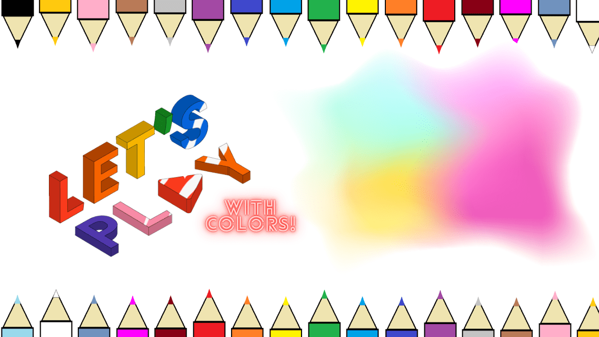
Ultimate CSS Colors: Let’s Learn While Playing with CSS Font Color!
Ultimate CSS Colors: Let’s Learn While Playing with CSS Font Color! Read More »

Explore modern UI/UX trends, CSS tricks, HTML tips, and coding tutorials. Stay updated with our hands-on guides to elevate your web design skills. Join us for fresh insights and grow your coding journey today!