
Among Web design concepts, the Box Model is a basic knowledge area in CSS that very much concerns layout design. The Box Model explains the way elements placed on the page are laid and situated, which influences horizontality, and general coherence.
Beyond outlining the background and border of the Box Model, this guide guides you through padding, margin, and box-sizing so you can obtain complete control of the layout. To embark on a professional level of designing your web projects, it is important to learn about the Box Model regardless of your level of programming.
In today’s post, we will dive deep into the background property and Border Property of the Box Model In CSS.
Box Model In CSS:
The Box Model in CSS is a fundamental concept that leads to the process of structuring and displaying elements on a web page. This model denotes that for each document tree element, a rectangular box is generated, comprising content, padding, border, and margin. The understanding of the Box Model comes in handy while controlling the layout and spacing of elements in web design.
Box Model Components:
- Background: The background property defines the color or image of the content area, padding, and borders to provide the foundation layer of an element visually.
- Content: The innermost part of the box, which contains the text or picture.
- Padding: The space between content and border. Padding just adds the internal spacing within the box, inside of its actual size.
- Border: Is a line around the padding if it exists, and content. It adds thickness and can also be of different styles and colors.
- Margin: The space between the border and other elements on the page is called the margin. This could be used to separate an element from another.
- Width: The physical measure of an element’s content area in the horizontal direction and it does not include border, margin, or padding.
- Height: The height property defines the verticle size of any element’s content area and also does not include padding, borders, or margins.
Benefits of Understanding the Box Model
- Accurate Control Over Layout: Understanding the box model allows great detail in laying out elements on a web page; therefore, layouts can be clean and visually appealing.
- Consistent Design: Determining the relation of content, padding, border, and margin is very helpful in maintaining consistent spacing and alignment across a website, which also encompasses varying page sizes and screen dimensions.
- Responsive Design: Box Model helps create responsive designs by managing how elements will resize and reflow on different devices and in different screen resolutions.
- Debugging Efficiently: When layout issues arise, such as elements not aligning correctly, understanding the Box Model makes it easier to identify how to fix such problems.
- Optimized Performance: Proper use of the Box Model ensures space utility that is effective since it reduces margins and padding, which would make your design cluttered or inefficient.
Key Points of the Box Model
- Total Size of the Element: The total width and height of an element are calculated by adding the width/height of the content, padding, border, and margin.
- Box-Sizing Property: The Box Model, by default, adds padding and borders to the width and height of the element. The box-sizing: border-box property allows you to include padding and border within the width and height of the element for which it has been specified and hence makes the calculation of the layout pretty easy.
- Collapsing Margins: When the vertical margins of two adjacent elements come into contact, they collapse into one margin, taking the larger of the two margins rather than adding the two margins together.
- Padding and Border and How They Affect the Background: Background colors and images also extend underneath the padding and border areas but not underneath the margin.
- Importance in Flexbox and Grid: In modern layout systems like Flexbox and Grid, which rely on the box size and properties for space distribution, alignment, and order, the Box Model acquires special importance.
Now Let’s Study Each Component One by One.
CSS Background :
I decided to describe the background property of the Box Model at the beginning because it is the fundamental layer that defines the appearance of an element.
The background also goes beyond the area known as the content area, into the padding and the border, and so is crucial for the creation of visually consistent designs.
Looking at the background property, it is possible to define how the items in the box model will approach other items on the page.
Introduction:
Background properties under CSS mainly focus on providing you the opportunity to add depth to the creativity of your web design projects. You might be looking at applying a solid color, an image, or even implementing a combination of several background properties. These are the tools that you will understand how to utilize so that your website can show professionally polished content. In this blog, we will deeply focus on background-color, background-image, background-repeat, background-attachment, and background-position in detail, while touching upon the background shorthand. It contains detailed explanations of each paired with examples using code snippets of HTML and CSS to show their implementation.
1-background-color
This defines a solid color of the element for which this property is applied as the background. Probably, it is one of the basic properties that allows increased contrast and legibility for the user against backgrounds of different types, either by using a full-color change or by using a subtle shade. A property that can be applied to any HTML element, it supports different kinds of color values like:
- Color Names: Standard color names like red, blue, and green.
- Hexadecimal Values: A # followed by a six-digit code representing color, for instance, #ff0000 would represent red. It is followed by three pairs of hexadecimal digits, for instance, # ff0000.
- RGB Values: It uses the RGB model, for example, rgb(255, 0, 0) to specify colors.
- HSL Values: These represent colors through the Hue, Saturation, and Lightness model, for instance, hsl(0, 100%, 50%). This property is often used along with a number of other background properties as a fallback color, in case the background image fails to load.
Example :
<!DOCTYPE html>
<html lang="en">
<head>
<meta charset="UTF-8">
<meta name="viewport" content="width=device-width, initial-scale=1.0">
<title>Background Color Example</title>
<style> // Inline css
body {
background-color: #f0f8ff; /* AliceBlue */
}
.header {
background-color: #4682b4; /* SteelBlue */
color: white;
padding: 20px;
text-align: center;
}
.content {
background-color: #e6e6fa; /* Lavender */
padding: 20px;
}
</style>
</head>
<body>
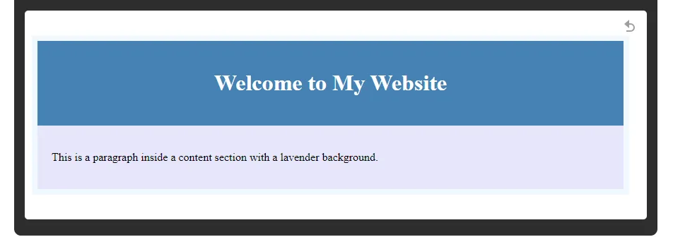
<div class="header">
<h1>Welcome to My Website</h1>
</div>
<div class="content">
<p>This is a paragraph inside a content section with a lavender background.</p>
</div>
</body>
</html>
2-background-image
The background-image property is used to set an image as an element’s background property. In such a case, the image can be used as a simple static visual element or a dynamic repeating pattern. You can specify an image with the help of a URL, which can be relative or either absolute. This property supports:
- Single Image: Apply a single image to the background
- Multiple Images: You can layer multiple background images by separating them with a comma. The first listed is the top image, and the second forms the background of the first which means after 1st appears on the top, other images appear beneath it.
Any time a background image is used, it is typically in places where a visual brand or theme designs are applied or where a more dynamic background is applied, such as hero sections/banners or the entire background of the web page.
Example :
<!DOCTYPE html>
<html lang="en">
<head>
    <meta charset="UTF-8">
    <meta name="viewport" content="width=device-width, initial-scale=1.0">
    <title>Background Image Example</title>
    <style> // Inline css
        body {
            background-image: url('background.jpg');
            background-color: #cccccc; /* Fallback color */
        }
        .header {
            background-image: url('header-bg.jpg');
            color: white;
            padding: 20px;
            text-align: center;
        }
    </style>
</head>
<body>
    <div class="header">
        <h1>Welcome to My Website</h1>
    </div>
</body>
</html>

3-background-repeat
The background-repeat property determines how the background image will be repeated over the element. The background-repeat property allows for more detailed control of the background image’s appearance:
- repeat: The image will be horizontally and vertically repeated, occupying the space on the full-size element.
- no-repeat: It’s going to display the image only once and without repetition.
- repeat-x: It will repeat the image horizontally across an element.
- repeat-y: Will keep the repetition of the image but only down the element in a vertical manner.
This property is especially handy when dealing with patterns, or when you need the background image to remain still, not overlapping or tiling in any unwanted way.
Example :
<!DOCTYPE html>
<html lang="en">
<head>
<meta charset="UTF-8">
<meta name="viewport" content="width=device-width, initial-scale=1.0">
<title>Background Repeat Example</title>
<style> // Inline css
body {
background-image: url('background.jpg');
background-repeat: no-repeat;
background-color: #cccccc; /* Fallback color */
}
</style>
</head>
<body>
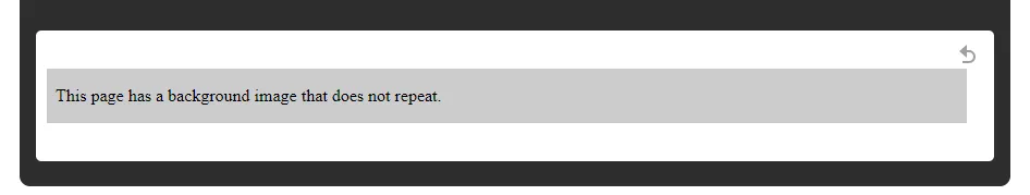
<p>This page has a background image that does not repeat.</p>
</body>
</html>
4-background-attachment
The background-attachment property sets whether a background image is fixed or scrolls with the containing block/area:
- scroll: The background image is intended to scroll along with the content. This is the default.
- fixed: The background image doesn’t move and just stays fixed at one place within the viewport while the content is scrolling. Normally used for a parallax scrolling effect when the background image seems to move at a different speed than the content.
- local: The background image scrolls with the element’s content if the element has a scrollbar. This is less common but can be useful in specific scenarios.
This property enhances the appearance of a webpage in relation to user engagement, more so with designs using large, immovable background images.
Example:
<!DOCTYPE html>
<html lang="en">
<head>
<meta charset="UTF-8">
<meta name="viewport" content="width=device-width, initial-scale=1.0">
<title>Background Attachment Example</title>
<style> // Inline css
body {
background-image: url('background.jpg');
background-attachment: fixed;
background-color: #cccccc; /* Fallback color */
}
</style>
</head>
<body>
<div style="height: 1000px;">
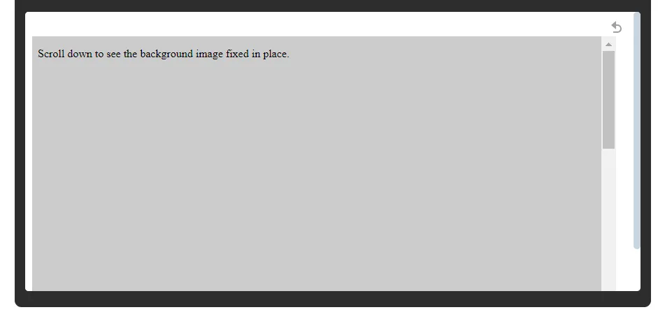
<p>Scroll down to see the background image fixed in place.</p>
</div>
</body>
</html>
5-background-position
The background-position property defines the initial placement of the background image in an element. This property can be used to specifically define the position of the background image:
- Percentage Values: The default is 50% and 50%, which centers the image in the element. 0% 0% places the image in the top-left corner.
- Keyword Values: Use keywords such as top, right, bottom, left, or center to place the image at a given location.
- Pixel Values: Any valid can also be used for example values for the positioning of the background image, 10px 20px.
This is especially handy when the background image has to fit in alignment with some of the other design elements, or even when you are working on somewhat complex layouts where the position of the image has to be just right.
Example:
<!DOCTYPE html>
<html lang="en">
<head>
    <meta charset="UTF-8">
    <meta name="viewport" content="width=device-width, initial-scale=1.0">
    <title>Background Position Example</title>
    <style>  // Inline css
        body {
            background-image: url('background.jpg');
            background-position: center;
            background-repeat: no-repeat;
            background-color: #cccccc; /* Fallback color */
        }
    </style>
</head>
<body>
    <p>The background image is centered within the viewport.</p>
</body>
</html>

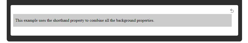
6-background (shorthand property)
This property lets you combine multiple background properties into a single line. This property follows these rules.
- Value Ordering: Typically, the order of values would be background-color, background-image, background-repeat, background-attachment, background-position
- Omitting Values: If you omit values, they will revert to their defaults: In the aforementioned example, if you omit the value for a “background-repeat”, it will revert to “repeat”.
Short-hand property is a very neat and tidy way of writing your CSS, especially for big projects where a single element has several background properties applied.
Example:
<!DOCTYPE html>
<html lang="en">
<head>
    <meta charset="UTF-8">
    <meta name="viewport" content="width=device-width, initial-scale=1.0">
    <title>Background Shorthand Example</title>
    <style>  // Inline css
        body {
            background: #cccccc url('background.jpg') no-repeat fixed center;
        }
    </style>
</head>
<body>
    <p>This example uses the shorthand property to combine all the background properties.</p>
</body>
</html>
CSS Borders :
Borders:
The border property of CSS is a property that sets the boundary of an HTML element. By setting borders, you could attach visual structuring to a webpage and could clearly define and set off the sections, buttons, images, or whatever other content is displayed. The border property could enable you to set the style, width, and color of the border.
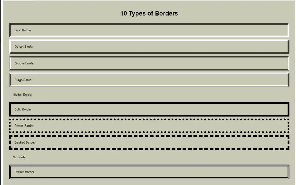
Border Styles:
- solid – A single solid line.
- dotted – A series of dots.
- dashed – A series of dashes.
- double – Two solid lines.
- groove – A 3D grooved line.
- ridge – A 3D ridged line.
- inset – A border that makes the containing element appear embedded.
- outset: A containing that makes the containing element appear raised.
- none – No border.
- hidden – Similar to none, but used in certain table scenarios. Borders are used to outline the structure of an element and to separate it clearly from other content. Borders are thus normally applied to all elements which contain images, paragraphs, and divs.
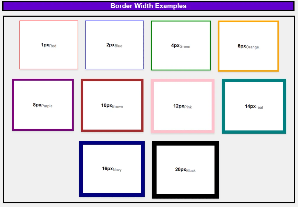
Border Width:
The border-width property establishes what width a border around an element should have. The property can have different specific measurements or even predefined values:
- Predefined values: thin, medium, thick.
- Specific measurements: values in pixels (px), ems (em), or percentages.
The width may be the same for all sides or different for each side of the element. For instance, you would want to have a thick border at the top, and a thinner one at the sides for a specific visual effect.
Sides of the border:
CSS gives you control over the border at each side of an element using properties such as:
- border-top
- border-right
- border-bottom
- border-left
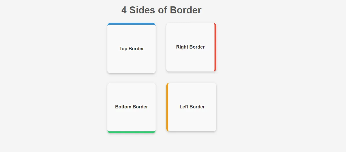
These properties can define different styles, widths, and colors for each side of an element. This is useful in complex layouts where you may want to draw attention to one side of a border compared to the others, like underlining headings or creating a left-hand sidebar divider.
Border-Color:
Property border-color sets the color of the border around an element. It can take the values:
- Color names: e.g., red, blue, green.
- Hexadecimal values: e.g., #ff0000 for red.
- RGB values: e.g., rgb(255, 0, 0).
- HSL values: e.g., hsl(0, 100%, 50%).
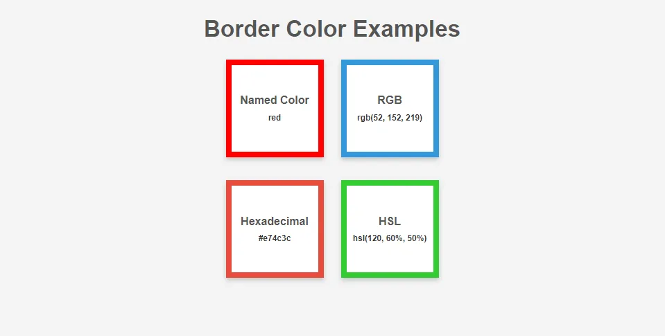
You can also set the color for each side of the border via border-top-color, border-right-color, border-bottom-color, and border-left-color. This makes it very flexible and it is popular for making creative designs or emphasis like multi-color borders or certain elements.
Border Radius:
A basic technique to obtain rounded borders, border-radius is a very important property in making boxes, buttons, and images in design less harsh, modern, and attractive.
- Single value: It uses only one value to define the radius for all corners.
- Multiple values: It involves different values of radius for each corner-one such value is(10px 20px 30px 40px for the t-l, t-r, b-r, b-l).
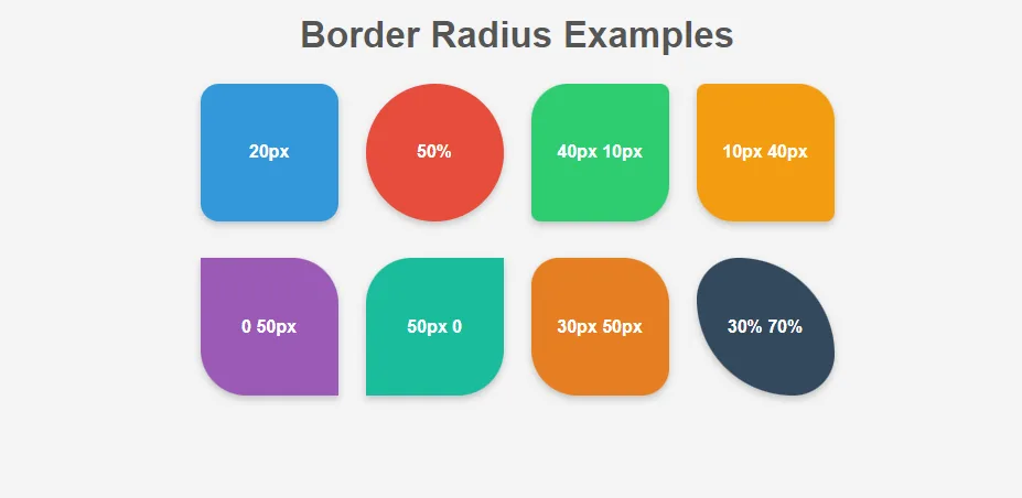
This makes it very helpful to create circles and ovals, as well as other shapes. For example, if set at 50%, the border-radius will make a square into a perfect circle.
Border (shorthand):
This is another CSS property, which is defined within one property for all the border properties, hence installing simplicity. It allows you to set width, style as well as color in one declaration.
Order:
- border-width
- border-style
- border-color
Shorthand property is a very powerful property that helps keep the CSS small and maintainable. For example, while defining the border, the shorthand would cover width, style, and color all in a single-line definition.
Conclusion:
In this post, we have pursued the CSS box model basics, focusing on two important components: borders and backgrounds. Where the border wraps up the content and padding, defining the extent of an element is basically what it does: adding structure and visual importance.
On the other hand, the background covers not only the content area but also extends to the padding and border areas, embedding the two aspects into a cohesive and visually engaging design.
As you go deeper and deeper into the Box Model and start using it within your work, knowledge of these components will grant you the ability the ability to make more controlled and beautiful layouts.
Keep your eyes open, as soon as we update this post with a continuation on the other components of the Box Model: padding, margin, and content, i.e., it will be a truly complete guide on mastering web design.
Read more about web development.
If you want more information regarding similar topics, do visit our CSS Home page where we discuss all the basics of styling in Surface. Furthermore, if you need more information regarding the various advanced CSS properties, go to the MDN Web Docs for the CSS specifications reference.
If you have any queries, you can also contact us.
Quiz:
Want to test your knowledge? visit Box Model in CSS Quiz
Next Part:
The remaining Topics are discussed in “The Box Model in CSS: Complete Guide to Content, Padding, Margin, Width, and Height”
FAQs:
Q. How do I find the hex code for a color?
Identifying the hex code of color, is very easy to do using graphics design tools such as the Adobe Photoshop color picker option or Internet color picker tools such as ColorPicker. You can also check an element’s color in the browser by selecting the element with a right click -> inspect -> elements and seeing its color properties.
Q. How do I change the background opacity in CSS?
When changing the background opacity in CSS, use the property background-color and the value rgba(r, g, b, a). RGBA format helps you to set the transparency level by using the fourth argument named Alpha which ranges in a scale where 1 is representative of full opacity and 0 represents full transparency. For example, background-color: rgba(255, 0, 0, 0, 0.5); puts the red semi-transparent background.
Q. How do I make my background transparent?
I have often asked myself some questions, such as, How can I make my background transparent? If you specifically want the background to be unseen or invisible, it is very easy to do because all you have to do is provide the background color code of ‘transparent’. This will take away background color so that the element has complete background transparency and the content that is behind it is visible.
Q. How do I change the background color of a web page?
If you want to change the background color of the entire web page, you must use the CSS declaration background-color on the body tag. For example, body { background-color: The code #f0f0f0} will set the background color of the whole page to light gray.
Q. How do you put a border inside a box in CSS?
To place a border inside a box without affecting its overall dimensions, use the box-sizing, and it should not take anything into account that is not either a border-box or a property of that box. This makes it possible to skin the padding and border in the width and height parameters so that the layout is as expected.
Q. What is border-box in CSS?
border-box is a value that has been defined for a property of CSS called box-sizing. When you use box-sizing: border-box, the padding and border of an element do not increase its width and height, but rather the size is kept as fixed as specified. This helps in managing layout because one does not have to worry about the element size expanding due to the setting of padding and borders.


It improved my crafting layout skill…
What’s Going down i am new to this, I stumbled upon this I’ve found It absolutely useful and it has helped me out loads.
I’m hoping to contribute & help other users like its aided me.
Good job.