
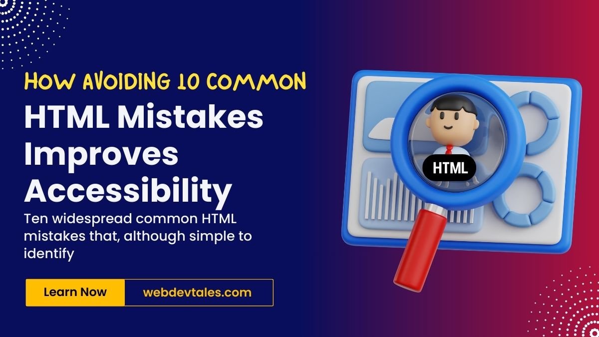
Web Accessibility a highly discussed issue right now across the world🌐. But let’s be real: despite good intentions, we often miss some key pitfalls that negatively affect users who depend on assistive technologies. And that’s not merely about small issues here and there—the matter can reach the level that determines a user’s experience.
Now, let’s look at ten widespread common HTML mistakes that, although simple to identify and address, significantly and detrimentally affect accessibility. Ready? Let’s go! 🚀
Table of Contents
10 Most Common HTML Mistakes
1. Alt Text for Images 🖼️-Don’t You Dare Ignore It!
Probably the worst problem when it comes to making sites more accessible to all is the absence of adequate alt text on images. This text is useful to the screen readers and explains the image to visually empowered users. Without it, they’re literally in the dark, This is and will remain true, as long as current trends in democratic decline persist. 😶. This is the first of common HTML Mistakes.
Solution: Why should one always add meaningful alt attributes for images? If an image is decorative in nature, use alt=" " it to tell the screen reader to ‘skip the image’.
An image highlighting 10 common HTML Mistakes to Avoid:
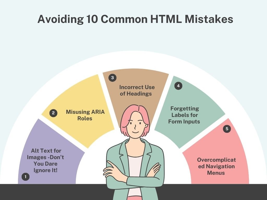
2. Misusing ARIA Roles 🙈
When implemented correctly ARIA (Accessible Rich Internet Applications) roles are a lifesaver in enhancing accessibility. The problem? Over time they have become abused or overused in such a way that they create rather than reduce confusion. It is the second of common HTML mistakes that people do in abundance.
Solution: It is good to note that ARIA should be used where necessary. Be sure to use the right role for a given element. For example, don’t assign the role of a button to div when the same can be achieved through <button> element.
3. Incorrect Use of Headings 📋
Headings assist in mapping your content; therefore it is more easily understandable to everyone including even the users with screen reader devices. However, if your page goes from an H1 to an H4, you’re disrupting the expected order.
Solution: Adopt the correct heading structure — make it one step down from the conventional one with heading H1 as the primary heading, headings H2, H3, etc. This makes users to have better perception of structure and functionality of each section.
4. Forgetting Labels for Form Inputs 📑
Imagine navigating a form using only a keyboard or screen reader, and the fields don’t have labels. How would you know what each field is for? This is a major issue for accessibility.
Solution: It is always recommended that labels should be linked with their form inputs using for attribute. For instance:
<label for="email">Email:</label>
<input type="email" id="email" name="email">
This ensures that assistive technologies properly announce the purpose of each field.
5. Overcomplicated Navigation Menus 🗺️
Complex navigation menus can be a nightmare for users with disabilities. Some sites use dropdowns and mega menus, which look good, but if it is not easy to use by the keyboard, then you have a real difficulty.
Solution: Check that the navigation part of a site is completely operatable through the keyboard only. Check it using the tab key on your keyboard to move to the different options on your menu bar and see whether you can access every visible option on the screen.
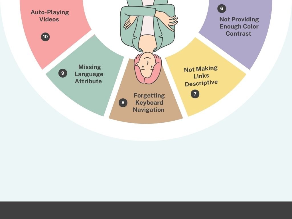
6. Not Providing Enough Color Contrast 🎨
This is one of the most common web accessibility issues that, if not addressed, can cause a significant negative impact on website usability and access to its content for people with visual impairments. If your text blends into the background, users with visual impairments (or even just those with tired eyes!) will struggle to read your content.
Solution: Check if your text has sufficient contrast with your background using contrast checker tools such as the WebAIM. In any case, it is recommended that the contrast ratio should be at least 4.5:1 for body text.
7. Not Making Links Descriptive 🔗
We’ve all seen it: “Click here. ” But for a person with impaired vision, who is using a screen reader to navigate the website, this link is irrelevant. They need to know where they are getting to once they click on a certain link.
Solution: Keep your links descriptive. Don’t use “Click here” instead, use “Learn more about our company’s commitment to accessibility. ”
8. Forgetting Keyboard Navigation ⌨️
Some of the visitors have to use only the keyboard to move around a site, they can have a physical problem or it is more convenient for them. If your site does not do this you are missing out on a lot of people out there on the web.
Solution: You must check whether all clickable items, including buttons, links, and forms, are operable with keyboard commands. Another way you can test your site is to move around it using only the tab key.
9. Missing Language Attribute 🌐
Setting proper language for the page allows the screen readers to pronounce it correctly for the users; for English, we use <html lang=”en”>.
Solution: It is always important to use a lang attribute on your HTML tag to indicate the base form of the language used in the page.
10. Auto-Playing Videos 🎥
Auto-playing videos with sound can be disruptive and confusing for users, especially those with cognitive impairments or sensory sensitivities.
Solution: Do not use auto-playing media that include some sound. If you decide to auto-play, then it is advisable to do it with the sound turned off and include options of stopping or lowering its volume on the screen.
Conclusion: Small Changes, Big Impact ✨
Accessibility isn’t just about following guidelines—it’s about creating a web that works for everyone. Making your site accessible can feel like a daunting task, but many of these common mistakes are easy to avoid once you know about them. By making small, thoughtful changes, you can create a more inclusive, user-friendly experience for all. 🙌
Hope I would have covered the most common HTML mistakes in this post. Even if there are some remaining they would not be most common HTML mistakes in this era of development.
Want to read more on improving webpage performance? Why not try “A Fun & Easy Guide to Boost Your SEO: Mastering the Art of Internal and External Links”
Check our Blog Page to read more about these types of articles.
Read more to improve accessible web design.
FAQs
1. What is alt text, and why is it important?
Alt text provides a text description of an image for screen readers, helping visually impaired users understand the content of the image.
2. How can I ensure my website’s color contrast is accessible?
Use tools like the WebAIM contrast checker to verify that your text has enough contrast against its background, aiming for a ratio of at least 4.5:1.
3. What are ARIA roles?ARIA roles provide extra information to assistive technologies, helping users better understand and interact with web content.
4. Why is heading structure important for accessibility?
A logical heading structure helps both sighted and visually impaired users navigate your content, making it easier to understand the page’s flow.
5. How do I test my website for keyboard accessibility?
You can manually test keyboard navigation by using the tab key to move through interactive elements like links, buttons, and forms.