
Box Shadow Generator – User Guide
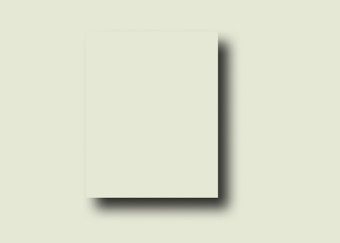
The Box Shadow Generator is a powerful tool that allows you to create custom shadows for your web elements with ease. Whether you’re a designer or developer, this tool helps you generate CSS, Tailwind, or SCSS code for beautiful box shadows in seconds.
Key Features:
✔ Real-time Preview – See changes instantly.
✔ Multiple Presets – Choose from 30+ professionally designed shadows.
✔ Code Export – Get CSS, Tailwind, or SCSS code with one click.
✔ Fully Customizable – Adjust position, blur, spread, color, and opacity.
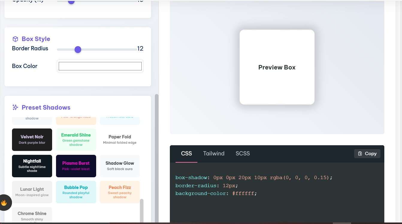
How to Use the Box Shadow Generator
1. Adjusting Shadow Properties
The tool provides several sliders and color pickers to customize your shadow:
Position Controls
Horizontal Offset (px): Moves the shadow left (negative) or right (positive).
Vertical Offset (px): Moves the shadow up (negative) or down (positive).
Blur & Spread Controls
Blur (px): Softens the shadow edges (higher = more blur).
Spread (px): Expands (positive) or shrinks (negative) the shadow size.
Color & Opacity
Shadow Color: Choose any color using the color picker.
Opacity (%): Adjusts transparency (0% = invisible, 100% = fully opaque).
Box Style
Border Radius (px): Rounds the corners of the box.
Box Color: Changes the background color of the preview box.
2. Using Presets
The generator includes 30+ ready-made shadow presets for quick styling:
Soft Shadow – Subtle, natural-looking shadow.
Material Elevation – Google’s Material Design-inspired shadow.
Neon Glow – Bright, glowing effect.
Clay Morphism – Soft 3D clay-like shadows.
Brutalist – Sharp, high-contrast shadows.
How to Apply a Preset:
Scroll through the Preset Shadows section.
Click any preset to apply it instantly.
Tweak further if needed.
3. Exporting Code
Once you’re happy with your shadow, you can copy the code in three formats:
CSS
Standard CSS for direct use in stylesheets:

Tailwind
For Tailwind CSS users:

SCSS
For SCSS/Sass projects:
How to Copy Code:
Select the desired tab (CSS, Tailwind, or SCSS).
Click the “Copy” button.
Paste into your project!
Tips for Best Results
✅ For Depth: Increase blur and opacity slightly.
✅ For Floating Effect: Use a negative spread value.
✅ For Soft Shadows: Keep opacity low (10-20%).
✅ For Neon Effects: Use bright colors with high opacity.
Troubleshooting
❌ Shadow Not Updating?
Ensure all sliders are properly adjusted.
Check if the opacity is too low.
❌ Code Not Copying?
Try clicking the “Copy” button again.
Check browser permissions for clipboard access.
Conclusion
The Box Shadow Generator simplifies shadow creation for websites and apps. Whether you need a subtle drop shadow or a dramatic glow effect, this tool helps you achieve the perfect look in seconds.