Understanding the Box Model in CSS is important for any responsive and structured web designer. Master how content, padding, borders, and margins interact, and you will have attractive layouts that work great on multiple devices. We will be learning this with examples in code and browser-ready visuals to explain each of these concepts.
Table of Contents
The Box Model in CSS
What is the Box Model?
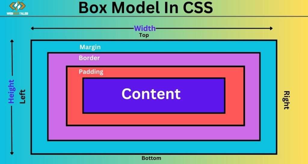
The Box Model describes how every HTML element is represented on a webpage. Each element is treated as a rectangular box containing several layers: content, padding, border, and margin. The structure also affects the layout and spacing of the elements on a webpage.
The Purpose of the Box Model in Web Design
The CSS Box Model makes sure that each element has clearly defined boundaries and spacing relative to other elements. These boundaries are key to arranging a clean and structured page layout, especially in responsive web design.
Key Components of the Box Model

1. Content Area
The content area is the heart of the Box Model, where text, images, or other media are displayed.
<div class="content-box">This is the content area</div>
.content-box {
  width: 200px;
  height: 100px;
  background-color: #f0f0f0;
  border: 1px solid #000;
}
This code creates a 200px wide and 100px high content area with a border around it. The content itself—whether text or an image—fits within these dimensions.
Preview:

2. Padding
Padding is the space between the content area and the border. Adding padding pushes the content inward, creating more breathing room inside the box.
<div class="padded-box">Padded Content</div>
.padded-box {
  width: 200px;
  padding: 20px;
  background-color: #d4edda;
  border: 2px solid #155724;
}
In this example, the 20px padding creates extra space inside the element, pushing the content away from the border. The overall width of the box now increases because of the padding (if using the default content-box model).
Preview:

3. Border
The border forms the edge of the element, visually separating it from other elements on the page.
<div class="border-box">Box with Border</div>
.border-box {
  width: 200px;
  padding: 10px;
  border: 5px solid #007bff;
  background-color: #e9ecef;
}
This example applies a 5px blue border around the content area. The border thickness adds to the box size unless you use the box-sizing property (more on that later).
Preview:

4. Margin
Margins create space between elements on the page, ensuring they don’t touch or overlap.
<div class="margin-box">Box with Margin</div>
.margin-box {
  width: 200px;
  padding: 10px;
  margin: 20px;
  border: 2px solid #343a40;
  background-color: #f8f9fa;
}
Here, the 20px margin provides space around the box, ensuring that no other element is placed too close to it.
Preview:

How the Box Model Works: Understanding Width and Height
In the default CSS Box Model, if you define width and height for an element, it is only defined for the content area. The dimensions include width and height exclusively and do not extend to padding, bordering, or margins. This common situation often creates confusion when creating design layouts.
<div class="default-box">Default Box Model</div>
.default-box {
  width: 300px;
  padding: 20px;
  border: 5px solid #000;
  margin: 10px;
  background-color: #fff3cd;
}
In this example, while the width is set to 300px, the actual width of the element is 350px due to the additional 20px padding and 5px border on both sides.
Preview:

Adjusting Width and Height Based on Box-Sizing
The box-sizing property also comes in handy; it allows you to include the padding and the border within the width and the height.
<div class="border-box-sizing">Box with Border-Box Sizing</div>
.border-box-sizing {
  width: 300px;
  padding: 20px;
  border: 5px solid #007bff;
  box-sizing: border-box;
  background-color: #f1f1f1;
}
With box-sizing: border-box, the total width remains 300px despite the padding and border. This approach simplifies layout calculations and is widely recommended for modern web design.
Preview:

Box-Sizing Property: Content-Box vs Border-Box
There are two main types of box-sizing:
content-box(default): The width and height apply only to the content area. Padding and borders are added outside these dimensions.border-box: The width and height include the padding and border, making it easier to manage element sizes.
Here’s a comparison using two boxes:

In the browser, you’ll notice that the border-box element retains a width of 200px, while the content-box element’s total width exceeds this due to the added padding and border.
Content Area: The Heart of the Box Model
The content area is where your actual data or media sits, whether it’s text, images, or other elements. Its size is defined by the element’s width and height.
How Content Affects Layout
In many cases, the content inside an element will dictate how much space is required, and CSS properties like width, height, or even flex can help control how content behaves.
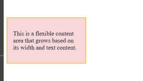
<div class="content-area-example">
  <p>This is a flexible content area that grows based on its width and text content.</p>
</div>
.content-area-example {
  width: 50%;
  padding: 15px;
  border: 2px solid #ffc107;
  background-color: #f8d7da;
}
In this example, the content area is 50% of the viewport width, demonstrating how content adapts in a responsive layout.
Preview 1:

Preview 2:

Preview 3:

Padding: Creating Space Inside the Box
Padding provides space between the content and the border, without affecting external elements.
How Padding Impacts Box Sizing
When using the content-box model, padding will increase the element’s size. With border-box, padding is included inside the width and height.
<div class="padding-box">Content with Padding</div>
.padding-box {
  width: 200px;
  padding: 20px;
  background-color: #d1ecf1;
  border: 1px solid #0c5460;
  box-sizing: border-box;
}
In this example, the box-sizing: border-box ensures that the total width remains 200px, despite the added padding.
Preview:

Border: The Edge of the Box
Borders provide a visual separation between elements. You can customize them with different styles, colors, and widths.
<div class="custom-border-box">Custom Border Box</div>
.custom-border-box {
  width: 200px;
  padding: 15px;
  border: 10px dotted #17a2b8;
  background-color: #e2e3e5;
  box-sizing: border-box;
}
This example applies a 10px dotted border, which is included in the total width and height due to box-sizing: border-box.
Preview:

Margin: The Outer Spacing of the Box
Margins push elements away from each other, creating external space. They don’t affect the internal size of the element but impact the layout flow.
Understanding Margin Collapse
In some cases, margins between two adjacent elements may “collapse” into a single margin. This occurs when both elements have margins, and instead of summing them, the larger margin is applied.
<div class="first-box">First Box</div>
<div class="second-box">Second Box</div>
.first-box {
  margin-bottom: 20px;
  padding: 10px;
  background-color: #d4edda;
}

.second-box {
  margin-top: 20px;
  padding: 10px;
  background-color: #cce5ff;
}
In this case, the total margin between the two boxes remains 20px, not 40px, due to margin collapsing.
Preview:

Practical Example of the CSS Box Model
Let’s see a practical example where multiple Box Model properties are used together.
<div class="practical-box">Practical Box Model Example</div>
.practical-box {
  width: 300px;
  padding: 15px;
  margin: 25px;
  border: 5px solid #dc3545;
  background-color: #fefefe;
  box-sizing: border-box;
  transition: transform 0.3s ease-in-out;
}

.practical-box:hover {
  transform: scale(1.1);
}
Here, the box uses all key properties of the Box Model, and on hover, it scales up slightly with a CSS transition for a smooth visual effect.
Preview:

NOTE: You need to test the visual effect in your own browser.
Best Practices for Using the Box Model
Handling Responsive Design with the Box Model
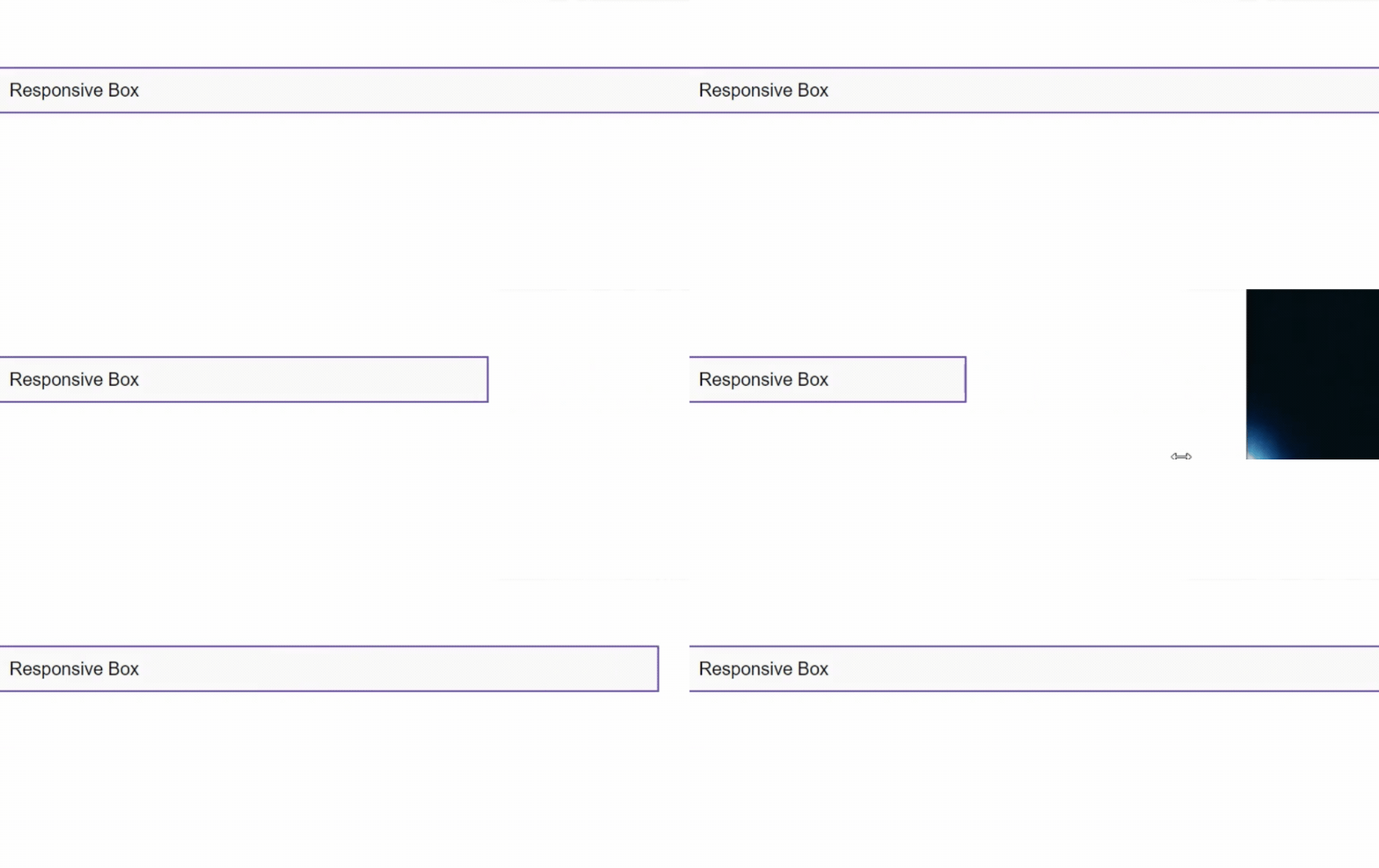
Using percentage-based widths and the border-box sizing model helps ensure that elements resize correctly across various screen sizes.
<div class="responsive-box">Responsive Box</div>
.responsive-box {
  width: 50%;
  padding: 10px;
  border: 2px solid #6f42c1;
  background-color: #f9f9f9;
  box-sizing: border-box;
}
This 50% width box adapts to the screen size, ensuring a responsive design.
Preview:

How to Inspect the Box Model in Browsers
You can easily inspect the Box Model in most browsers by right-clicking an element, selecting “Inspect,” and navigating to the Computed or Styles tab. The developer tools will show you the exact size of the content, padding, border, and margin.
Conclusion: Mastering the CSS Box Model
Mastering the Box Model allows you to control layout and spacing with precision, ensuring that your designs are both functional and visually appealing. Whether you’re working on simple or complex layouts, understanding how each element of the Box Model works will help you create cleaner, more responsive web designs.
Quiz:
You can test what you have learned. Click Here.
You can also check another part of the Box Model to get the full idea of the Box Model.
You can also visit this site to read about Box Model.
FAQs
1. What is the main difference between padding and margin?
Padding creates space inside the element, between the content and border, while margin creates space outside, between the element and others.
2. How does the box-sizing property affect layout?
The box-sizing property defines whether the padding and border are included in the element’s total width and height (border-box) or not (content-box).
3. Can the Box Model affect page load times?
Yes, inefficient use of large padding and margins can increase page size and affect load times, especially on mobile devices.
4. How do I handle box sizing in responsive web design?
Use percentage-based widths and box-sizing: border-box to ensure elements resize properly across different screen sizes.
5. What are common mistakes when using the Box Model?
A common mistake is miscalculating the total element size by forgetting to account for padding and borders. Using box-sizing: border-box helps prevent this issue.


