
This is Day 1 of our AI-powered frontend experiment — and we’re starting strong by building a clean, animated Blog Card UI using BlackBox AI’s “Image to App” feature. No manual coding at the start, just smart prompts and sharp feedback.
Video Tutorial:
🧠 Step 1: Upload an Image. Let AI Do Its Thing.
We began with a simple UI mockup of a blog card — title, image, category tag, and some content.
We uploaded it into BlackBox AI’s Image to App tool and waited a few seconds…
✨ Boom — the AI generated a full HTML + TailwindCSS layout in seconds. No copy-paste from Dribbble or rebuilding in Figma — it actually gave us code based on the design alone.
🎨 Step 2: Design Was Okay… But Not There Yet.
The base layout was solid — structure-wise, it gave us something usable. But visually? It lacked flair.
So, we started guiding it:
- Asked for hover effects to make it interactive
- Tweaked margins, borders, and shadows
- Improved typography and spacing
It handled the changes shockingly well — like a junior dev you can train on the fly.
🏷️ Step 3: Fix the Category Tag
Here’s where it got tricky.
The category tag (e.g., “Tech”, “Design”) was sitting weirdly — positioned relative to the card, not the image.
We wanted it to sit at the bottom-left corner of the image, not the card container.
So, we gave it very specific instructions:
“Position the tag at the bottom left of the image section, not the entire card.”
And… guess what? It did it. Precise placement, no CSS chaos.
✨ Step 4: Add Hover-Based Reveal
We wanted more depth — so we asked the AI to:
“Show the category tag only on hover.”
Surprisingly, it gave us a whole new design idea:
Instead of just showing the tag, it created a ‘View More’ button that appears on hover.
Unexpected, but cool. We loved the creative direction and kept it.
🧼 Step 5: Convert Tailwind to Pure CSS
By default, the AI uses Tailwind CSS, but we wanted this version in vanilla CSS for flexibility and custom styling.
We just asked:
“Convert this design into standard CSS.”
Within moments, we had a clean, readable HTML + CSS version — no dependencies, no extra classes.
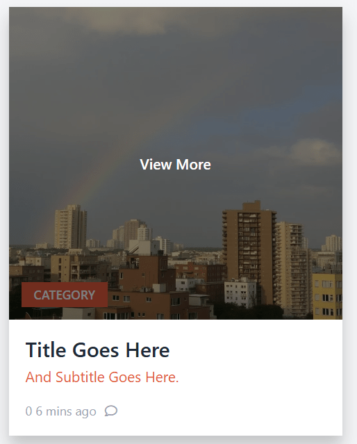
✅ Final Result: A Responsive, Interactive Blog Card
What started as a static image became a real, working component — styled, interactive, and production-ready.
🛠️ Built in 4 minutes
💡 Guided by creative prompts
🎨 Polished with developer vision
This was not just code generation — this was co-creation.
Full Code:
<html lang="en">
<head>
  <meta charset="utf-8" />
  <meta content="width=device-width, initial-scale=1" name="viewport" />
  <title>Card Example with Hover Tag</title>
  <link
    href="https://cdnjs.cloudflare.com/ajax/libs/font-awesome/5.15.3/css/all.min.css"
    rel="stylesheet"
  />
  <style>
    body {
      background-color: #f3f4f6;
      padding: 1.5rem;
      display: flex;
      justify-content: center;
      align-items: center;
      min-height: 100vh;
      margin: 0;
      font-family: system-ui, -apple-system, BlinkMacSystemFont, "Segoe UI",
        Roboto, Helvetica, Arial, sans-serif, "Apple Color Emoji",
        "Segoe UI Emoji";
    }

    .card {
      background-color: white;
      max-width: 20rem;
      width: 100%;
      box-shadow: 0 1px 3px rgb(0 0 0 / 0.1);
      cursor: pointer;
      transition: box-shadow 0.3s ease;
    }

    .card:hover {
      box-shadow: 0 10px 15px rgb(0 0 0 / 0.2);
    }

    .image-wrapper {
      position: relative;
    }

    .image-wrapper img {
      width: 100%;
      height: 300px;
      object-fit: cover;
      display: block;
    }

    .category-tag {
      position: absolute;
      bottom: 0;
      left: 0;
      margin-left: 0.75rem;
      margin-bottom: 0.75rem;
      background-color: #e25a3c;
      color: white;
      font-weight: 600;
      font-size: 0.75rem;
      padding: 0.25rem 0.75rem;
      user-select: none;
      z-index: 10;
      font-family: inherit;
    }

    .hover-link {
      position: absolute;
      inset: 0;
      background-color: rgba(0, 0, 0, 0.5);
      color: white;
      font-weight: 600;
      font-size: 0.875rem;
      display: flex;
      justify-content: center;
      align-items: center;
      opacity: 0;
      transition: opacity 0.3s ease;
      text-decoration: none;
      z-index: 20;
      font-family: inherit;
    }

    .image-wrapper:hover .hover-link {
      opacity: 1;
    }

    .content {
      padding: 1rem;
    }

    .title {
      color: #1f2937;
      font-weight: 600;
      font-size: 1.25rem;
      line-height: 1.25;
      margin: 0 0 0.25rem 0;
    }

    .subtitle {
      color: #e25a3c;
      font-size: 0.875rem;
      margin: 0 0 1rem 0;
    }

    .footer {
      display: flex;
      align-items: center;
      color: #9ca3af;
      font-size: 0.75rem;
      gap: 0.5rem;
    }
  </style>
</head>
<body>
  <div class="card">
    <div class="image-wrapper">
      <img
        src="https://storage.googleapis.com/a1aa/image/6bc55ec1-3e77-4ed2-63ce-2cbd9b12c46f.jpg"
        alt="Cityscape with buildings and a rainbow in the sky"
        width="600"
        height="300"
      />
      <span class="category-tag">CATEGORY</span>
      <a href="#" class="hover-link">View More</a>
    </div>
    <div class="content">
      <h2 class="title">Title Goes Here</h2>
      <p class="subtitle">And Subtitle Goes Here.</p>
      <div class="footer">
        <span>0 6 mins ago</span>
        <i class="far fa-comment"></i>
      </div>
    </div>
  </div>
</body>
</html>
🔜 What’s Next?
This is just Day 1. We’re experimenting daily with different UI elements — cards, navbars, loaders, forms — all powered by BlackBox AI.
We’ll keep pushing the boundaries of AI-assisted frontend development — showing how you can use AI not just to code, but to create.
Other Posts:
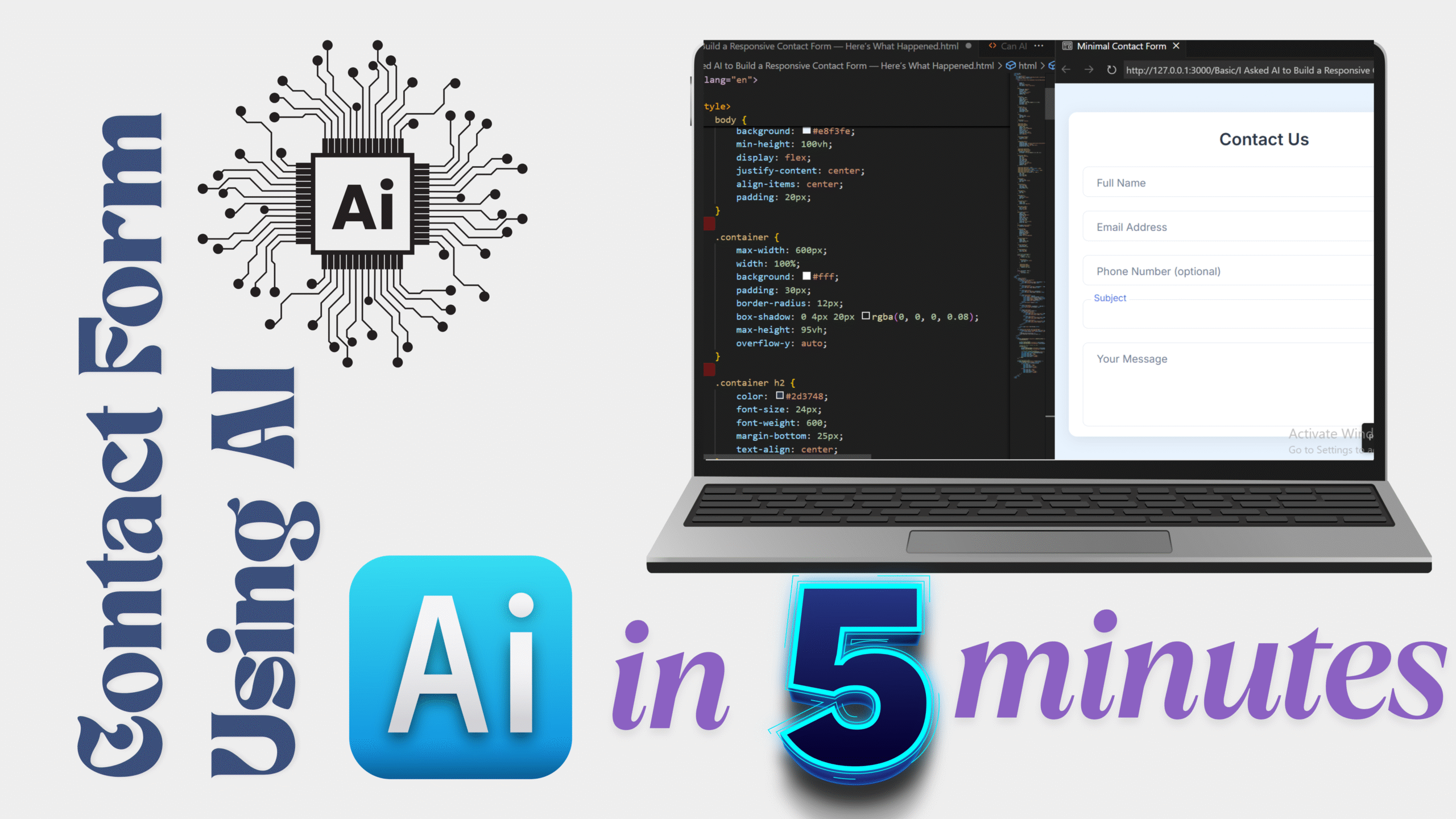
I Asked AI to Build a Responsive Contact Form