
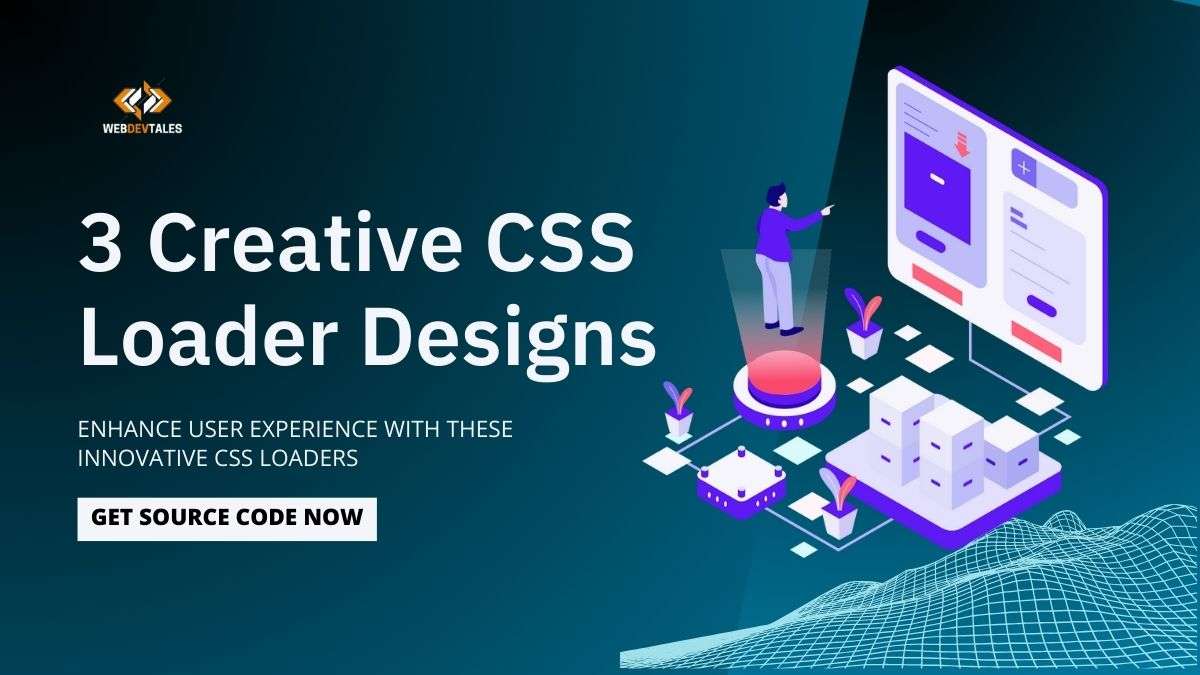
Yay! Today we begin our new series on CSS loaders! In this extensive guide, we will be presenting various elegant and attractive loaders that may be used to boost the visual appeal of your websites.
The first example that we’re going to show you is “Creating a Stylish CSS Loader with SVG Animations” and the second edition in the list, is the “Spinning Squares Loader: A Simple and Effective CSS Loader”, which is a fluid and lively and will perfectly fit into most modern sites.
That is just the beginning of the list of ways to implement the What-If tool in your QlikView environment. This post will be updated daily, and for each day we’ll present a new unique loader to spark your creativity and give you new code snippets.
For web developers who want to improve or for those of you who are in search of new inspiration, wait for the full list and guide on CSS loader designs to make your projects stand out.

Table of Contents
What is a CSS Loader?
CSS loaders are the essential and creative visual feedback given to the users while loading a web page or an application. They allow users to stay active and informed regarding whatever content they are waiting to see fetched or processed.
Using CSS with your loaders makes providing smooth, interactive animations easy without needing help from JavaScript or other extra libraries.
Importance of CSS Loaders in Web Design
Loaders are not just for show, but they are also an extremely important element in enhancing the experience of a user.
This shows that much waiting time feels much shorter and keeps them entertained while waiting for what is needed, especially in a web application with very long load times.
The good design of the loaders enhances the general look of the site and follows the brand’s visual identity.
1. Creating a Stylish CSS Loader with SVG Animations
This tutorial explains the step-by-step process of making a fancy CSS loader using SVG-based animations.
Highlight:

1. HTML Structure for CSS Loader:
We start by setting up the basic HTML structure for our loader. Each letter in the word “WEBDEVTALES” is represented by an SVG element. The SVGs are used to define the shapes and strokes of each letter, and they are animated to create a drawing effect.
2. SVG Definitions
If we want to add some color and gradient effects on a loader, we just need to define those using SVG definitions; most of them will be some definitions for our gradients inside a <defs>:
- Linear Gradients: These create smooth color transitions within the SVG paths. For example, we use different color stops to create vibrant effects using gradients.
3. CSS Styling and Animation
Basic Styling:
- Body: We vertically and horizontally center the loader using Flexbox and add a background for contrast.
- Loader Container: The class loader ensures all SVGs are shown inline.
SVG Path Animation:
- Stroke Properties: A stroke is attached to every SVG path defining its width. The animation to the stroke adds a feature of the dynamic draw effect.
Keyframe Animations:
- dashArray: This animation controls the appearance of the stroke so that it looks like it is being drawn. It manipulates the stroke-dash array style attribute, making it look like the path runs through a complete series.
- dash-offset: Animates the dash offset and makes the stroke move along the path smoothly.
4. Implementation Details
- Inline SVGs: every letter is an SVG element with the viewBox and path set on it specifically. The path data (d attribute) specifies the shape for every letter, whereas the stroke attribute gives the palatable gradient color.
- Path Length: As an attribute indicated, the length of a path; when using this attribute, it makes the path correctly scale concerning a letter’s size.
5. Result
Well, the following is a loader featuring SVG paths that draw each letter of ‘WEBDEVTALES’ on the fly with CSS animations. I’ve used an indefinite animation loop to continually keep the loader moving, so it offers an eye-catching visual effect to users.
This is a pretty flexible CSS loader design wherein you could play with different colors, stroke weights, and animation. Continue tuning and learning with us in detail to design more creative CSS loaders!
6. Complete Source Code:
<!DOCTYPE html>
<html lang="en">
<head>
  <meta charset="UTF-8">
  <meta name="viewport" content="width=device-width, initial-scale=1.0">
  <title>WebDevTales Loader</title>
  <style>
    body {
      display: flex;
      justify-content: center;
      align-items: center;
      height: 100vh;
      margin: 0;
      background-color: #151414;
    }

    .loader {
      display: flex;
    }

    .inline-block {
      display: inline-block;
    }

    .dash {
      stroke-width: 10;
      animation: dashArray 2s ease-in-out infinite, dashOffset 2s linear infinite;
    }

    @keyframes dashArray {
      0% {
        stroke-dasharray: 0 1 359 0;
      }

      50% {
        stroke-dasharray: 0 359 1 0;
      }

      100% {
        stroke-dasharray: 359 1 0 0;
      }
    }

    @keyframes dashOffset {
      0% {
        stroke-dashoffset: 365;
      }

      100% {
        stroke-dashoffset: 5;
      }
    }
  </style>
</head>
<body>

  <!-- Gradient Definitions -->
  <svg height="0" width="0" viewBox="0 0 64 64" class="absolute">
    <defs xmlns="http://www.w3.org/2000/svg">
      <linearGradient id="b" gradientUnits="userSpaceOnUse" y2="2" x2="0" y1="62" x1="0">
        <stop stop-color="#973BED"></stop>
        <stop stop-color="#007CFF" offset="1"></stop>
      </linearGradient>
      <linearGradient id="c" gradientUnits="userSpaceOnUse" y2="0" x2="0" y1="64" x1="0">
        <stop stop-color="#FFC800"></stop>
        <stop stop-color="#F0F" offset="1"></stop>
      </linearGradient>
      <linearGradient id="d" gradientUnits="userSpaceOnUse" y2="2" x2="0" y1="62" x1="0">
        <stop stop-color="#00E0ED"></stop>
        <stop stop-color="#00DA72" offset="1"></stop>
      </linearGradient>
    </defs>
  </svg>

  <!-- Loader -->
  <div class="loader">
    <!-- W -->
    <svg xmlns="http://www.w3.org/2000/svg" fill="none" viewBox="0 0 64 64" height="64" width="64" class="inline-block">
      <path stroke-linejoin="round" stroke-linecap="round" stroke-width="10" stroke="url(#b)" d="M 4 4 L 10 60 L 32 32 L 54 60 L 60 4" class="dash" pathLength="360"></path>
    </svg>

    <!-- E -->
    <svg xmlns="http://www.w3.org/2000/svg" fill="none" viewBox="0 0 64 64" height="64" width="64" class="inline-block">
      <path stroke-linejoin="round" stroke-linecap="round" stroke-width="10" stroke="url(#c)" d="M 10,4 H 54 V 14 H 20 V 28 H 48 V 38 H 20 V 52 H 54 V 60 H 10 Z" class="dash" pathLength="360"></path>
    </svg>

    <!-- Updated B -->
<svg xmlns="http://www.w3.org/2000/svg" fill="none" viewBox="0 0 64 64" height="64" width="64" class="inline-block">
  <path stroke-linejoin="round" stroke-linecap="round" stroke-width="10" stroke="url(#d)" d="M 10,4 H 36 C 50,4 54,24 36,32 C 54,38 50,60 36,60 H 10 Z" class="dash" pathLength="360"></path>
</svg>


    <!-- D -->
    <svg xmlns="http://www.w3.org/2000/svg" fill="none" viewBox="0 0 64 64" height="64" width="64" class="inline-block">
      <path stroke-linejoin="round" stroke-linecap="round" stroke-width="10" stroke="url(#b)" d="M 10,4 H 36 C 50,4 50,60 36,60 H 10 Z" class="dash" pathLength="360"></path>
    </svg>

    <!-- E -->
    <svg xmlns="http://www.w3.org/2000/svg" fill="none" viewBox="0 0 64 64" height="64" width="64" class="inline-block">
      <path stroke-linejoin="round" stroke-linecap="round" stroke-width="10" stroke="url(#c)" d="M 10,4 H 54 V 14 H 20 V 28 H 48 V 38 H 20 V 52 H 54 V 60 H 10 Z" class="dash" pathLength="360"></path>
    </svg>

    <!-- V -->
    <svg xmlns="http://www.w3.org/2000/svg" fill="none" viewBox="0 0 64 64" height="64" width="64" class="inline-block">
      <path stroke-linejoin="round" stroke-linecap="round" stroke-width="10" stroke="url(#d)" d="M 10,4 L 32,60 L 54,4" class="dash" pathLength="360"></path>
    </svg>

    <!-- T -->
    <svg xmlns="http://www.w3.org/2000/svg" fill="none" viewBox="0 0 64 64" height="64" width="64" class="inline-block">
      <path stroke-linejoin="round" stroke-linecap="round" stroke-width="10" stroke="url(#b)" d="M 10,4 H 54 V 14 H 32 V 60 H 32" class="dash" pathLength="360"></path>
    </svg>

    <!-- A -->
    <svg xmlns="http://www.w3.org/2000/svg" fill="none" viewBox="0 0 64 64" height="64" width="64" class="inline-block">
      <path stroke-linejoin="round" stroke-linecap="round" stroke-width="10" stroke="url(#c)" d="M 32,4 L 10,60 H 20 L 32,28 L 44,60 H 54 L 32,4" class="dash" pathLength="360"></path>
    </svg>

    <!-- L -->
    <svg xmlns="http://www.w3.org/2000/svg" fill="none" viewBox="0 0 64 64" height="64" width="64" class="inline-block">
      <path stroke-linejoin="round" stroke-linecap="round" stroke-width="10" stroke="url(#d)" d="M 10,4 V 60 H 50" class="dash" pathLength="360"></path>
    </svg>

    <!-- E -->
    <svg xmlns="http://www.w3.org/2000/svg" fill="none" viewBox="0 0 64 64" height="64" width="64" class="inline-block">
      <path stroke-linejoin="round" stroke-linecap="round" stroke-width="10" stroke="url(#b)" d="M 10,4 H 54 V 14 H 20 V 28 H 48 V 38 H 20 V 52 H 54 V 60 H 10 Z" class="dash" pathLength="360"></path>
    </svg>

    <!-- S -->
    <svg xmlns="http://www.w3.org/2000/svg" fill="none" viewBox="0 0 64 64" height="64" width="64" class="inline-block">
      <path stroke-linejoin="round" stroke-linecap="round" stroke-width="10" stroke="url(#c)" d="M 50,10 H 10 V 28 H 50 V 54 H 10" class="dash" pathLength="360"></path>
    </svg>
  </div>

</body>
</html>
Final Look:
Links :
Check other new UI Elements and CSS animations.
2. Spinning Squares Loader: A Simple and Effective CSS Loader
Highlight:

Understanding the Need for CSS Loader
Before going into detailed aspects of the spinning squares loader, first consider the role generally played by loaders in CSS. Loaders serve as an indication that some kind of loading of content or similar actions is going on in the background.
This may include pages that need to pull data from servers, render big images, or do some heavy computation. In the absence of any loader, the user may think that the site is unresponsive and has a bad user experience.
CSS loaders offer several advantages:
- No External Dependencies: Unlike with animated GIFs or with JavaScript-based loaders, there’s no further need to weigh down your project with additional files or libraries.
- Customizable: CSS loaders can be easily customized regarding size, color, speed of animation, and so on.
- Performance: Since CSS is rendered by the browser’s native engine, this means smooth animation with minimal performance overhead.
Now that we know about the importance of CSS loaders, let’s dive into our Spinning Squares loader.
Creating the Spinning Squares Loader
The Spinning Squares Loader is a simple and beautiful animation consisting of four squares rotating in a circle. You can see below the complete HTML and CSS code for this loader:
<!DOCTYPE html>
<html lang="en">
<head>
  <meta charset="UTF-8">
  <meta name="viewport" content="width=device-width, initial-scale=1.0">
  <title>Spinning Squares Loader</title>
  <style>
    body {
      background-color: #2c2c2c;
    }
    .loader {
      display: flex;
      justify-content: center;
      align-items: center;
      height: 100vh;
    }
    .square {
      width: 30px;
      height: 30px;
      background: radial-gradient(circle, rgba(63,94,251,1) 0%, rgba(252,70,107,1) 100%);
      margin: 10px;
      animation: spin 1.2s infinite linear;
      box-shadow: 0 0 20px rgba(82, 171, 222, 0.8);
    }
    .square:nth-child(1) {
      animation-delay: 0s;
    }
    .square:nth-child(2) {
      animation-delay: 0.3s;
    }
    .square:nth-child(3) {
      animation-delay: 0.6s;
    }
    .square:nth-child(4) {
      animation-delay: 0.9s;
    }
    @keyframes spin {
      0% { transform: rotate(0deg); }
      100% { transform: rotate(360deg); }
    }
  </style>
</head>
<body>
  <div class="loader">
    <div class="square"></div>
    <div class="square"></div>
    <div class="square"></div>
    <div class="square"></div>
  </div>
</body>
</html>
Breaking Down the Code
1. HTML Structure:
The <div class="loader"> will wrap our four squares, each represented as a <div class="square"></div>.
2. CSS Styling:
- The body of the page will have a dark background,
#2c2c2c, just to make the loader more visible. - The class
loaderwill include display: flex, ensuring the squares are perfectly centered on the page. - Every
squarewill be given a width and height of 30px, with a radial gradient background that goes from blue to pink. This does a sort of gradient effect to make the color pop up dynamically in the loader.
3. Animation:
- The
@keyframesspin defines an animation of simple rotation where each square rotates from 0 to 360 degrees. - The
square:nth-child(n)selectors will always create a delayed start in the animation, thus creating the cascading effect in the spinning of the squares.
Customizing the Spinning Squares Loader
One of the major plus sides of CSS loaders is how flexible they are. Following are a few ways you can edit the Spinning Squares Loader to suit your design needs:
Changing the Size:
To increase or decrease the size of the squares, simply adjust the width and height properties in the.square class.
Modifying Colors:
You can change the color scheme by changing the background property. You can replace the radial gradient with a solid color, a linear gradient, or even an image.
Adjusting Animation Speed:
For it to speed up the rotation or make it slower, you need to edit the animation property in the .square class. For example, you can change the 1.2s to 2s so that it rotates slower.
Adding More Squares:
You can add more squares to the loader by duplicating the <div class="square"></div>
elements in the HTML. Just be sure to adjust the animation delays accordingly.
Final Look:
Implementing the Loader in Your Project
You can implement the Spinning Squares Loader in your project by simply copying the above HTML and CSS code in your web page. You can place this loader inside any container or div where you need a loading animation.
Best Practices for Using CSS Loaders
Even as CSS loaders are a great way to enhance user experience, wisdom in their usage should be employed:
- Use Loaders Only When Necessary:
Do not use loaders for operations that are accomplished in a snap. The use of loaders shall be saved for those operations that do take time, noticeably.
- Ensure Accessibility:
Make sure your loader is accessible for all users, including those with disabilities. You should consider adding ARIA labels or alternative text that describes the loading state.
- Optimize Performance:
Most CSS loaders will be very lightweight by default, but it’s always good to optimize them for performance. Limit how many animations appear on a page and avoid excessive use of shadows or gradients that can lower rendering speed.
Conclusion
The Spinning Squares Loader will improve the user experience of a website due to its simplicity and ease of implementation. You will be able to create a nice-looking loading animation with pure CSS, which will be fully customizable and light in weight. Be it an experienced developer or a beginner, this loader is a good addition to your toolbox. Experiment with different styles and animations to come up with unique CSS loaders.
Stay tuned for more creative loaders in our 7-Creative loader series. In the next session, we will also introduce another intriguing loader that will raise your web development projects to another level.
Reminder:
Remember, a well-designed loader is more than just an animation—it is a reflection of the quality and care you put into your website.
Visit this uiverse to see more of UI elements.
Note: This Post will be daily updated until we complete our 7 Loaders Creation. You can visit daily to get updates, and also provide your email to get daily updates.
3. Creating Marble Ball Rotation Loader
Overview of the Marble Ball Rotation Loader

Purpose and Aesthetics
The Marble Ball Rotation Loader is designed to amaze users with its beautiful marble ball effect. This loader gives the feel of motion and class; thus, it is very good for modern web design. It outstands other traditional loaders because of its smooth rotation along with gradient effects.
Key Features
- Marble Ball Effect: The radial gradient on a central marble ball adds a professional look.
- Orbit Animation: A small ball orbits around the marble ball, which gives a mobile effect to it.
- Hover Effect: The loader increases in size a bit on hover to give interactivity to it.
Detailed Explanation of the CSS Code
HTML Structure
The HTML structure of this loader is simple yet quite effective:
- Loader container: This is a flex container used for positioning the loader in the middle of the page.
- Loader elements: The loader and all its child elements are styled to design the marble ball along with the orbit effect.
<div class="loader-container">
    <div class="loader loader1">
        <div class="orbit-container">
            <div class="orbit"></div>
        </div>
    </div>
</div>
CSS Styling
1. General Styling
The general styling here is to center the loader and also ensure that it looks the same across different browsers.
- Loader Container: For this example, the container of the loader uses flexbox to center it both horizontally and vertically.
- Loader: It was styled using CSS to include a border, background, and hover effects to get the look of the marble ball.
body {
    display: flex;
    justify-content: center;
    align-items: center;
    height: 100vh;
    margin: 0;
    background: #2f2e2e;
}

.loader-container {
    display: flex;
    gap: 30px;
}

.loader {
    position: relative;
    width: 150px;
    height: 150px;
    border-radius: 50%;
    display: flex;
    align-items: center;
    justify-content: center;
    overflow: hidden;
    transition: transform 0.4s ease;
}

.loader:hover {
    transform: scale(1.1);
}
2. Marble Ball Effect
It uses a radial gradient and box shadow to give an impression of a marble ball.
- Background: White to gray radial gradient.
- Box Shadow: The box-shadow gives depth to the marble ball.
.loader1 {
    position: relative;
    box-shadow: 25px 25px 75px rgba(0,0,0,0.55);
    border: 1px solid #333;
    background: #101010;
}

.loader1::before {
    content: '';
    position: absolute;
    width: 70px;
    height: 70px;
    border-radius: 50%;
    background: radial-gradient(circle at center, #fff, #aaa);
    box-shadow: 0 0 20px rgba(0,0,0,0.5);
    z-index: 1;
}
3. Orbit Animation
The orbit animation enables a small ball to orbit the marble ball in an animated way.
- Keyframes Animation: The keyframes animate rotation and translation that compose the orbit effect.
.orbit-container {
    position: absolute;
    width: 100%;
    height: 100%;
    display: flex;
    align-items: center;
    justify-content: center;
    border-radius: 50%;
}

.orbit {
    position: absolute;
    width: 40px;
    height: 40px;
    border-radius: 50%;
    background: rgb(178,176,214);
    background: -moz-linear-gradient(90deg, rgba(178,176,214,1) 0%, rgba(231,164,33,1) 35%, rgba(148,211,224,1) 100%);
    background: -webkit-linear-gradient(90deg, rgba(178,176,214,1) 0%, rgba(231,164,33,1) 35%, rgba(148,211,224,1) 100%);
    background: linear-gradient(90deg, rgba(178,176,214,1) 0%, rgba(231,164,33,1) 35%, rgba(148,211,224,1) 100%);
    filter: progid:DXImageTransform.Microsoft.gradient(startColorstr="#b2b0d6",endColorstr="#94d3e0",GradientType=1);
    box-shadow: 0 0 10px rgba(253, 253, 253, 0.5);
    animation: orbit 2s linear infinite;
}

@keyframes orbit {
    0% {
        transform: rotate(0deg) translateX(80px) rotate(0deg);
    }
    100% {
        transform: rotate(360deg) translateX(80px) rotate(-360deg);
    }
}
Breakdown of the CSS Loader Design
The Loader Container
The loader container is very important for aligning the loader on the page.
- Flexbox Layout: Uses Flexbox to center the loader.
- Centering the Loader: Ensures that the loader is perfectly centered horizontally and vertically.
Marble Ball Styling
The marble ball is designed to be realistic and interactive.
- Background and Box Shadow: For 3D effect and depth.
- Radial Gradient Effect: Makes it look intriguing-real.
Orbit Animation
Orbit animation will add dynamism to the movement of the loader.
Keyframes Animation: This will be a smooth and continuous rotation.
Transitions and Effects: Make sure the small ball is orbiting around the marble ball without twitchy movements.
Customizing the Marble Ball Loader
- Changing Colors and Gradients: You can easily customize the color and gradients of the loader to fit your website’s branding. Playing with the background and gradient properties will get you going where you need to go.
- Adjusting Animation Speed: To change the animation speed, you will have to change the duration in the animation property. You can use faster or slower animations based on your design context.
- Adding More Elements: You can go ahead and add more elements or animations to this loader to make it even more interesting. Playing with different effects can get quite various and creative designs.
Complete Source Code:
<!DOCTYPE html>
<html lang="en">
<head>
    <meta charset="UTF-8">
    <meta name="viewport" content="width=device-width, initial-scale=1.0">
    <title>CSS Loaders with Marble Ball Rotation</title>
    <style>
        body {
            display: flex;
            justify-content: center;
            align-items: center;
            height: 100vh;
            margin: 0;
            background: #2f2e2e;

        }

        .loader-container {
            display: flex;
            gap: 30px;
        }

        .loader {
            position: relative;
            width: 150px;
            height: 150px;
            border-radius: 50%;
            display: flex;
            align-items: center;
            justify-content: center;
            overflow: hidden;
            transition: transform 0.4s ease;
        }

        .loader:hover {
            transform: scale(1.1);
        }

        /* Marble Ball Loader */
        .loader1 {
            position: relative;
            box-shadow: 25px 25px 75px rgba(0,0,0,0.55);
            border: 1px solid #333;
            background: #101010;

        }

        .loader1::before {
            content: '';
            position: absolute;
            width: 70px;
            height: 70px;
            border-radius: 50%;
            background: radial-gradient(circle at center, #fff, #aaa);
            box-shadow: 0 0 20px rgba(0,0,0,0.5);
            z-index: 1;
        }

        .orbit-container {
            position: absolute;
            width: 100%;
            height: 100%;
            display: flex;
            align-items: center;
            justify-content: center;
            border-radius: 50%;

        }

        .orbit {
            position: absolute;
            width: 40px;
            height: 40px;
            border-radius: 50%;
            background: rgb(178,176,214);
background: -moz-linear-gradient(90deg, rgba(178,176,214,1) 0%, rgba(231,164,33,1) 35%, rgba(148,211,224,1) 100%);
background: -webkit-linear-gradient(90deg, rgba(178,176,214,1) 0%, rgba(231,164,33,1) 35%, rgba(148,211,224,1) 100%);
background: linear-gradient(90deg, rgba(178,176,214,1) 0%, rgba(231,164,33,1) 35%, rgba(148,211,224,1) 100%);
filter: progid:DXImageTransform.Microsoft.gradient(startColorstr="#b2b0d6",endColorstr="#94d3e0",GradientType=1);
            box-shadow: 0 0 10px rgba(253, 253, 253, 0.5);
            animation: orbit 2s linear infinite;
        }

        @keyframes orbit {
            0% {
                transform: rotate(0deg) translateX(80px) rotate(0deg);
            }
            100% {
                transform: rotate(360deg) translateX(80px) rotate(-360deg);
            }
        }
    </style>
</head>
<body>

    <div class="loader-container">
        <div class="loader loader1">
            <div class="orbit-container">
                <div class="orbit"></div>
            </div>
        </div>
    </div>

</body>
</html>
Final Look
Conclusion
In a nutshell, the Marble Ball Rotation CSS Loader is surely among those fancy yet functional pieces any web designer would love to have in their pocket.
By grasping its structure and ways of customization, you will enhance the website loading experience and give it a polished look. Do not be afraid to play with various styles and effects to make your loader unique and interesting.
To get more UI elements source codes visit our UI Elements page.
To learn more about web-development visit our blog page.
To get our latest updates ,subscribe our newsletter at the footer of homepage.
FAQ:
Q. Which browsers support CSS loaders?
All modern browsers now support CSS loaders, including Chrome, Firefox, Safari, and Edge. That being said, one should always test across browsers to ensure compatibility.
Q. How do I make my CSS loader responsive?
To make your CSS loader responsive, use relative units such as percentages or viewport units instead of fixed sizes. This will ensure that it scales well on different screen sizes.
Q. Can I use this loader on mobile devices?
Of course, yes. The Marble Ball Rotation Loader is responsive, and it should work well on mobile devices. Check on different devices to make sure everything is going great.
Q. How can I debug problems in the animation?
If something is not working properly with the animation, check if keyframes are correctly set and if CSS properties are appropriately applied. Use browser developer tools to debug and adjust code.
Q. Where can I find more examples of CSS loaders?
You can find a lot of examples of CSS loaders on CodePen, CSS-Tricks, and other CSS animation libraries. Feel free to experiment until you find a style that best suits your project.
Benefits of Using CSS Loaders
- Enhancing User Experience: CSS loaders will help improve the user experience by making the wait time seem shorter and more pleasant. A good loader will keep the user busy while minimizing waiting times.
- Reducing Page Load Time: This saves on the overhead of including a JavaScript library, which often can further reduce load times and improve performance overall.
- Adding Visual Appeal: CSS loaders bring a level of professionalism and flair to your website, allowing it to look modern and polished.
Best Practices for CSS Loaders
- Performance Considerations: Keep your CSS loaders as performance-friendly as possible. Avoid overly complex animations, which may slow down the rendering of the site.
- Ensuring Cross-Browser Compatibility: Test the loaders across different browsers to ensure that performance and appearance are retained. Use prefixes and give fallbacks for older browsers.
- Accessibility Tips: Ensure that the loaders do not compromise on accessibility. Add alt texts or other indicators for screen readers and visually impaired users.


All these 7 designs really amazed me… Everyone should visit this …
I am extremely impressed together with your writing talents as smartly as with the format in your blog. Is this a paid theme or did you modify it yourself? Either way stay up the excellent quality writing, it is uncommon to peer a great blog like this one nowadays!