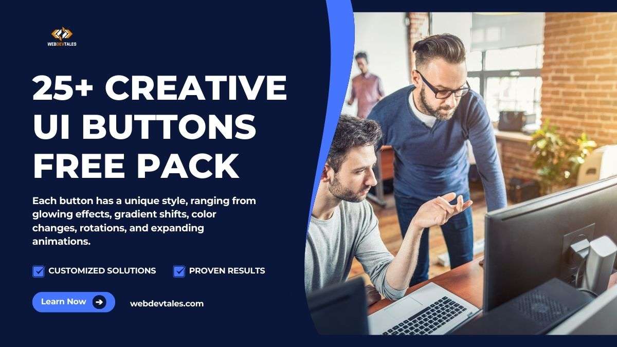
What This Pack Contains
This 25+ Creative UI Buttons Free Pack includes a variety of buttons designed with modern hover effects, transitions, transforms, and 3D elements. Each button has a unique style, ranging from glowing effects, gradient shifts, color changes, rotations, and expanding animations. The buttons are crafted to be responsive and customizable, providing developers with a versatile collection for any type of web project.
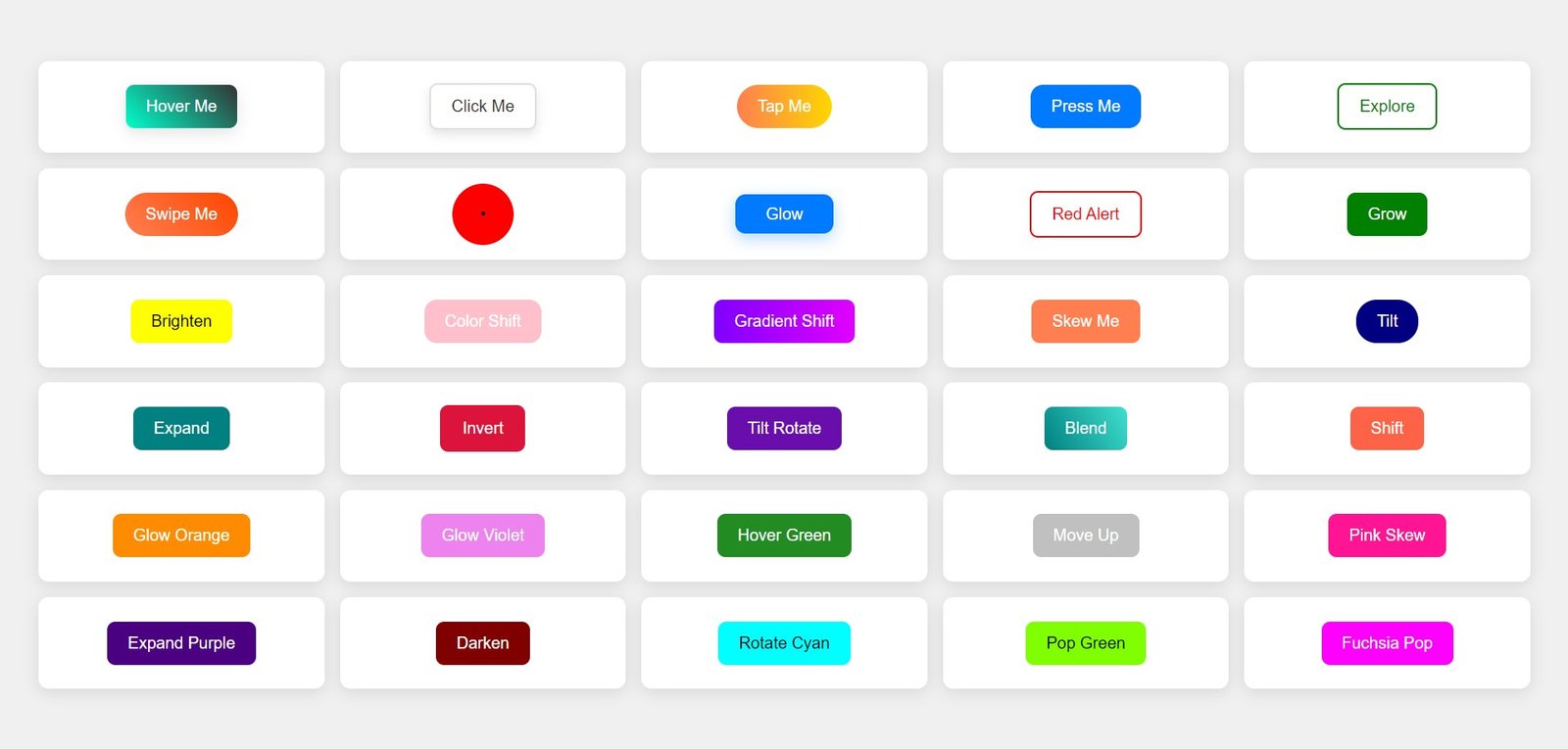
You’ll find UI Buttons for:
- Hover animations
- Color transitions
- 3D effects and shadows
- Scaling and rotation on click
- Text transformations on hover
Table of Contents
How Can You Use It?
These UI buttons are ideal for improving user experience and adding interactivity to any web interface, such as:
- Landing pages to create engaging calls-to-action (CTA)
- Forms with visually appealing submit buttons
- Navigation menus with hover-over effects
- Interactive content like popups or modals
- Product pages, making add-to-cart buttons more dynamic
By integrating these UI buttons, your site will have a modern, sleek design that responds intuitively to user interaction, increasing engagement and improving overall usability.
How to Import It into Your Project
Adding these buttons to your project is simple:
- Download the Button Pack from this blog post.
- You will find the UI Buttons.html file.
- You have multiple options now. Either you can copy-paste the file to your project folder and then here comes the twist, if you want simplicity then separate CSS code from the file (code written in <style> tag. ) and then save it in a separate UI Buttons.css file and then link the CSS file or you can just find your favorite button and then copy-paste its code from the files to your project, the choice is yours. But let me share with you a method so that you won’t have any problems.
- Copy the UI Buttons.css file and paste it into your project folder.
- Link the CSS file in the
<head>section of your HTML file:
<link rel="stylesheet" href="path/to/UI Buttons.css">
- Copy the HTML structure of the buttons you wish to use from the provided examples. Here’s an example:
<button class="btn btn-glow">Click Me</button>
- Ensure you link the correct JavaScript (if needed for advanced effects).
Once you add the CSS and HTML to your project, the buttons will be ready to use.

How to Customize It
You can easily customize these buttons to suit your brand or project needs. Here’s how:
- Change colors: Modify the background, gradient, or hover colors in the CSS file. For example, update the background color like this:
.btn-glow {
    background-color: #3498db; /* New color */
}
- Adjust hover effects: Update the hover animations to suit your style by tweaking transition timings or effects. For instance, you can slow down or speed up the hover effect like so:
.btn-glow:hover {
    transition: 0.4s ease; /* Adjust timing */
}
Modify dimensions: Adjust the button size or padding for different devices. You can set different styles for mobile views using media queries:
@media (max-width: 768px) {
    .btn {
        padding: 10px 20px;
    }
}
Download UI Buttons Pack
Complete Source Code:
After thinking a little I have also decided to provide you guys with HTML & CSS code directly so you can also copy it.
Buttons.html
<!DOCTYPE html>
<html lang="en">
<head>
    <meta charset="UTF-8">
    <meta name="viewport" content="width=device-width, initial-scale=1.0">
    <title>Creative UI Buttons on Shelves</title>
    <link rel="stylesheet" href="Buttons.css">
</head>
<body>
    <div class="container">
        <div class="button-container"><button class="btn btn1">Hover Me</button></div>
        <div class="button-container"><button class="btn btn2">Click Me</button></div>
        <div class="button-container"><button class="btn btn3">Tap Me</button></div>
        <div class="button-container"><button class="btn btn4">Press Me</button></div>
        <div class="button-container"><button class="btn btn5">Explore</button></div>
        <div class="button-container"><button class="btn btn6">Swipe Me</button></div>
        <div class="button-container"><button class="btn btn7">•</button></div>
        <div class="button-container"><button class="btn btn8">Glow</button></div>
        <div class="button-container"><button class="btn btn9">Red Alert</button></div>
        <div class="button-container"><button class="btn btn10">Grow</button></div>
        <div class="button-container"><button class="btn btn11">Brighten</button></div>
        <div class="button-container"><button class="btn btn12">Color Shift</button></div>
        <div class="button-container"><button class="btn btn13">Gradient Shift</button></div>
        <div class="button-container"><button class="btn btn14">Skew Me</button></div>
        <div class="button-container"><button class="btn btn15">Tilt</button></div>
        <div class="button-container"><button class="btn btn16">Expand</button></div>
        <div class="button-container"><button class="btn btn17">Invert</button></div>
        <div class="button-container"><button class="btn btn18">Tilt Rotate</button></div>
        <div class="button-container"><button class="btn btn19">Blend</button></div>
        <div class="button-container"><button class="btn btn20">Shift</button></div>
        <div class="button-container"><button class="btn btn21">Glow Orange</button></div>
        <div class="button-container"><button class="btn btn22">Glow Violet</button></div>
        <div class="button-container"><button class="btn btn23">Hover Green</button></div>
        <div class="button-container"><button class="btn btn24">Move Up</button></div>
        <div class="button-container"><button class="btn btn25">Pink Skew</button></div>
        <div class="button-container"><button class="btn btn26">Expand Purple</button></div>
        <div class="button-container"><button class="btn btn27">Darken</button></div>
        <div class="button-container"><button class="btn btn28">Rotate Cyan</button></div>
        <div class="button-container"><button class="btn btn29">Pop Green</button></div>
        <div class="button-container"><button class="btn btn30">Fuchsia Pop</button></div>
    </div>
</body>
</html>
Buttons.css
* {
    margin: 0;
    padding: 0;
    box-sizing: border-box;
}
body {
    display: flex;
    justify-content: center;
    align-items: center;
    min-height: 100vh;
    background-color: #f0f0f0;
    font-family: Arial, sans-serif;
}
.container {
    display: grid;
    grid-template-columns: repeat(5, 1fr);
    gap: 15px;
    width: 95%;
}
.button-container {
    background: #fff;
    box-shadow: 0 4px 15px rgba(0, 0, 0, 0.1);
    padding: 15px;
    border-radius: 10px;
    display: flex;
    justify-content: center;
    align-items: center;
    min-height: 90px;
}
.btn {
    padding: 12px 20px;
    border: none;
    font-size: 16px;
    cursor: pointer;
    transition: all 0.3s ease;
    border-radius: 8px;
    text-align: center;
}
.btn1 { background: linear-gradient(45deg, #00ffcc, #333); color: white; box-shadow: 0 5px 15px rgba(0, 0, 0, 0.1); }
.btn1:hover { transform: scale(1.1) rotate(3deg); box-shadow: 0 10px 20px rgba(0, 0, 0, 0.2); }

.btn2 { background: #fff; color: #333; border: 2px solid #ddd; box-shadow: 0 5px 10px rgba(0, 0, 0, 0.1); }
.btn2:hover { background: #f0f0f0; box-shadow: 0 8px 20px rgba(0, 0, 0, 0.2); }

.btn3 { background: linear-gradient(90deg, #ff7f50, #ffd700); color: white; border-radius: 50px; }
.btn3:hover { transform: translateY(-5px); box-shadow: 0 8px 15px rgba(255, 127, 80, 0.3); }

.btn4 { background-color: #007bff; color: white; border-radius: 12px; }
.btn4:hover { transform: scale(1.1); background-color: #0056b3; }

.btn5 { background-color: transparent; color: green; border: 2px solid green; }
.btn5:hover { background-color: green; color: white; transform: scale(1.1); }

.btn6 { background: linear-gradient(45deg, #ff7f50, #ff4500); color: white; border-radius: 30px; }
.btn6:hover { box-shadow: 0 8px 20px rgba(255, 69, 0, 0.4); transform: translateY(-3px); }

.btn7 { background-color: #f00; border-radius: 50%; width: 60px; height: 60px; display: flex; justify-content: center; align-items: center; }
.btn7:hover { background-color: #ff4500; transform: scale(1.1); }

.btn8 { background-color: #007bff; color: white; border-radius: 10px; padding: 10px 30px; box-shadow: 0 5px 15px rgba(0, 123, 255, 0.3); }
.btn8:hover { box-shadow: 0 8px 20px rgba(0, 123, 255, 0.5); transform: translateY(-5px); }

.btn9 { border: 2px solid red; background: none; color: red; }
.btn9:hover { background: red; color: white; }

.btn10 { background-color: green; color: white; }
.btn10:hover { transform: scale(1.2); background-color: darkgreen; }

.btn11 { background-color: yellow; color: black; }
.btn11:hover { background-color: orange; color: white; }

.btn12 { background-color: pink; color: white; border-radius: 12px; }
.btn12:hover { transform: scale(1.1); background-color: magenta; }

.btn13 { background: linear-gradient(90deg, #7f00ff, #e100ff); color: white; }
.btn13:hover { box-shadow: 0 10px 20px rgba(127, 0, 255, 0.5); }

.btn14 { background-color: coral; color: white; }
.btn14:hover { transform: skew(10deg); box-shadow: 0 8px 20px rgba(255, 127, 80, 0.5); }

.btn15 { background-color: navy; color: white; border-radius: 20px; }
.btn15:hover { transform: rotate(-3deg); box-shadow: 0 5px 10px rgba(0, 0, 128, 0.3); }

.btn16 { background-color: teal; color: white; }
.btn16:hover { background-color: darkslategray; transform: scale(1.2); }

.btn17 { background-color: crimson; color: white; border: 2px solid crimson; }
.btn17:hover { background-color: white; color: crimson; }

.btn18 { background-color: #6a0dad; color: white; }
.btn18:hover { transform: rotate(5deg) scale(1.1); }

.btn19 { background: linear-gradient(60deg, #008080, #40e0d0); color: white; }
.btn19:hover { background: linear-gradient(60deg, #40e0d0, #008080); }

.btn20 { background-color: tomato; color: white; }
.btn20:hover { background-color: darkred; transform: rotate(-2deg); }

.btn21 { background-color: darkorange; color: white; }
.btn21:hover { background-color: orangered; }

.btn22 { background-color: violet; color: white; }
.btn22:hover { box-shadow: 0 8px 20px rgba(238, 130, 238, 0.5); transform: translateY(-5px); }

.btn23 { background-color: forestgreen; color: white; }
.btn23:hover { background-color: seagreen; transform: scale(1.2); }

.btn24 { background-color: silver; color: white; }
.btn24:hover { transform: translateY(-3px); background-color: gray; }

.btn25 { background-color: deeppink; color: white; }
.btn25:hover { background-color: hotpink; transform: skewY(5deg); }

.btn26 { background-color: indigo; color: white; }
.btn26:hover { background-color: purple; transform: scale(1.1); }

.btn27 { background-color: maroon; color: white; }
.btn27:hover { background-color: firebrick; }

.btn28 { background-color: cyan; color: black; }
.btn28:hover { transform: rotate(-3deg); }

.btn29 { background-color: chartreuse; color: black; }
.btn29:hover { background-color: limegreen; transform: scale(1.2); }

.btn30 { background-color: fuchsia; color: white; }
.btn30:hover { box-shadow: 0 5px 10px rgba(255, 0, 255, 0.5); }
Video Demo:
FAQs
What does this UI Buttons Pack contain?
This pack contains over 25 unique and creatively designed UI buttons that feature various styles, hover effects, transitions, and 3D elements. Each button is crafted to enhance the user experience and can be easily integrated into your web projects.
How can I use these buttons in my projects?
To use the buttons, simply download the provided files and integrate them into your HTML/CSS code. You can copy the HTML structure for each button and link the corresponding CSS styles. Customize the text and colors as needed to fit your design.
Can I customize the buttons?
Absolutely! Each button can be easily customized by modifying the CSS styles. You can change colors, hover effects, borders, shadows, and text according to your project’s design requirements. Feel free to experiment with different styles to create a unique look.
Are these buttons responsive?
Yes, the buttons are designed with responsiveness in mind. They will adapt to various screen sizes, ensuring a consistent look and feel across devices. You can further enhance their responsiveness by adding media queries if necessary.
Do I need any coding knowledge to use these buttons?
While basic knowledge of HTML and CSS is helpful, the buttons are designed to be user-friendly. You can simply copy the provided code snippets and paste them into your project, making it easy even for beginners to implement.
Are these buttons suitable for commercial use?
The buttons in this pack are typically free for personal and commercial use, but it’s always good to check the specific license terms provided with the pack and if you don’t get any license then it means it is free for you. Ensure that you comply with any attribution or usage guidelines if specified.
Where can I find additional resources or support?
For additional resources, tutorials, or support regarding these buttons, you can visit our website or refer to the documentation included in the button pack. Feel free to reach out if you have any specific questions or need further assistance!